 Interior
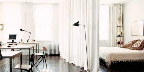
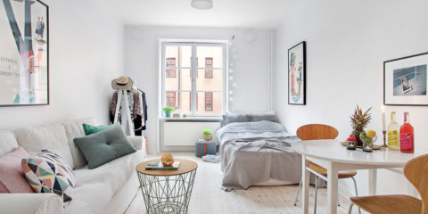
 options for a studio apartment with a bed and a sofa
Interior
Interior options for a studio apartment with a bed and a sofa
Owners of small apartments often wonder: what to choose a sofa or bed. I would like to fully equip the space. There are many ...
Read more
Psychologists noted that for many people, the gray color is perceived as something not very pleasant, but does not cause obvious negative emotions. Therefore, everyone understands the expression, where "gray" is known under the sign of something boring and inconspicuous. This can be explained by the fact that for many it is close to white and is perceived as an almost complete absence of brightness. However, it is not. It has its advantages and bright accents that will make the interior unique.
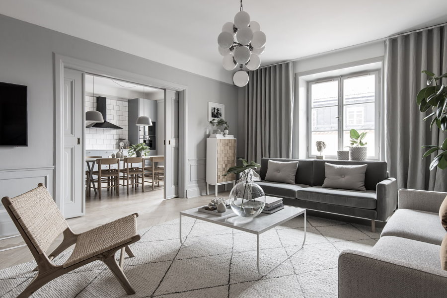
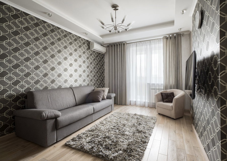
Proper use of gray allows you to create incredibly beautiful interiors in a variety of styles
Content
A couple of centuries ago, this basic shade was associated with the color of aristocrats. And for good reason: such tones are combined with everything, even not very bright accents stand out against a nondescript background. Complementing gray, you can apply rich, complex shades of red, blue or green. At the same time, no one can say about a person with such an interior that he is tasteless.
Gray has many shades and each of them has its own character, its own characteristics of use in the interior
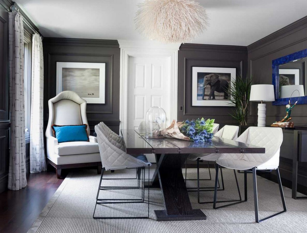
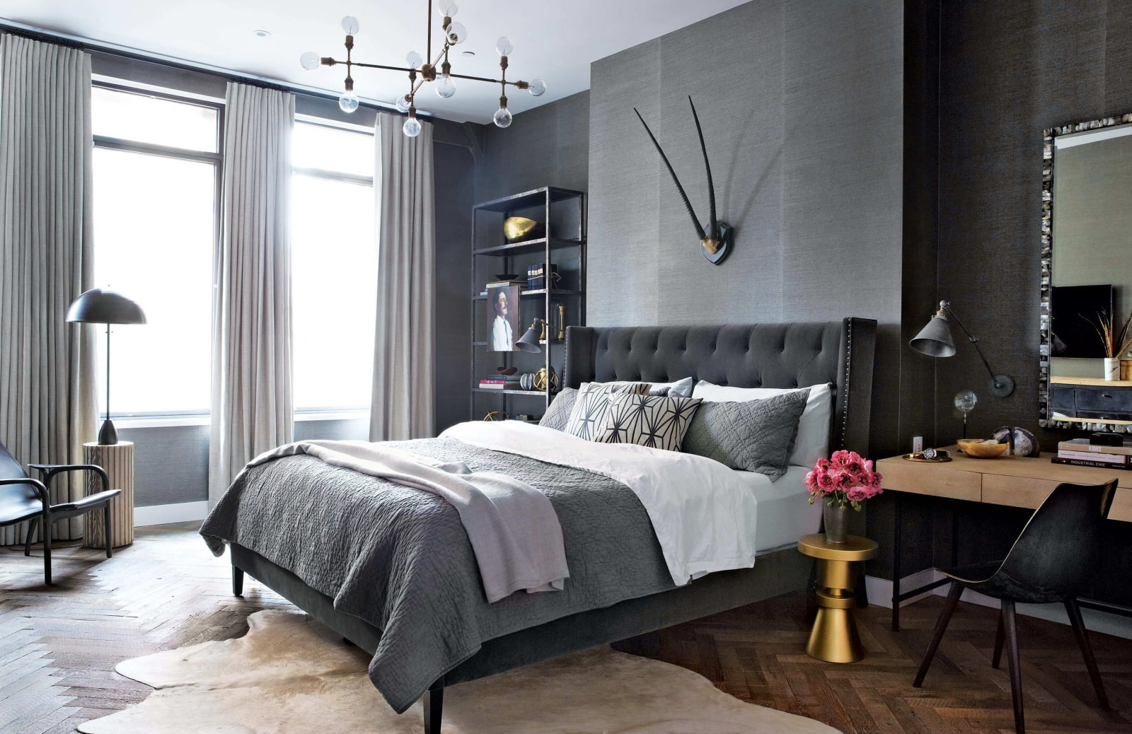
Gloomy adds stability to the interior. He also reassures, which is important for working and tired of the bustle and constant movement of people. This psychological effect is enhanced when combined with others: white, beige or black.
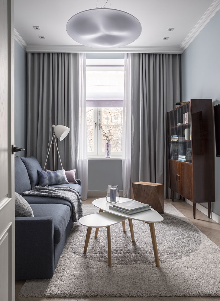
It looks good in composition with white or light gray. However, the interior of such flowers will be too “lifeless” in the living room. Such combinations are an excellent solution for the office. The design of the apartment in gray tones is recommended to be diluted with natural shades - sand, sea, delicate lavender.
Dilution of gray with natural elements or light spots allows you to get a trendy interior
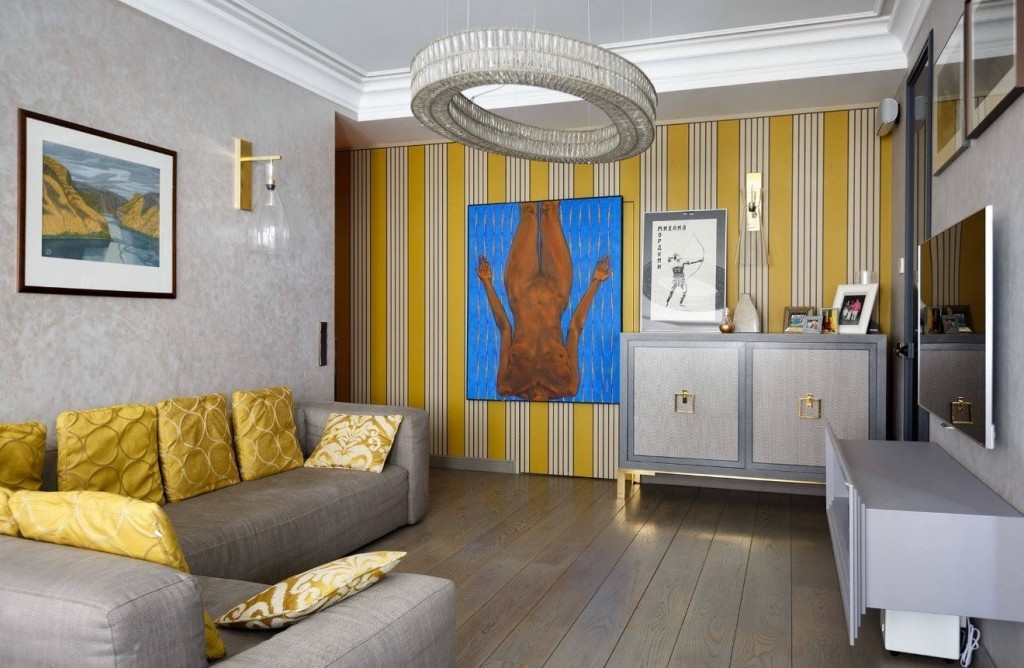
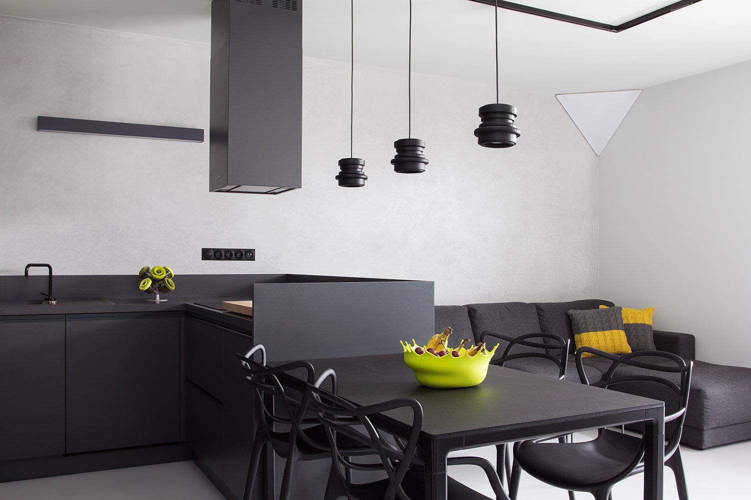
The monotonous gray interior is almost perfectly diluted with yellow, regardless of mixing proportions
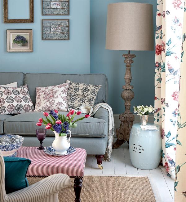
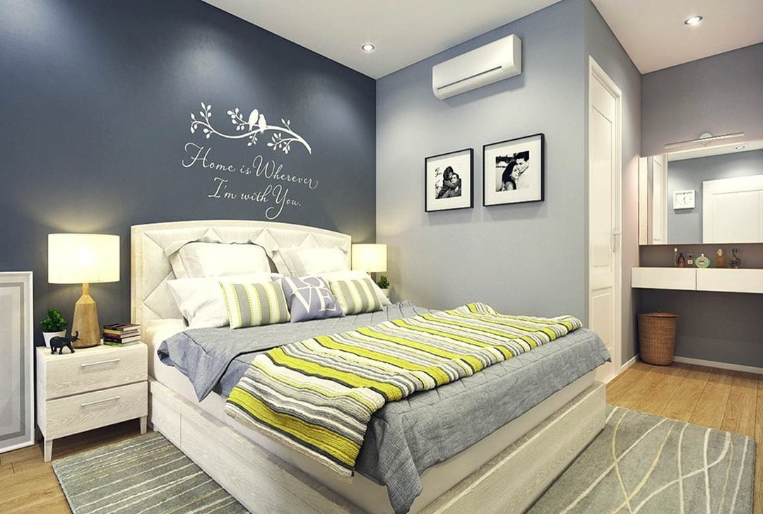
Enhances the brightness of other, even the most dim, tones. The atmosphere in the room changes depending on what colors are added to the interior besides the basic one. Gray with blue is refreshing. They will add an apartment in gray tones of elegance, freshness and lightness. Gray with blue looks much stricter, but it does not save the room from a sense of style. Blue helps to unleash fantasy. It is combined with pink and purple. In such a union, he looks the warmest. Gray with red or sunny orange will help revitalize the atmosphere and add energy to it. Such combinations fit into the retro style or the latest style. Gray and yellow give the interior joy and optimism. Bright yellow looks against such a background even more accent and attractive.
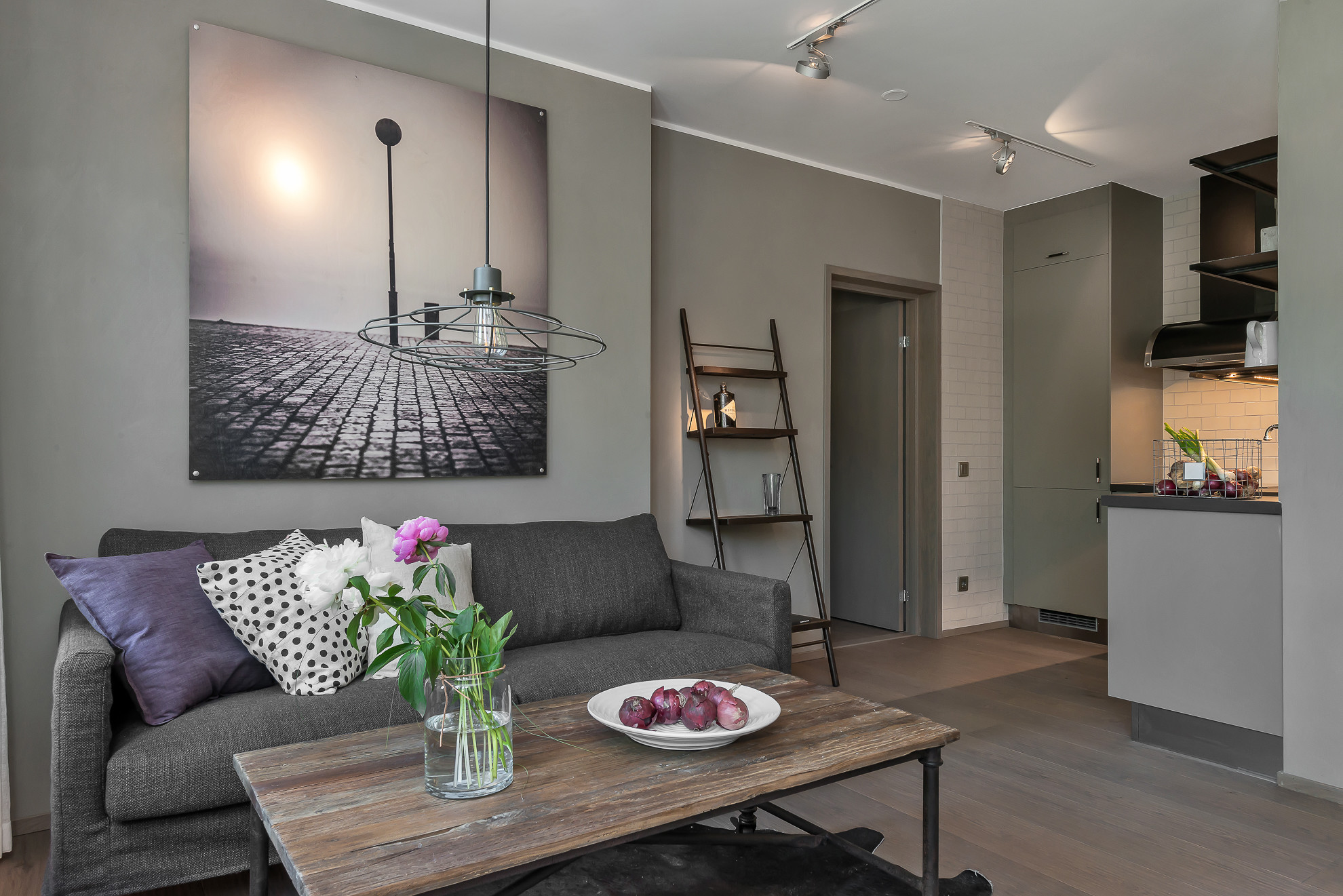
The combination of gray and beige gives a psychologically comfortable interior, ideal for rest and relaxation.
Lead is considered neutral, so it is perfect as a background. Having painted the walls in light gray shades, you can use furniture and accessories of almost any, even very bright, “accent” colors.At the same time, the interior will retain its zest, it will not be “flashy”, it will maintain restraint and peace.
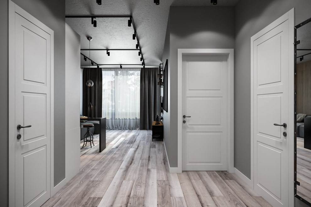
The combination of gray walls and white doors in the hallway interior looks noble and rich
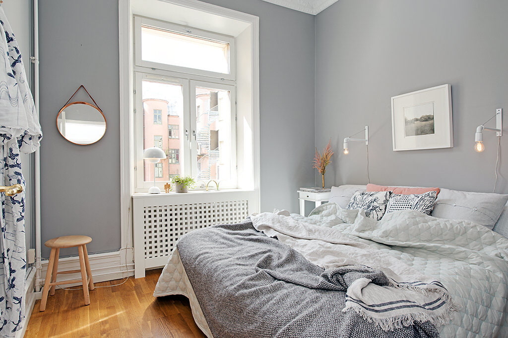
If the emphasis is on details, furniture, then for the main surfaces it is better to take a light grayish shade.
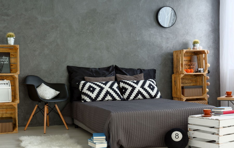
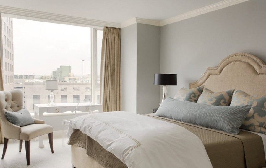
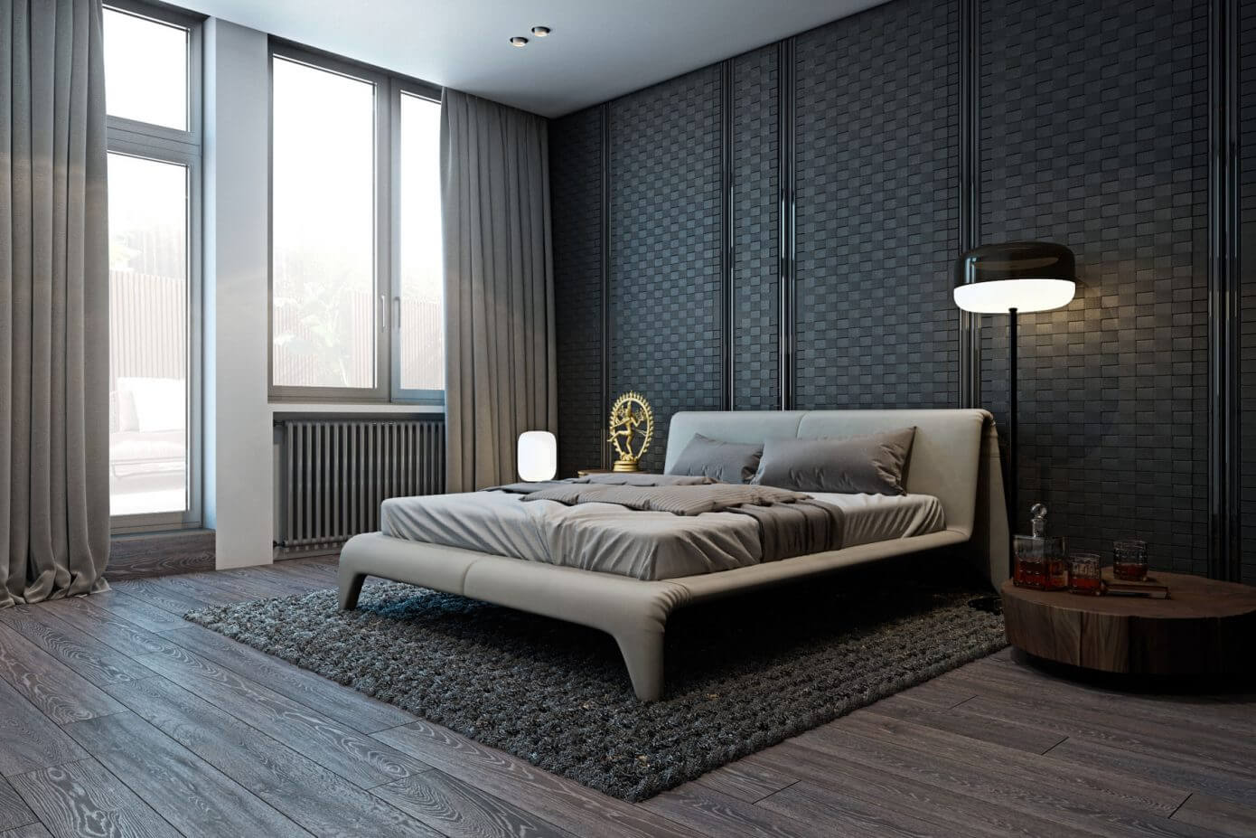
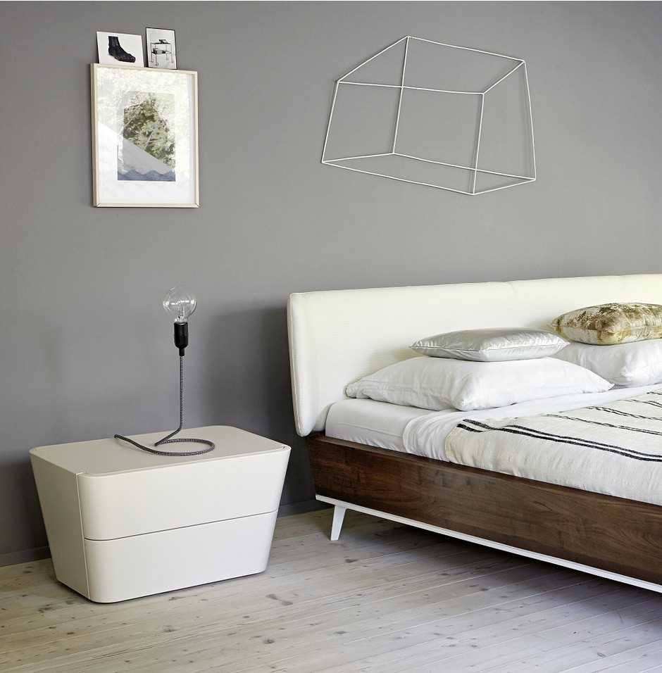
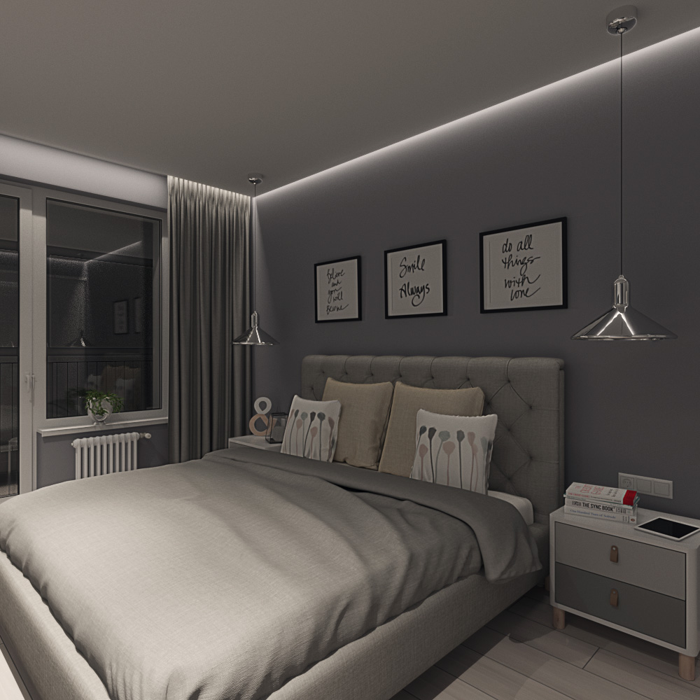
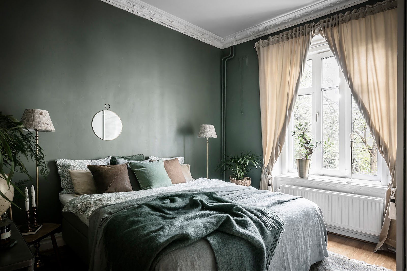
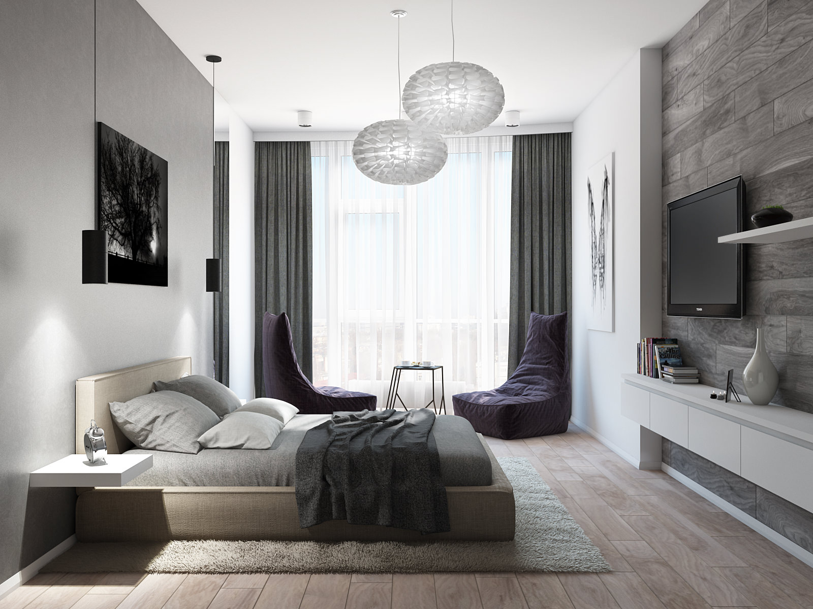
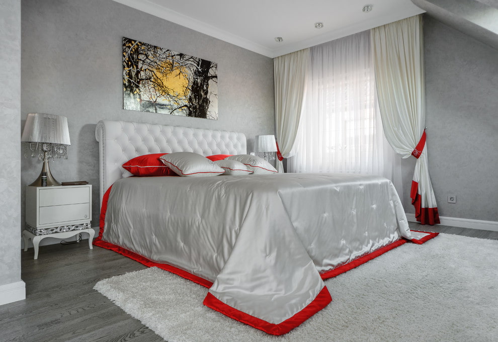
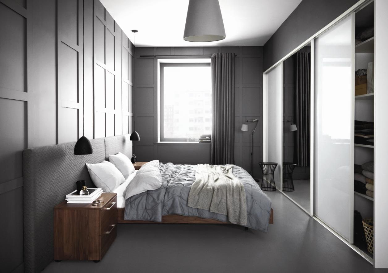
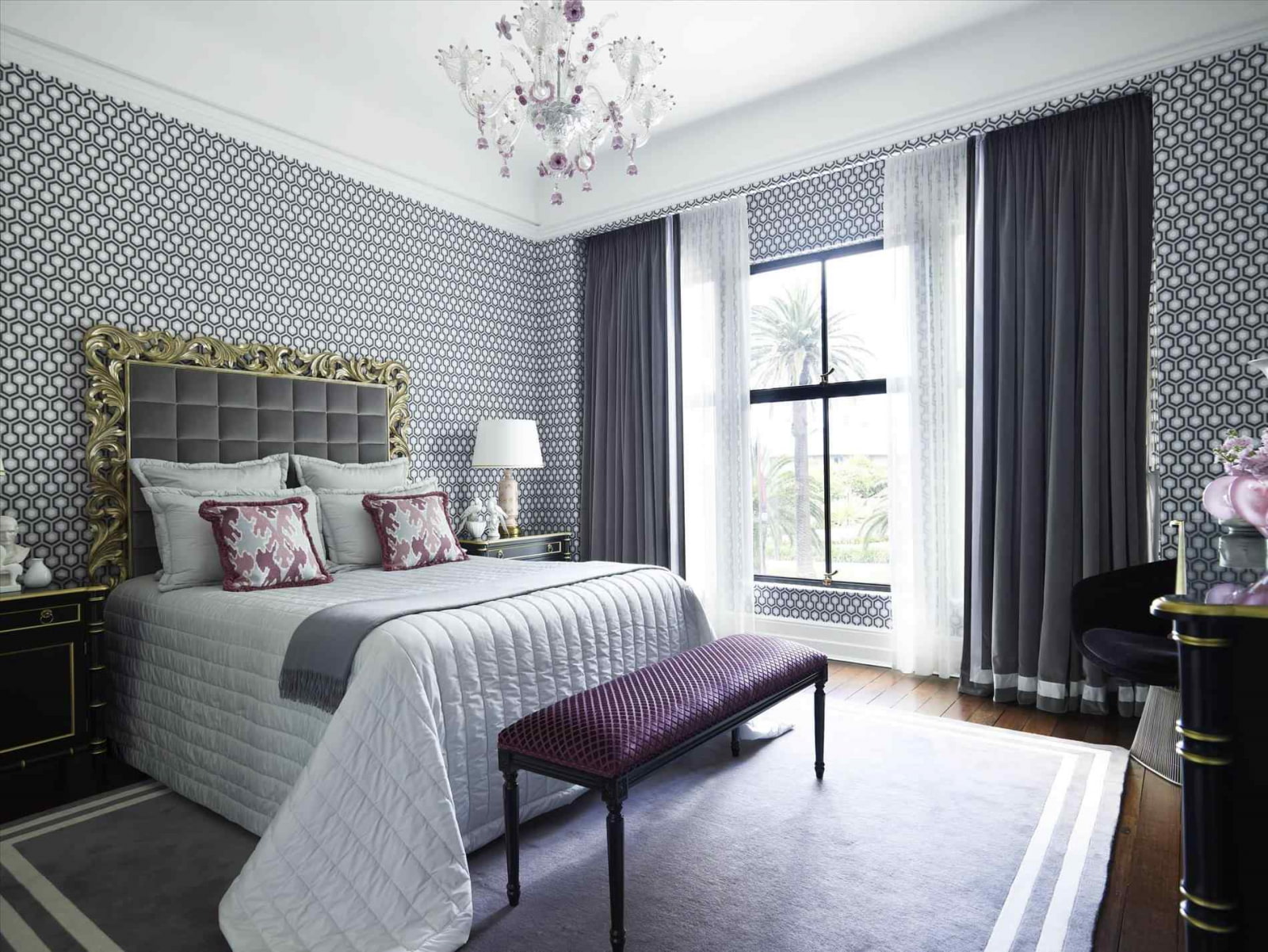
No need to fear lead in the bedroom. This tone gives the bedroom a calm, which is what is needed for this room. Due to the gray color in the room creates coziness, harmony. The room will look good light tone, which goes well with elegant decor additions: a vase, a statuette, a lamp.
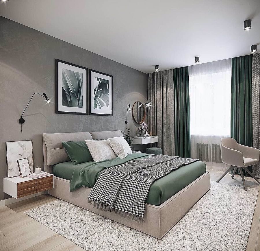
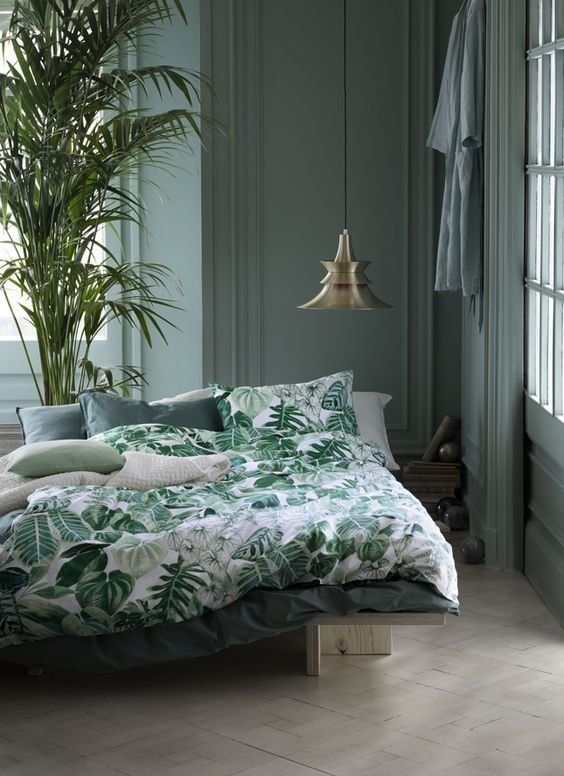
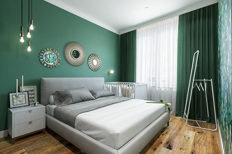
The gray-green combination is pleasing to the eyes, soothes nerves and promotes good rest
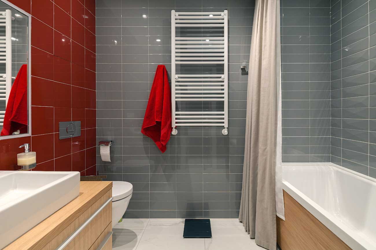
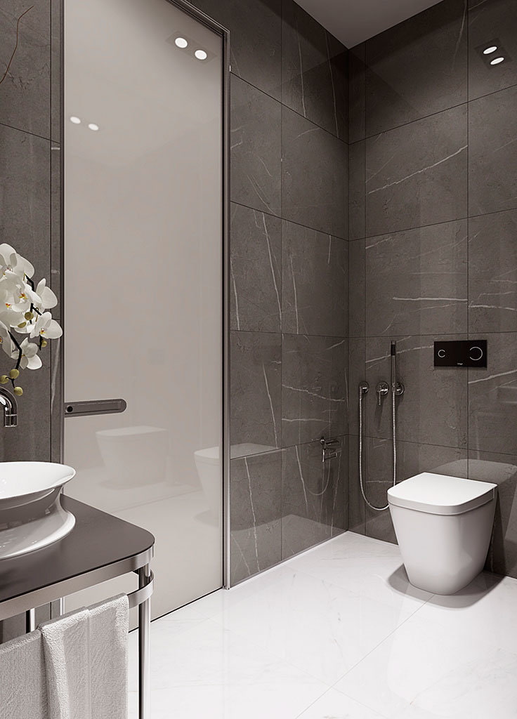
In the bathroom, it goes well with blue or beige. The gray walls will help give the room peace and relaxation. This color can also be used in the bathroom. But on the floor it will seem “dirty” and be associated with dark sand.
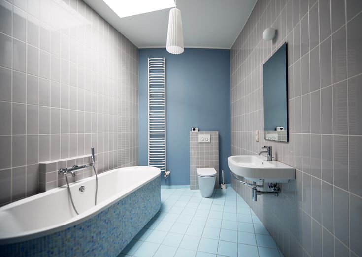
On gray ceramic tiles less visible stains and splashes of water
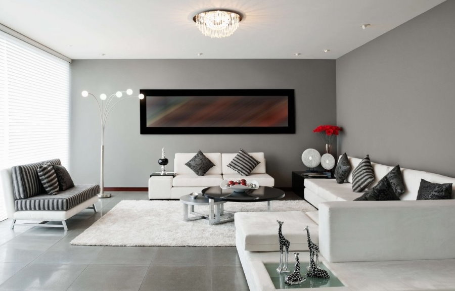
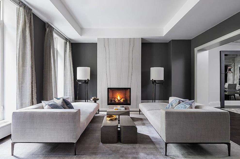
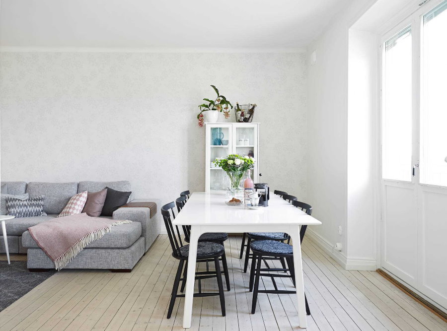
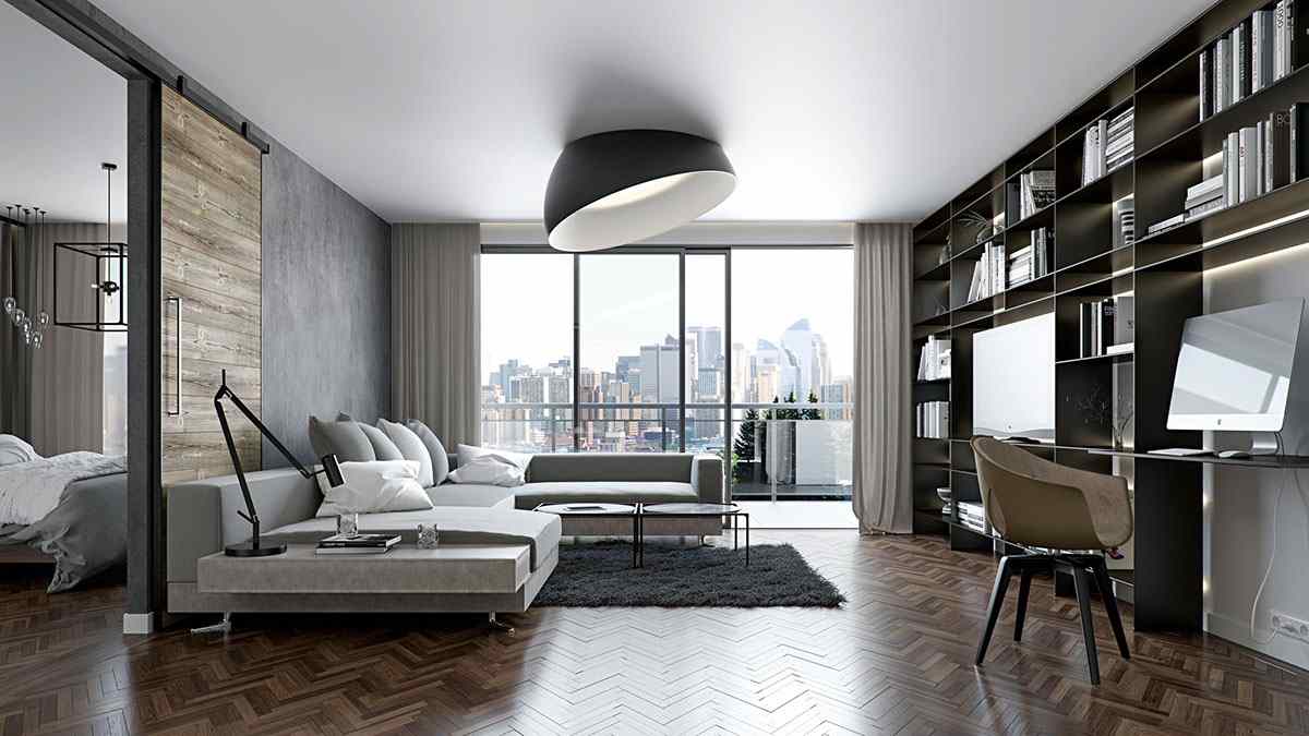
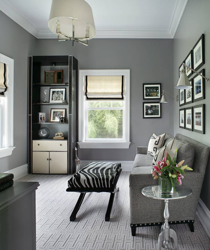
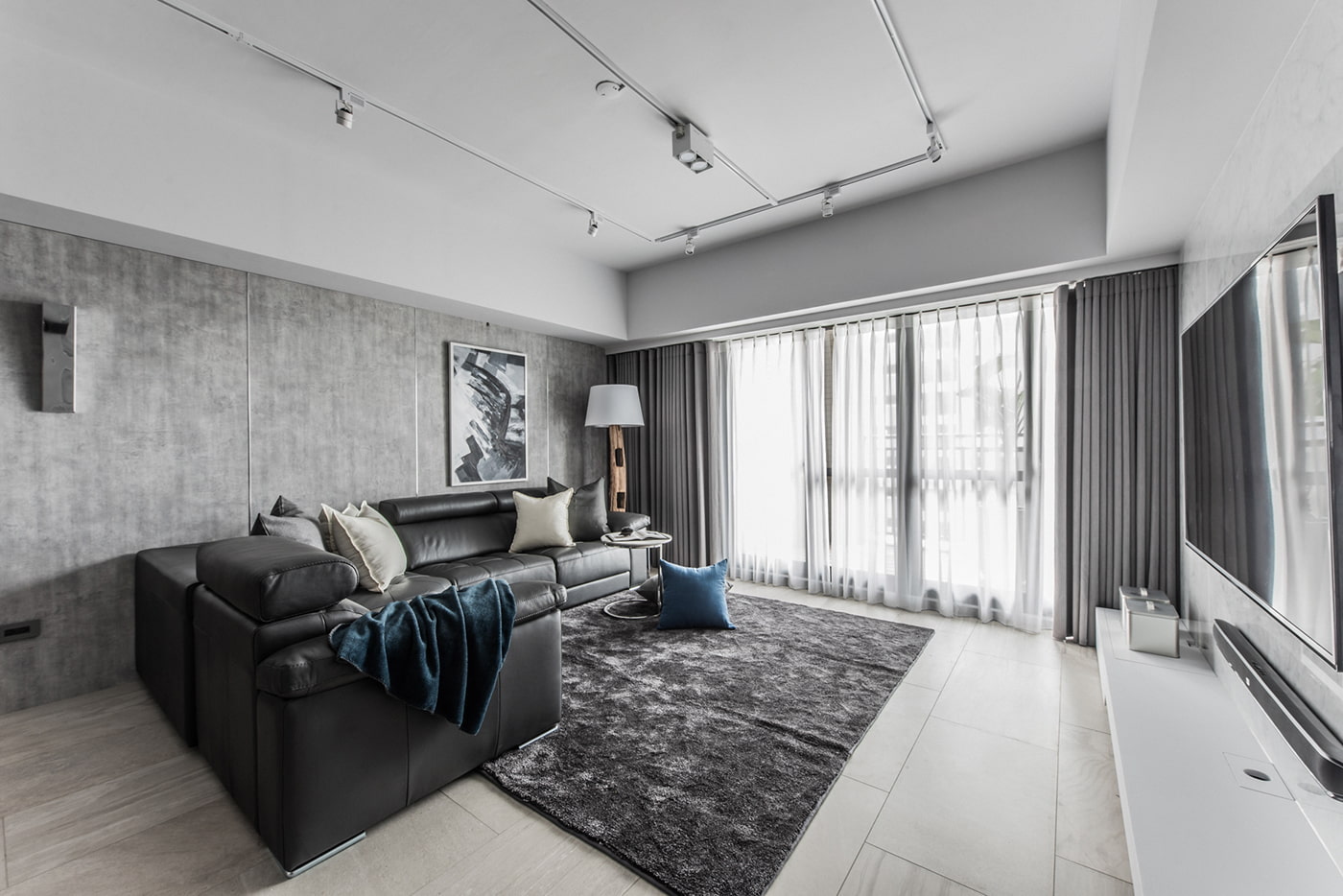
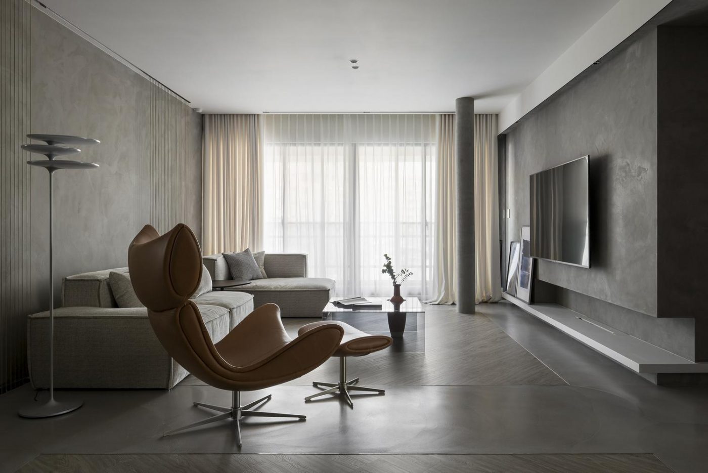
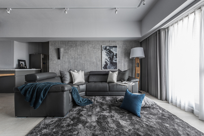
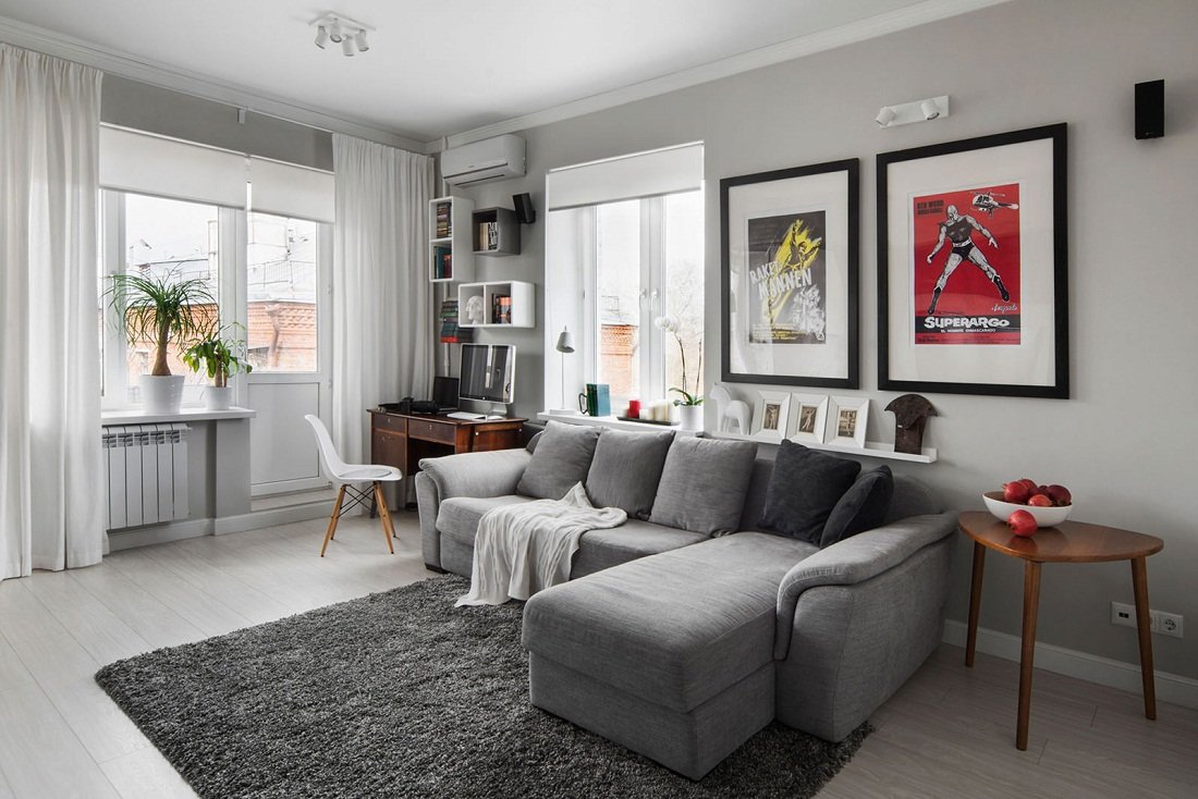
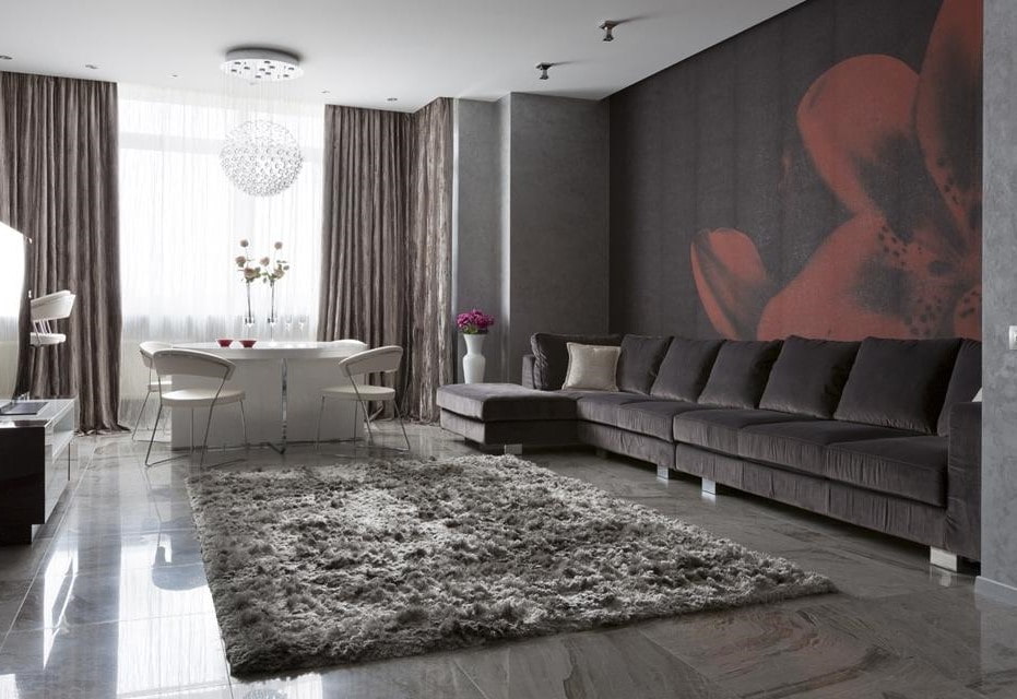
The gray living room gives the effect of chic and luxury, wealth. Light gray tones will look better. The atmosphere of the room will gain a feeling of lightness. If to use shades of gray darker, for example, wet asphalt or lead, then the room will look strict, conservative. To make the interior more smooth, not sharp, noble textures and bright accent colors will help. Gray will not allow the room to be too overloaded. But such a living room is not suitable for a studio apartment.
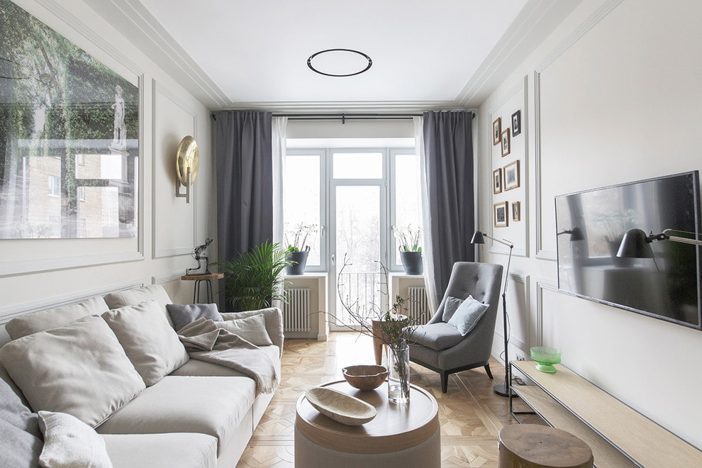
In a small living room, it is better to highlight the accent role in gray.
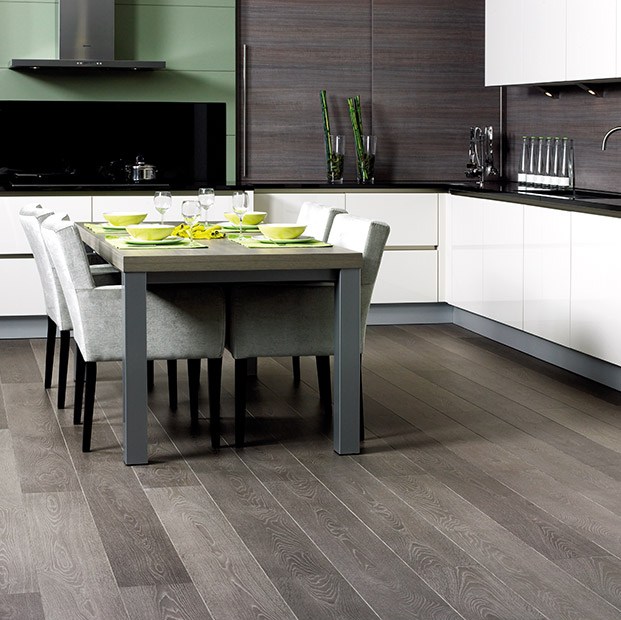
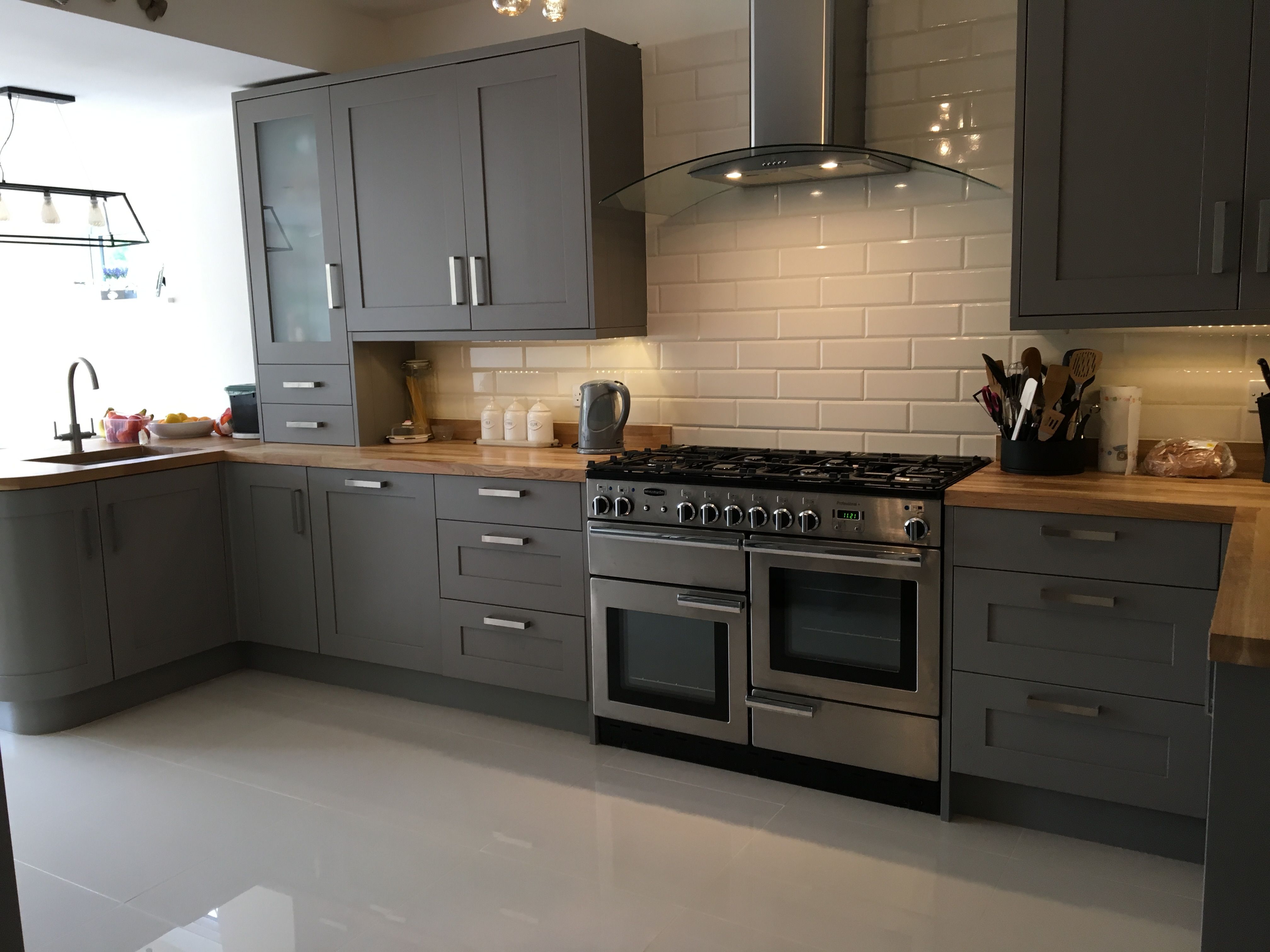
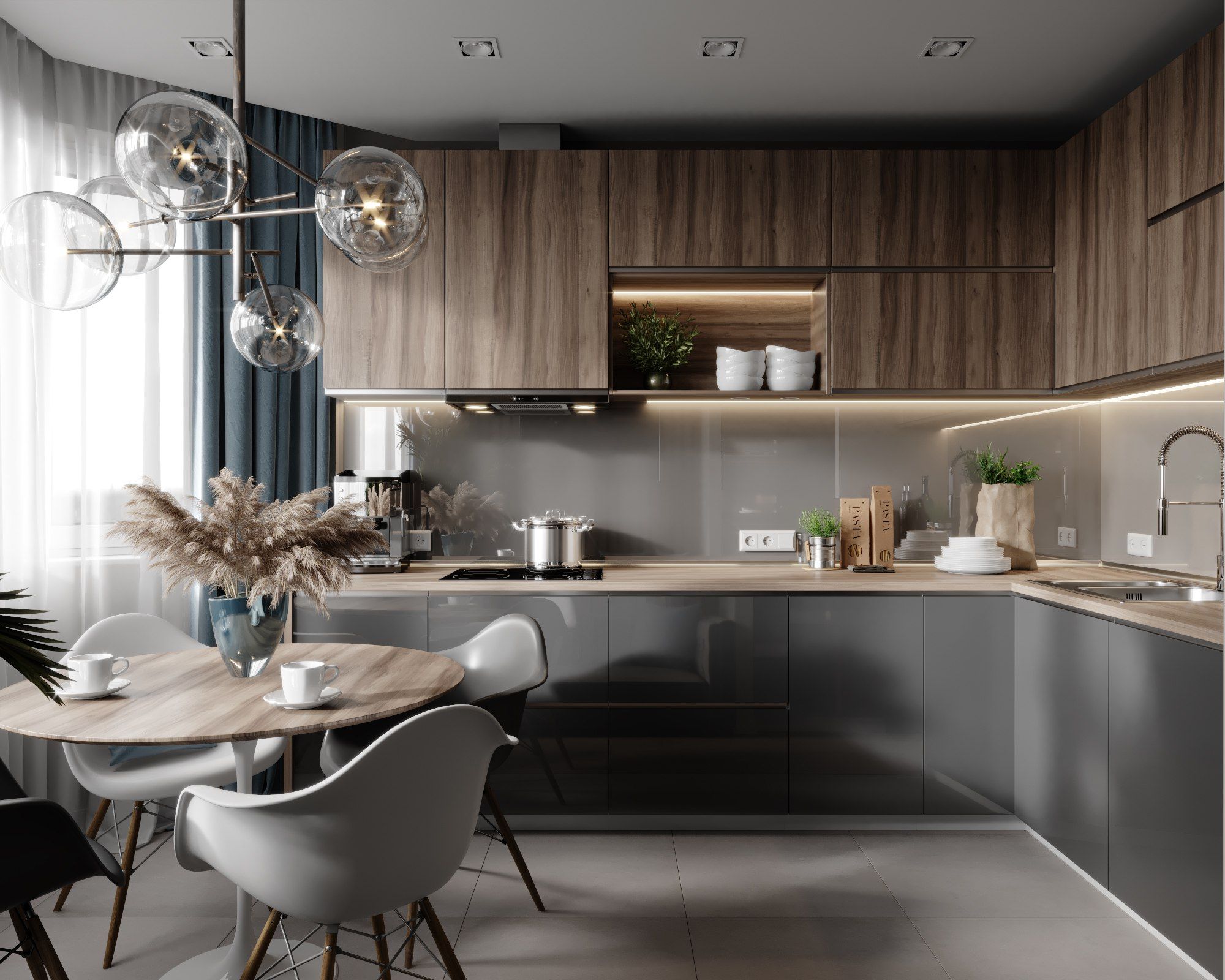
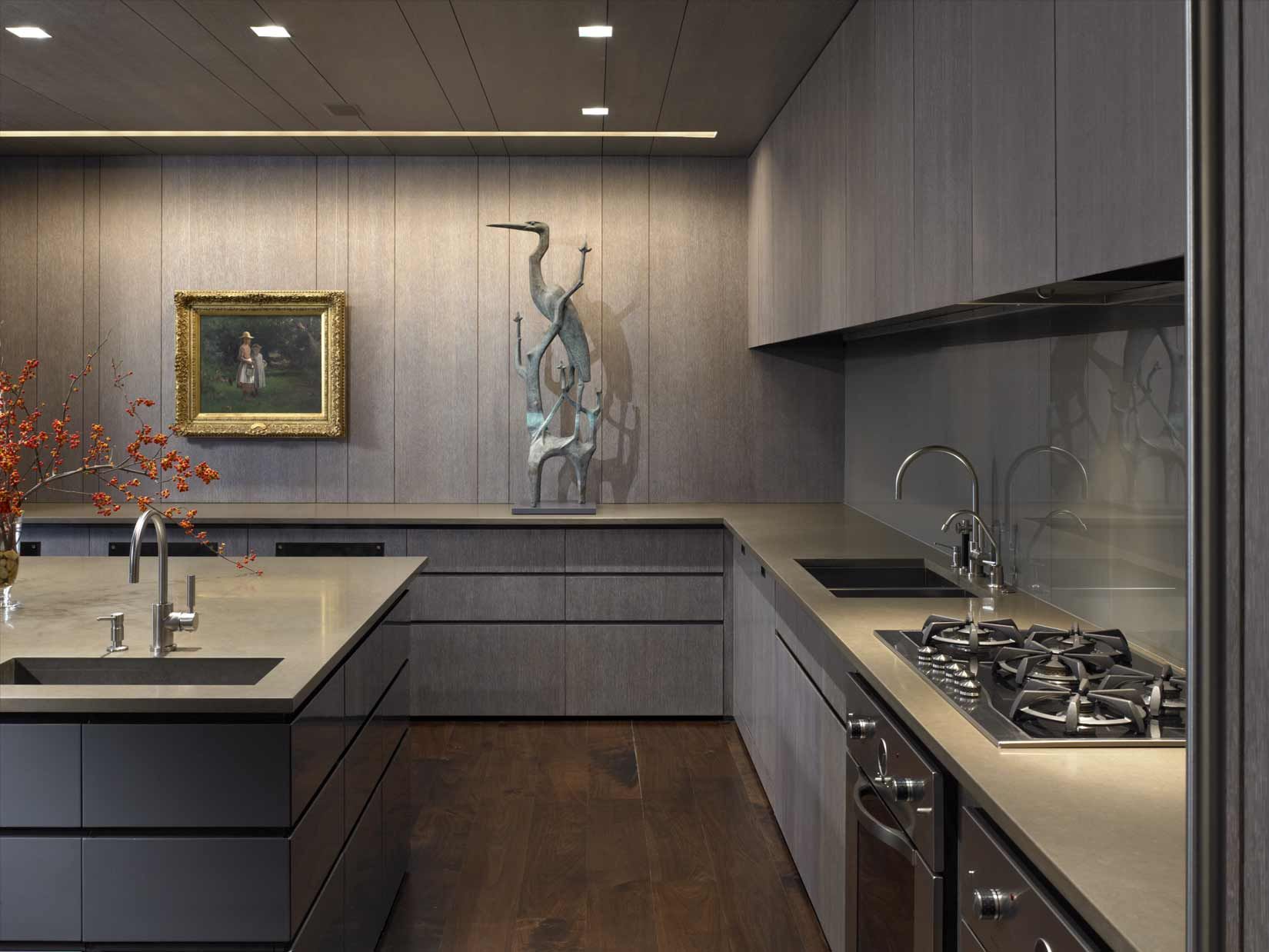
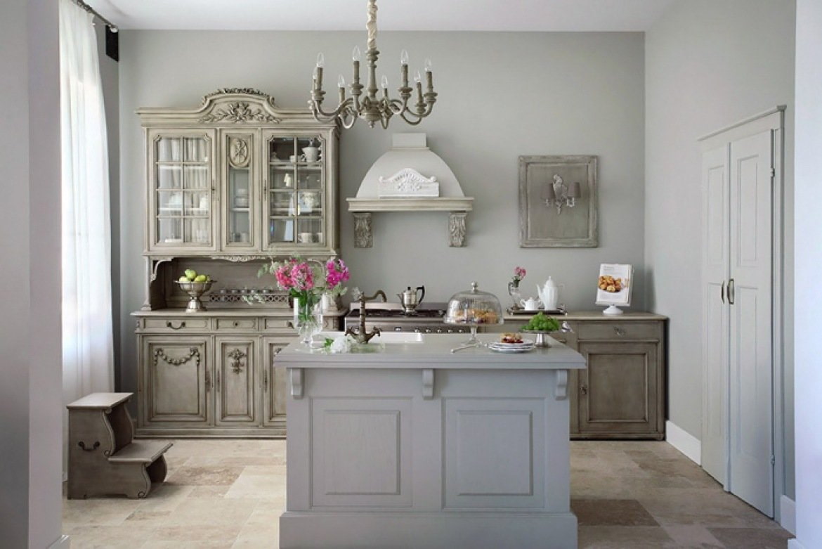
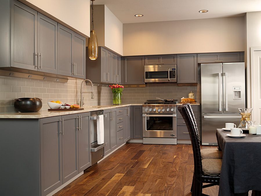
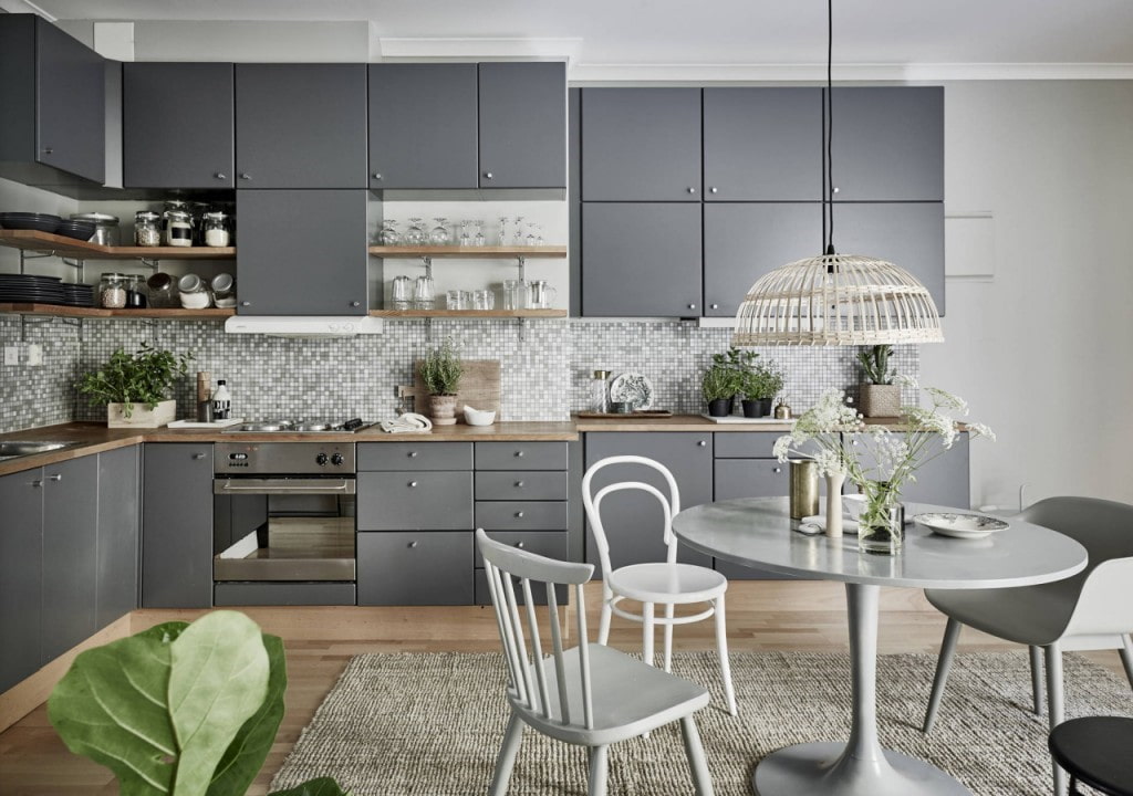
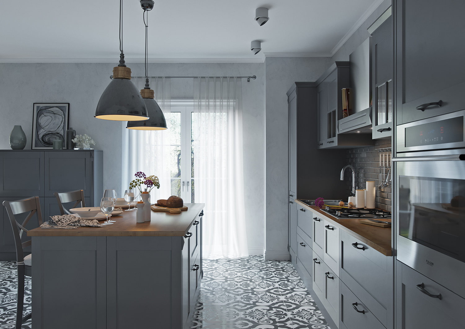
Gray is a symbol of purity and innocence. The kitchen is exactly the place where this perception "works on hand". Most often, cleanliness is needed in the kitchen. Monochrome kitchens are popular not only in modern styles, but also in others, even the most elaborate ones. Kitchen furniture can be any: matte, glossy, interspersed with sequins or not. She will invariably maintain her aristocracy.
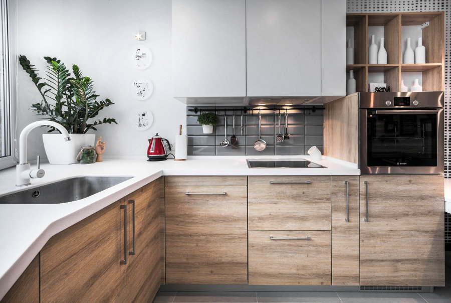
The interior of the kitchen is often decorated in a cozy taupe combination.
For floors for kitchens, this color is also chosen, since dirt is not visible on it. In addition, gray is the tone of natural stone, which is why such a tile is widely popular. In a “non-flashy” color kitchen, a person feels special calmness and tranquility, but at the same time he does not have a desire to spend too much time in it. For comfort, a monochrome color must be diluted with bright accents or a tree. For example, lay a laminate floor. In the decoration of the walls, you can use interspersed with bright tiles and wallpaper. Chairs and a table can also be made of wood. Such a room acquires a special "warmth", as it is associated in humans with the natural habitat.
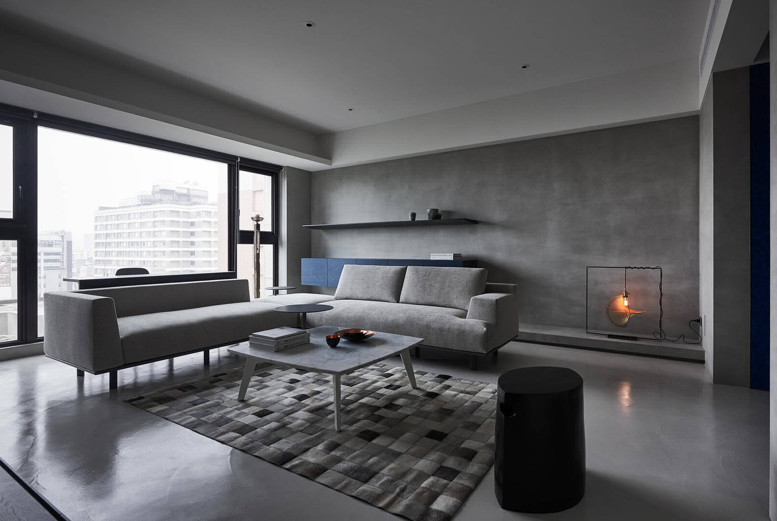
In such a living room, it is better to avoid dark gray and turn your attention to lighter tones. They look great in natural light and give the room sophistication. The room seems more spacious.
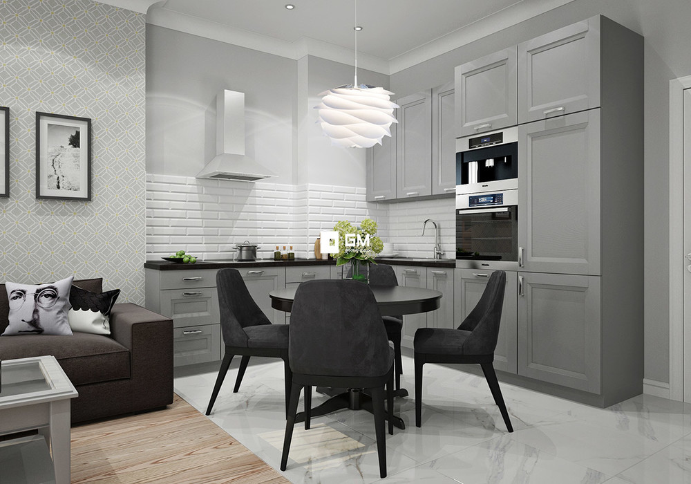
Gray Scandinavian-style kitchen-living room
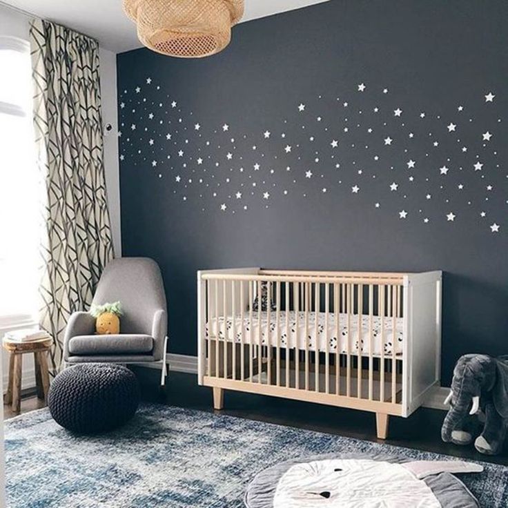
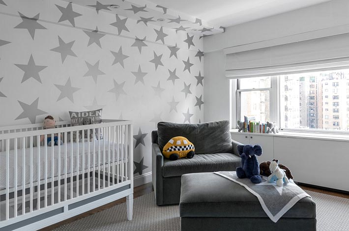
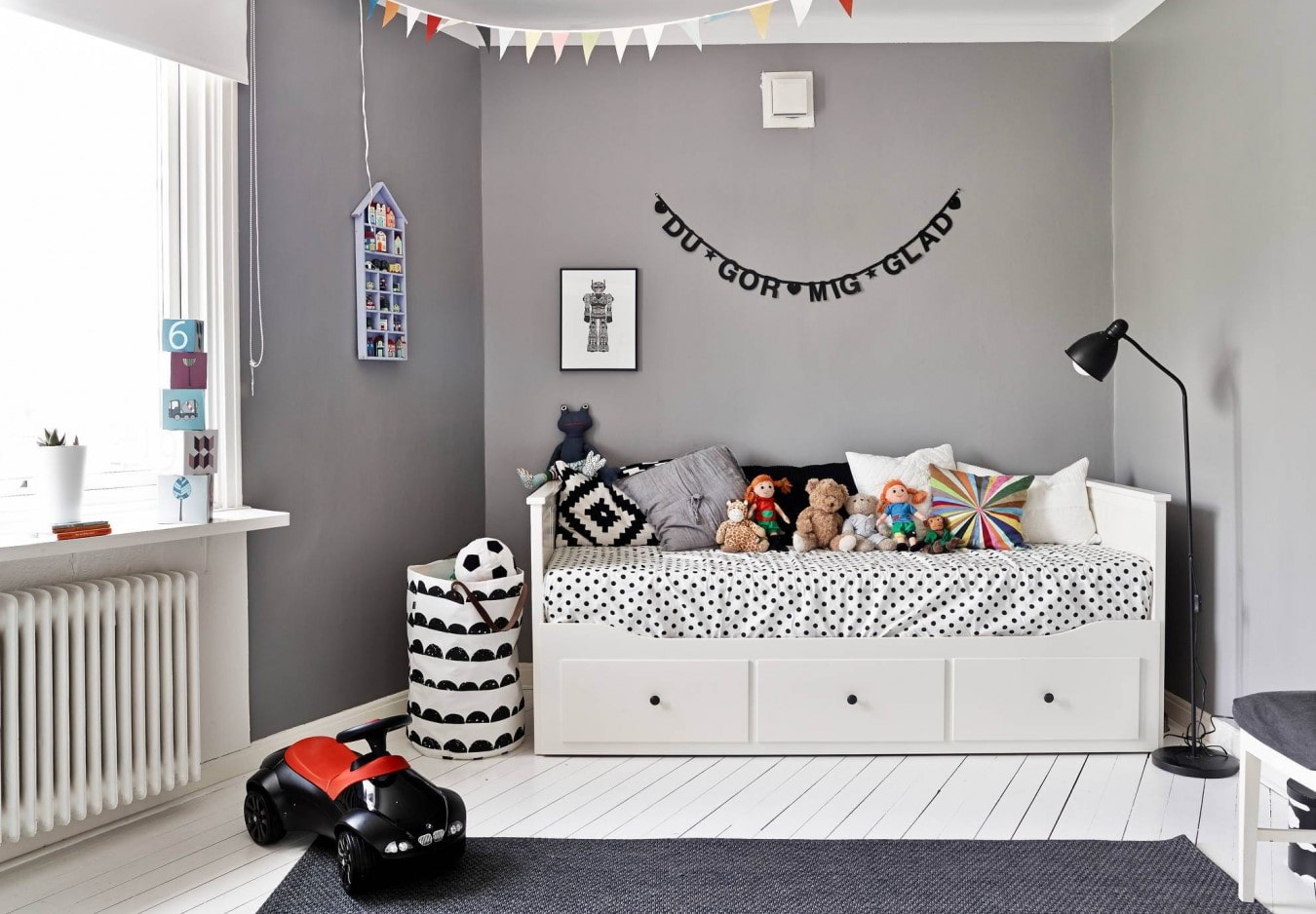
For a children's room, gray is not considered good. However, if the child is hyperactive, then this color will soothe him. But in combination with bright accents, he will cease to be so boring and joyless. It will look good in combination with red or pink.
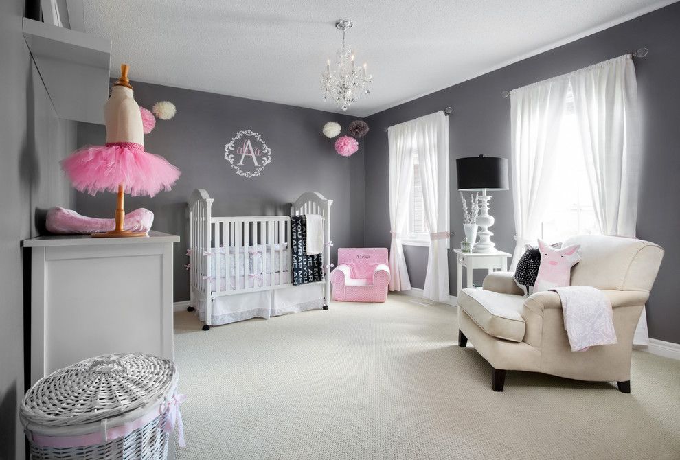
A worthy solution would be a gray wall decoration in combination with light furniture
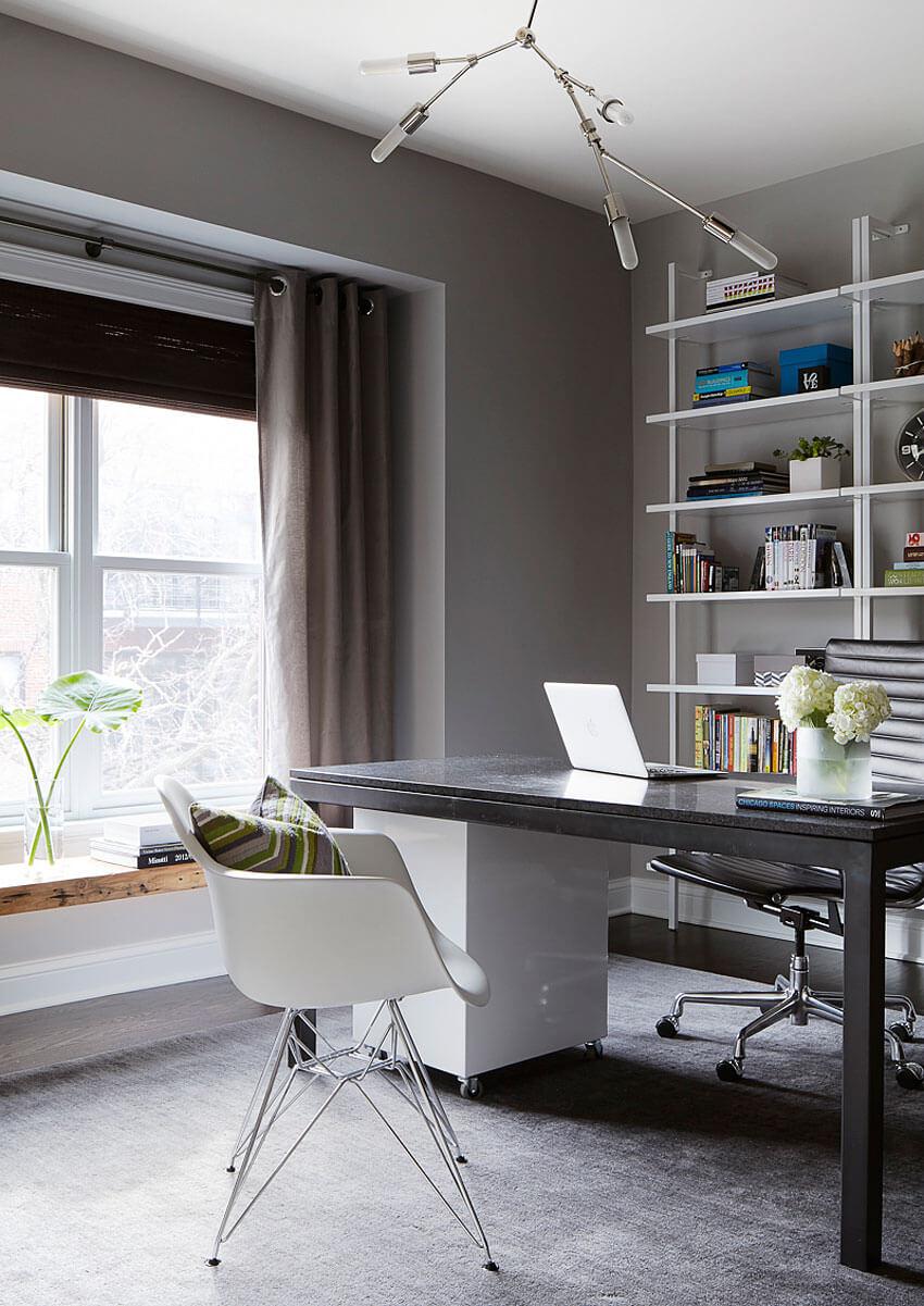
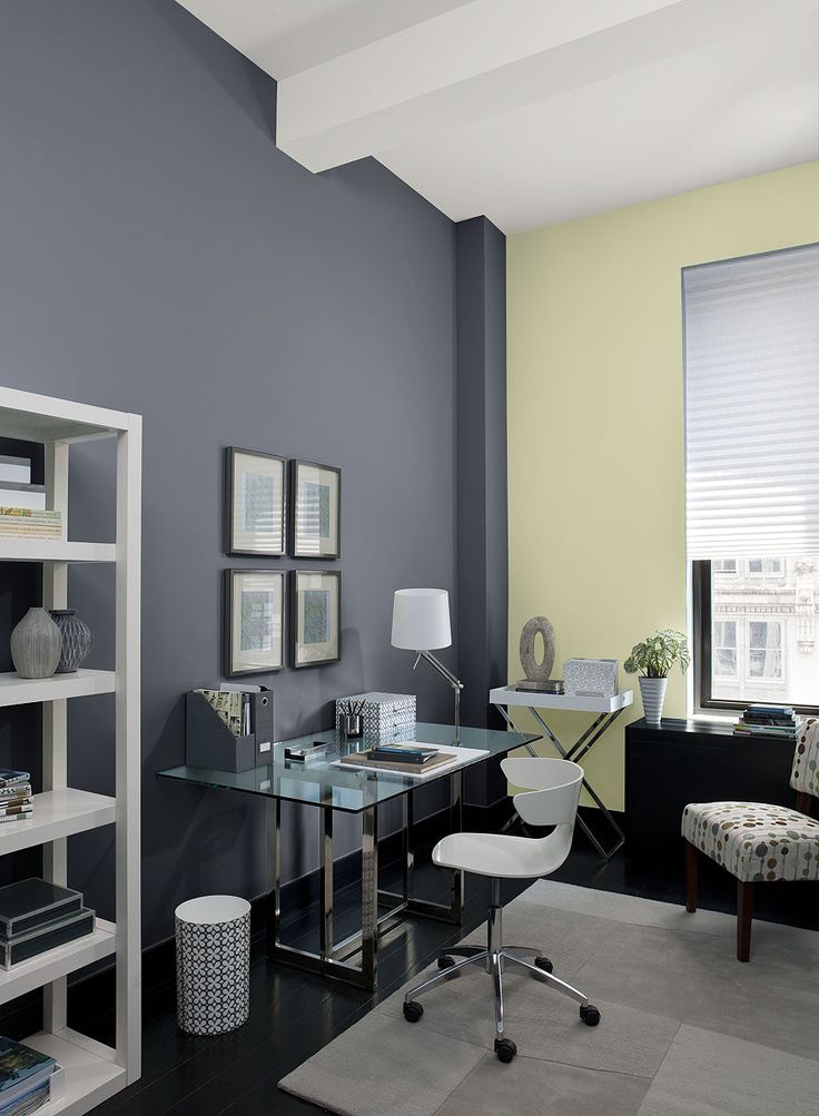
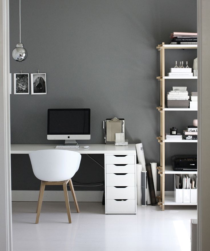
The design of the cabinet should be tuned to work. Executed in gray, it gives the room severity and restraint. In addition to gray, you can use brown or black. Accents of blue will return a feeling of a surge of strength and relieve fatigue. Green will help to tune in to the "working mood."
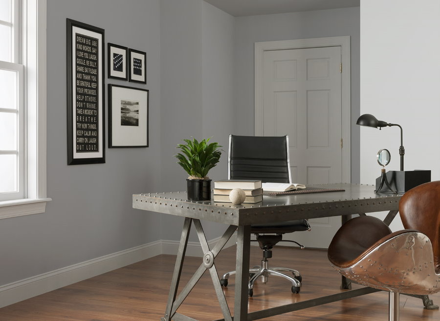
Ash and steel colors are considered the best shades for creating a business atmosphere.
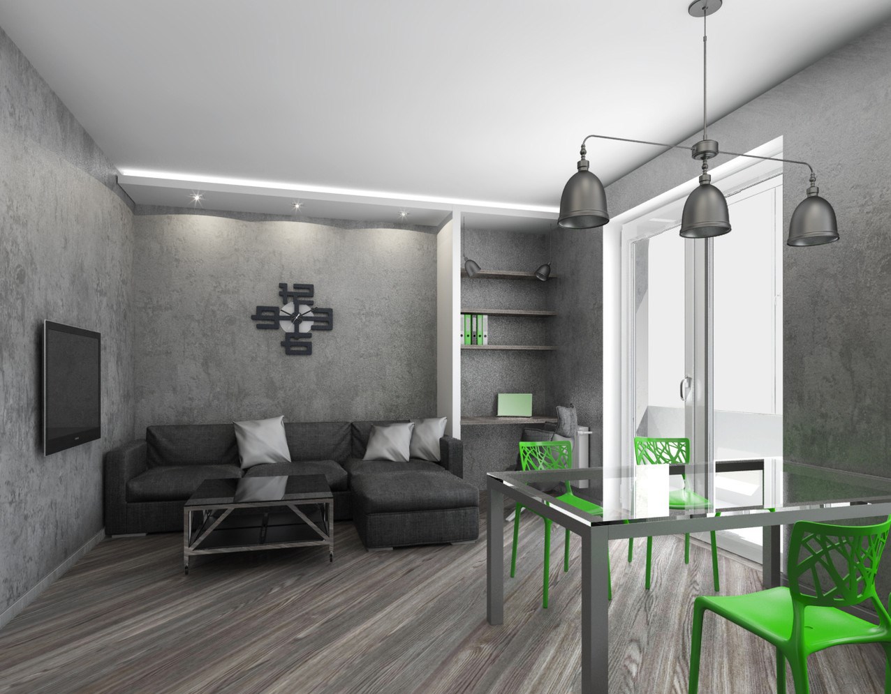
A successful combination of gray with white and black in a minimalist style room
Gray wallpaper with drawings in a classic living room with beige furniture
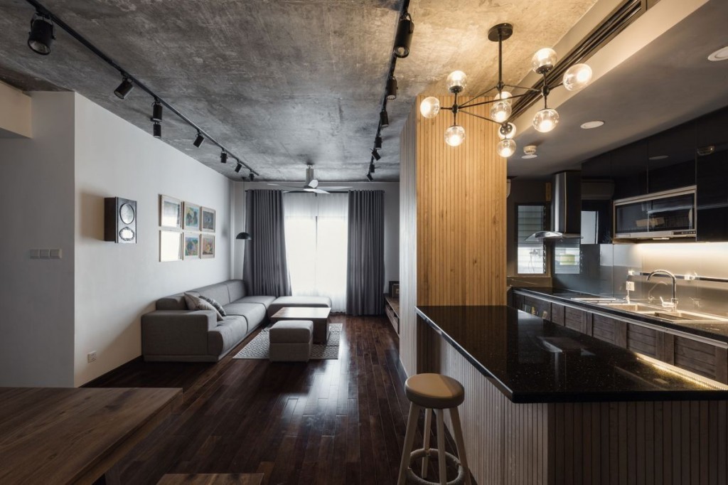
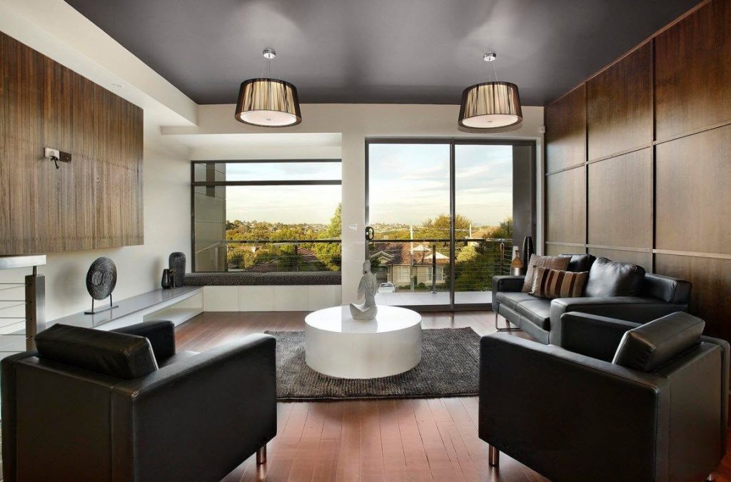
The gray ceiling fits perfectly into the brutal interior with elements of an industrial loft
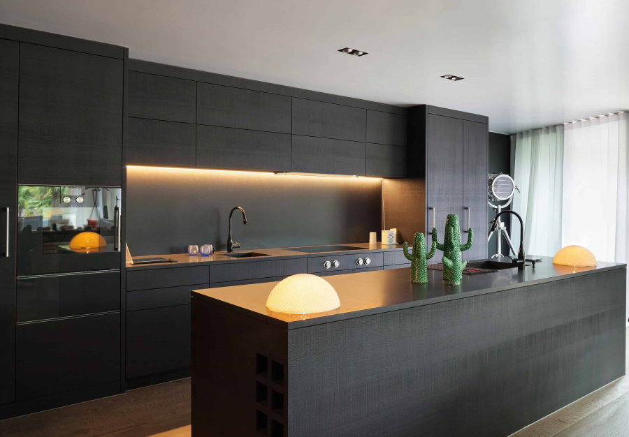
Gray high-tech kitchen with an unusual lighting solution
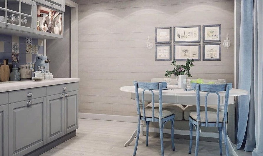
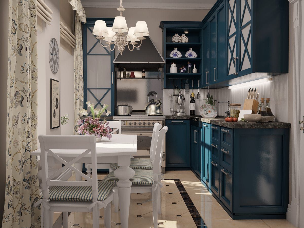
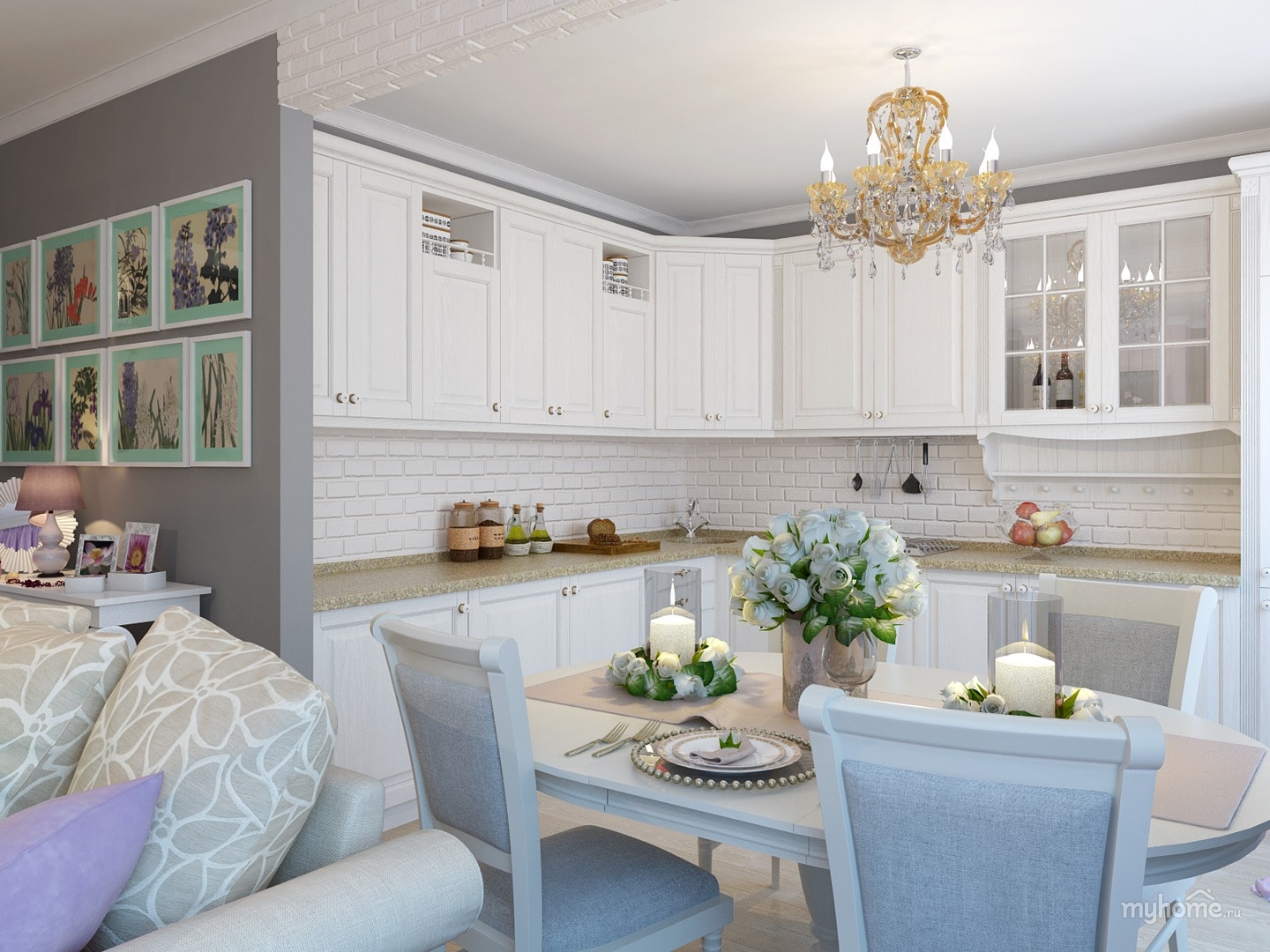
Cozy interior of Provencal cuisine with an amazing combination of gray and blue colors
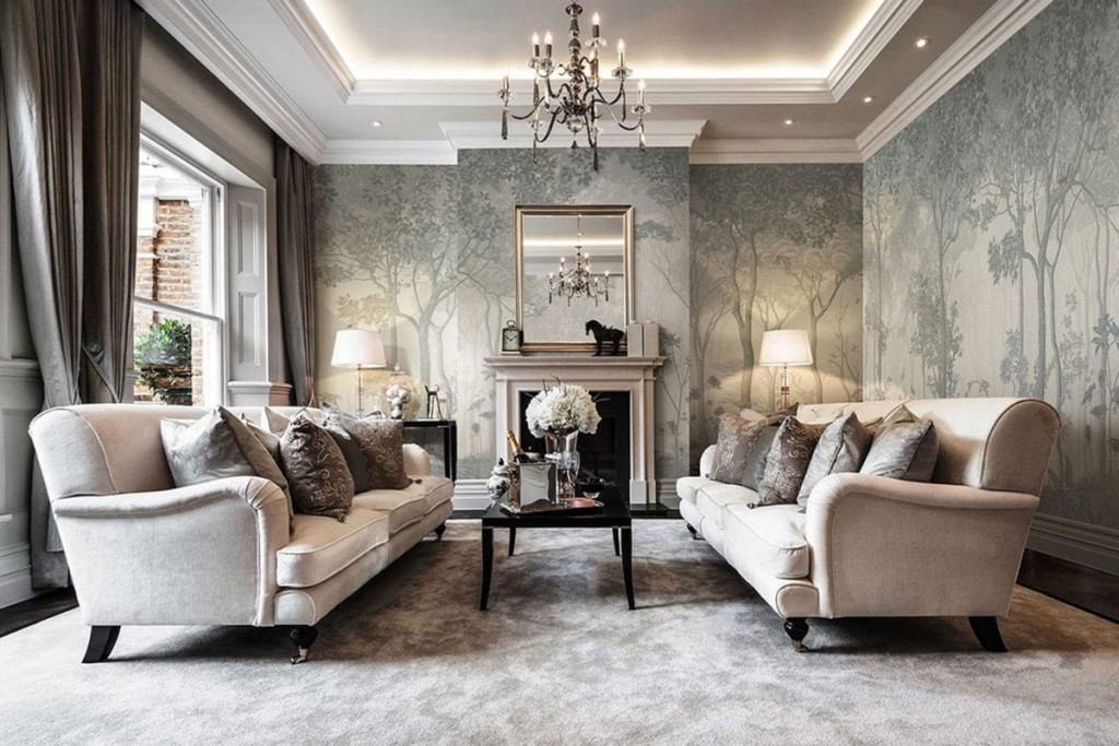
Walls of neutral background help to connect the rest of the colors of the parts and doors together. Gray on the walls is an excellent solution for a complete change in the interior, it will help give the room lightness. But for the design of walls in residential premises, it is better to dilute it with blue, pink, so that the shade is not so faceless. Such colors will definitely appeal to those who like Provence, romantic or classic. When choosing a shade, it is necessary to take into account the fact that the room will be transformed under the influence of daylight or artificial light.
Gray walls create a romantic atmosphere, enveloping the room with some mysterious haze
Gray wallpapers do not look like paint at all. They may have stripes, patterns or geometric shapes. If an emphasis is placed on the wall, then it is necessary to choose a wallpaper with a light print.
In a room with gray wallpaper, flooring with a pronounced wooden texture will be appropriate
This gender is often used in European classics. This flooring is easy to combine with white, gold or metallic colors. Also, such a laminate fits perfectly into the gray-white design of the apartment. But in order to avoid overload, you need to consider several nuances when choosing a gray laminate:
Accessories of neutral color always look advantageous. This is due to the fact that they do not attract too much real attention and easily fit into the interior. They muffle the rest of the bright accents and bring restraint to the interior. Pale gray colors muffle the rest of the shades, so a feeling of "prestige" and sleekness is created. Silver floor lamps, lamps, vases also play a role in increasing the static.

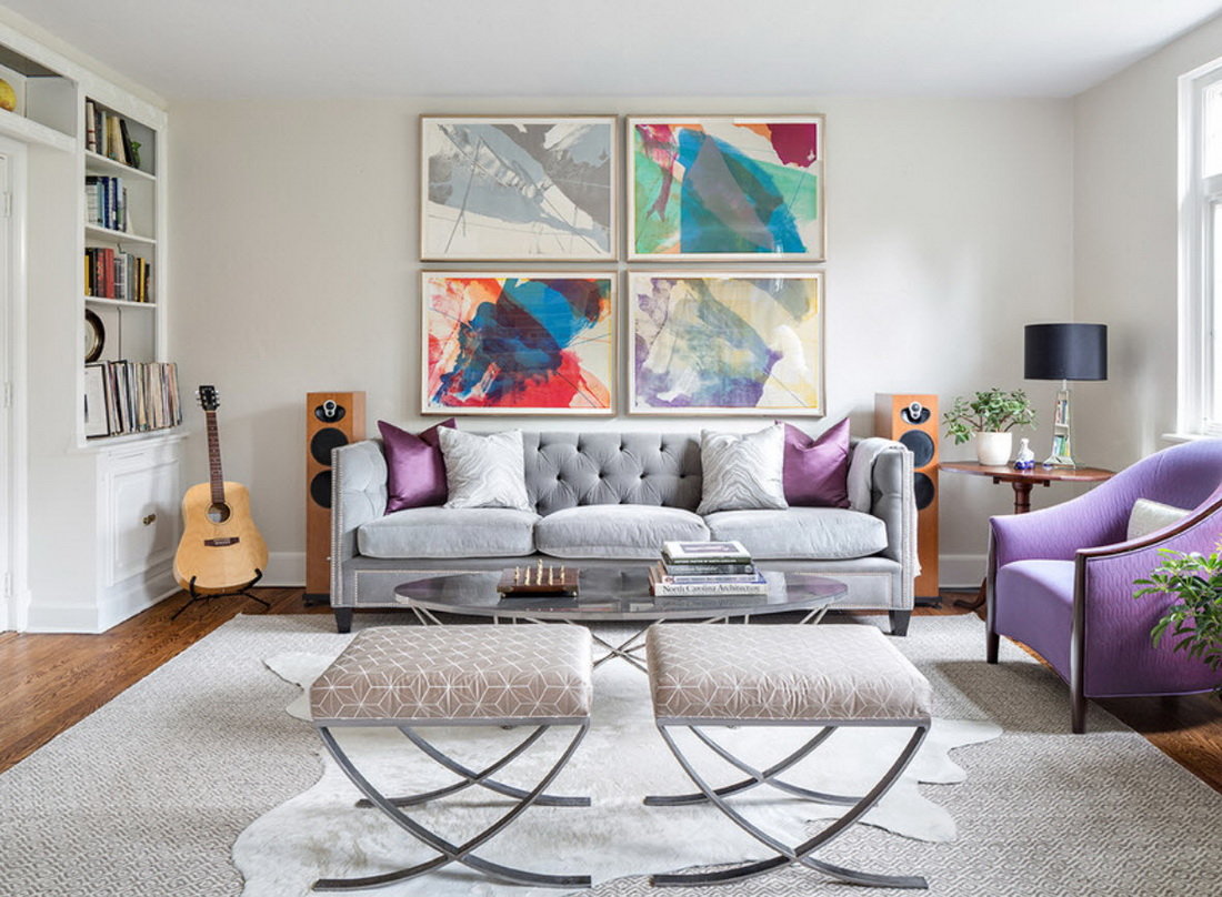
Gray walls provide a wonderful backdrop for colorful furniture.
On the basis of gray furniture, you can create beautiful and bold interiors with a fashionable and functional design.
Gray always looks harmonious and natural, if you learn to correctly combine it. It will give the interior a special chic, which many aspire to.

 Interior
 options for a studio apartment with a bed and a sofa
Interior
Interior options for a studio apartment with a bed and a sofa
 Interior
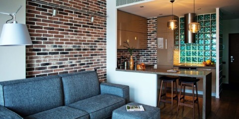
Options for decorating an apartment under a decorative brick
Interior
Options for decorating an apartment under a decorative brick
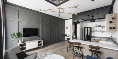
 Interior
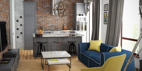
Options for using the loft style in the design of the studios
Interior
Options for using the loft style in the design of the studios
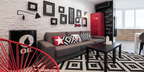 Interior
The use of brickwork in the interior of the apartment
Interior
The use of brickwork in the interior of the apartment
 Interior
Design options for one-room apartments Khrushchev
Interior
Design options for one-room apartments Khrushchev
 Interior
Design and layout of an apartment for a bachelor
Interior
Design and layout of an apartment for a bachelor