 Kitchen
What should be a modern kitchen in 2020
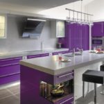
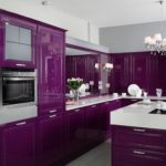
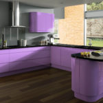
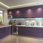
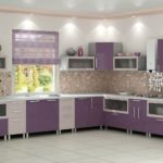
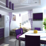
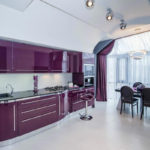
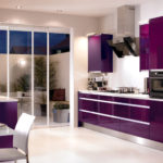
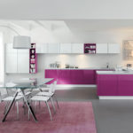
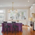
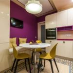
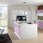
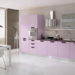
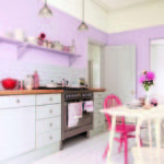
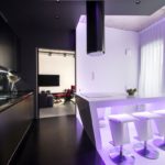
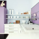
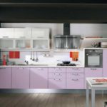
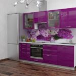
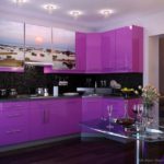
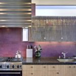
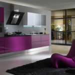
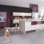
So, we proceed to the arrangement of the kitchen. Today for implementation we chose purple color.
Let us examine this controversial and ardent debate element. Does it fit into the kitchen, what are the nuances of its use, what bears in itself, what is combined with, etc.
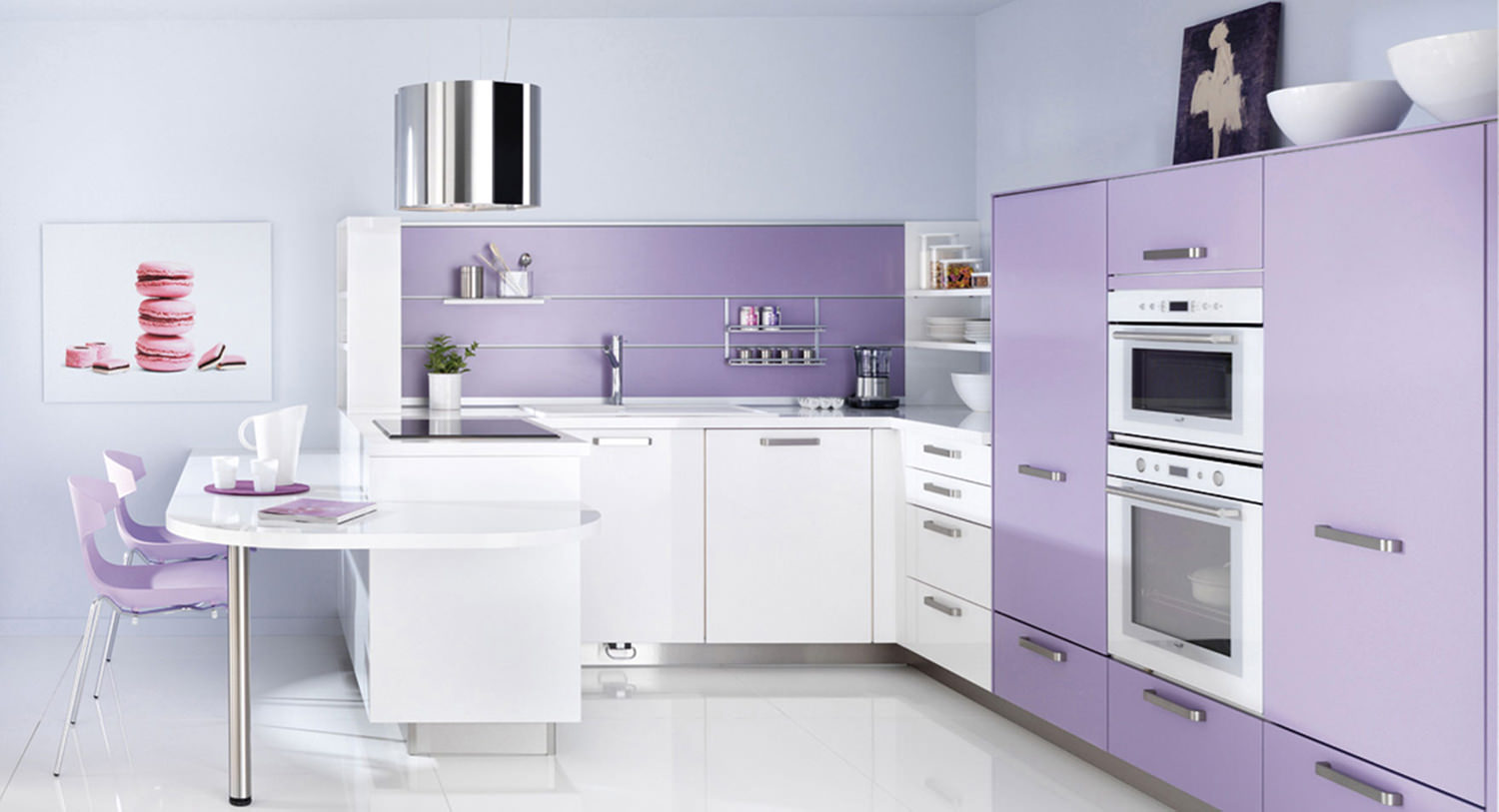
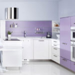
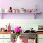
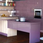
The combination of pale purple will delight you every morning!
Color psychology
Content
Violet is a combination of opposites in every way. Its origins are already a combination of incongruous, because it is based on a mixture of red and blue. Cold and warm, passion and restraint, ice and flame, male and female principles - all these qualities, appearing from the original mix, fit in the proposed color.
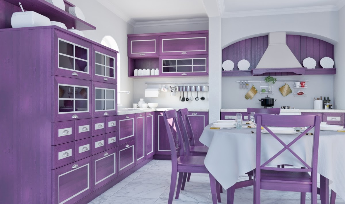
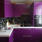
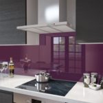
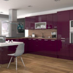
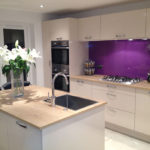
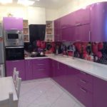
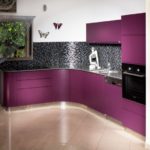
Purple cuisine is a combination of trends and practicality!
Due to the unusual nature of origin, this color is universal. It has a huge range that we can use to create a purple kitchen design. Even when creating color, if you add more red, you get one shade, with notes of passion and energy. If the balance is outweighed by blue, you get a cool and restrained color.

The palette of violet color has different shades (dark, bright, delicate light, pale, diluted with white). Choose what you like best.
So, playing with the creation of purple, you can get pink, fuchsia, violet, purple, eggplant, plum, amethyst, light lilac, etc. Accordingly, the spectrum of the main purple contains all these shades. For this reason, this color has a wide range of psychological designations.
Violet is also restraint, coolness, majesty and power. No wonder this color was once present only in the clothing of noble nobles. At the same time, it symbolizes calm, tranquility, wisdom, enlightenment.
On a note!
In the design of the premises it is not advised to use deep shades of purple.

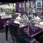
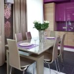
Purple chairs will complement your bright interior.
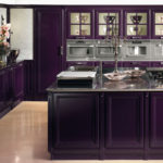
In interior design, it all depends on what effect you want to create. In general, it is recommended to use medium and soft tones, and leave them very saturated for other purposes. It is believed that the deep shades of this color have a depressing effect on the human psyche, and are absolutely not suitable for the kitchen. But, unambiguously, designers have already managed to appreciate the charms of purple, and willingly use it in the arrangement of the kitchen space.
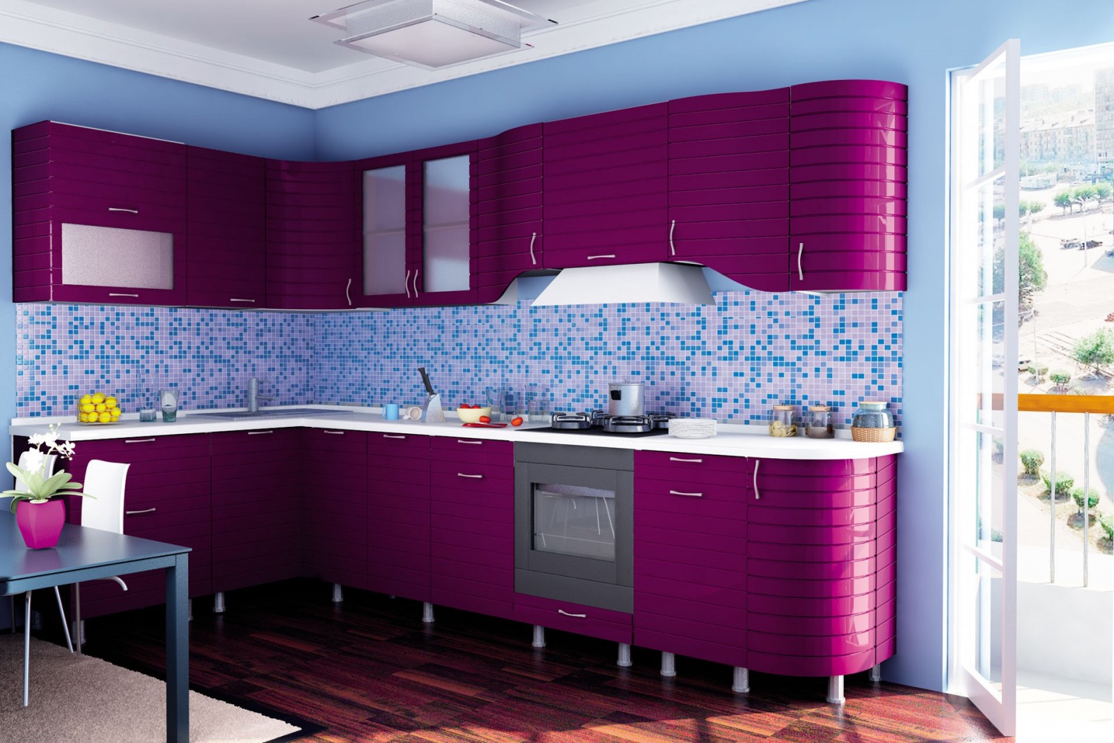
There are a lot of shades of purple, so the choice is great!
Advantages and disadvantages of using in the kitchen
Despite all the advantages and contradictions of purple, many designers believe that it is absolutely not suitable for the kitchen in any way. However, we, along with brave masters, have to break stereotypes, and show that this is quite acceptable, and even a great option for this room. So, in this case we have certain advantages.

The violet color in the interior will allow you to avoid gloom and excessive pomposity!
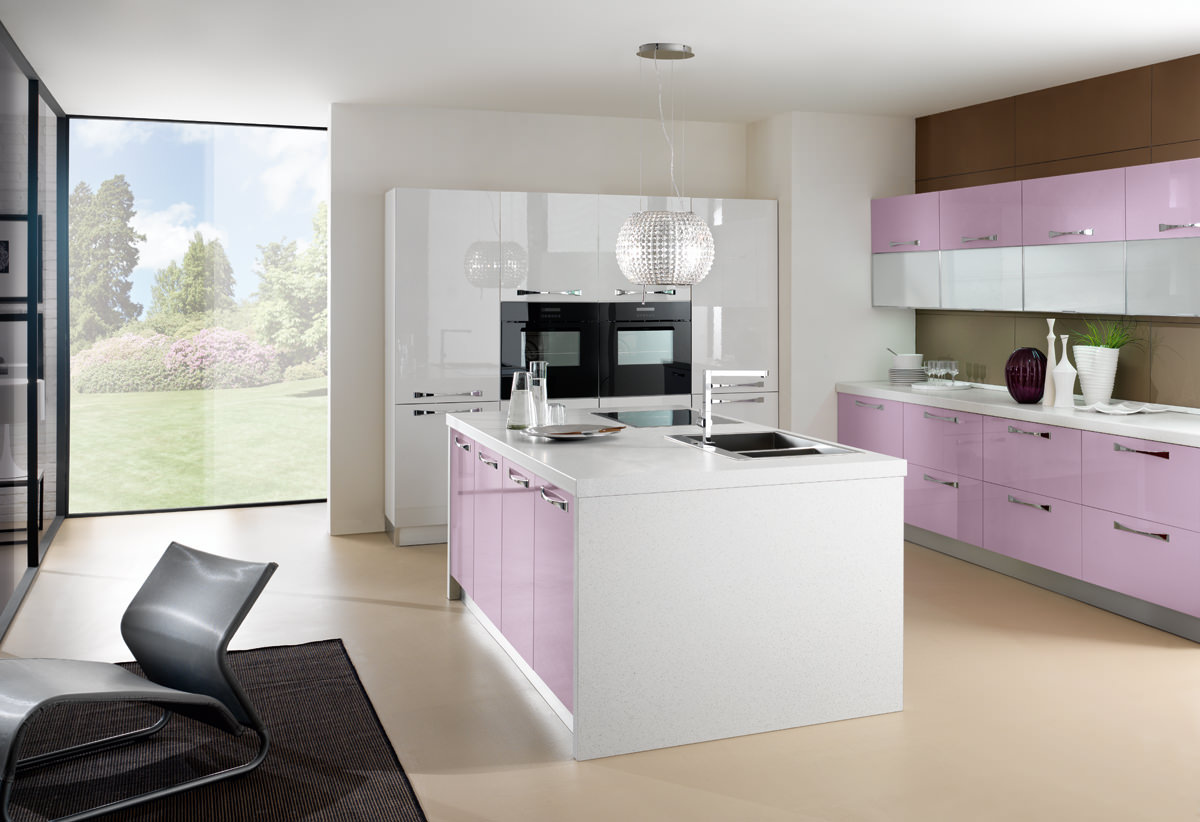
The palette of violet color has different shades (dark, bright, delicate light, pale, diluted with white). Choose what you like best.
Purple:
- not easily soiled, therefore pollution will be less visible on it that is ideally suited for the working kitchen zone;
with a predominance of blue notes reduces appetite, which is perfect for people suffering from constant overeating; - has a special vibrant energy that will help you feel throughout the day in great shape and good mood;
- lighter tones has a calming effect, and will help to quickly restore strength after a hard day;
- It goes well with many other colors, which allows you to create a full-fledged design.
The disadvantages include the difficulty of working with this color. It is multifaceted, contains many shades and values, so there are difficulties with choosing the right notes. Sometimes designers make mistakes when working with this color. But this does not mean that it cannot be used. Our task is to clarify the basic rules and patterns of its use.
| Color implementation option | Basic shade | Combinations |
| Kitchen set | Rich deep options: purple, purple, eggplant | White, beige, golden |
| Textile | Vivid colors from red to blue shades of purple | Black, combinations within the spectrum of violet |
| Walls | Shades close to blue | Beige, milky, blotches of yellow or orange for a contrasting picture |
| Ceiling | Lilac, bright purple, violet | Ceiling is best made plain |
Here's a quick overview of color options for your kitchen. Now we can proceed to a detailed examination.

The palette of violet color has different shades (dark, bright, delicate light, pale, diluted with white). Choose what you like best.
The best combinations
So, let's start with the most profitable combinations, because they form the basis of the interior in our case.
As we already mentioned, you can combine this paint with many colors of the palette. However, this must be done correctly in order to achieve the desired effect, and not the opposite. Consider the best combinations.
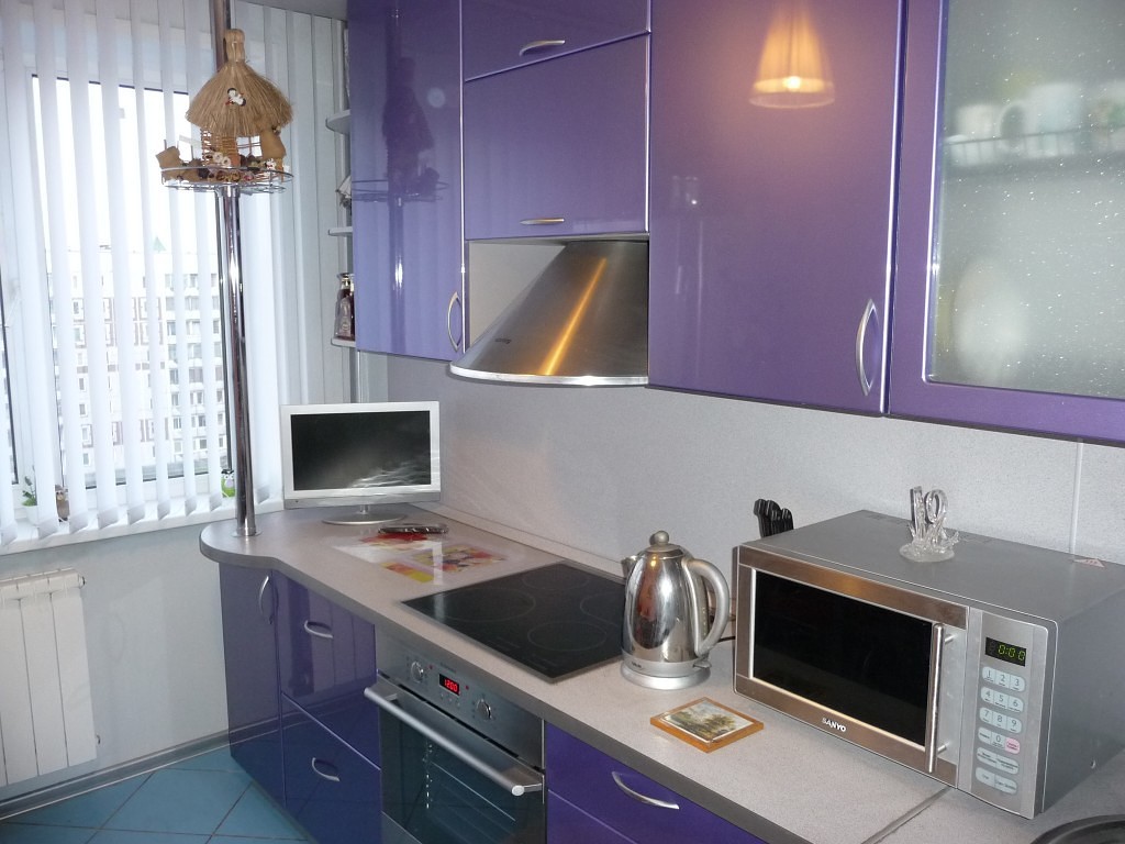
Do not forget that the purple kitchen will be attended by appliances.
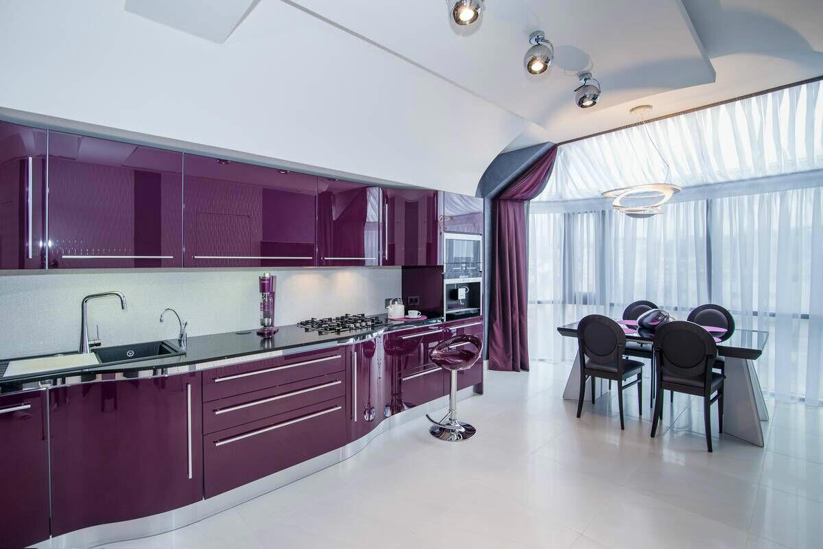
Such a kitchen interior will look great in any room: both in a small and a large one!
Add white
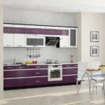
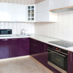
One of the best combinations is with white. With it you can combine both light colors - so you get a delicate, airy and spacious design - and dark ones - in this case you will find an elegant, restrained and contrasting room.
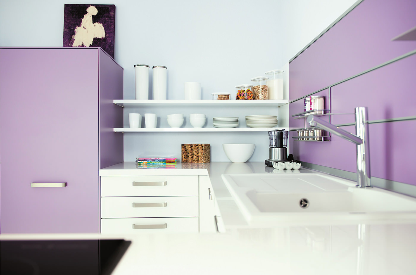
Do not be afraid that your kitchen may get dirty. With modern materials it is almost impossible!
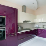
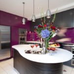
For white, it is recommended to divert the upper tiers of the kitchen: ceiling, cabinets, walls. Also, it will turn out to make beautiful patterns. A two-color kitchen set is perfect, where the lower part will be dark, respectively - purple, and the upper - white.
On a note!
To make the interior softer, use close to white, but not so sharp paints.
Use close to white tones: beige, cream, ivory, etc. They will also create a wonderful pair, and make the kitchen tender, fresh and at the same time majestic.
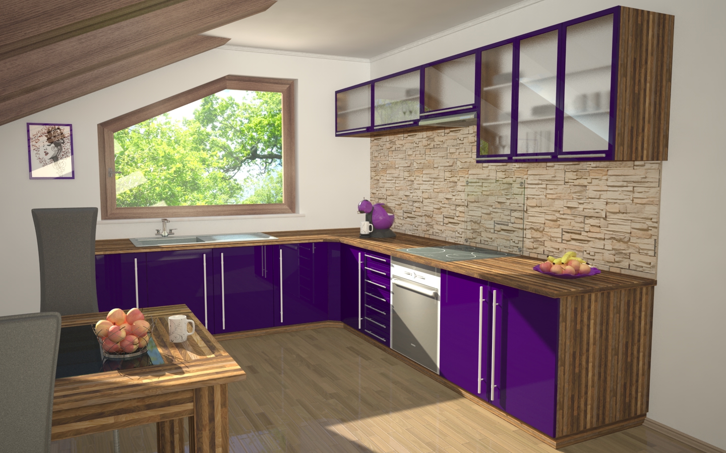
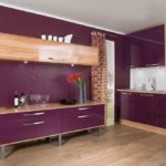
The purple kitchen will look great with wood accents.
Combine with gray
Since gray is a neutral and calm color, it perfectly complements the main one. In this case, it will not be possible to achieve a contrast effect, therefore, as a basis, choose more calm and pale shades of purple. Such a tandem is easiest for visual perception.
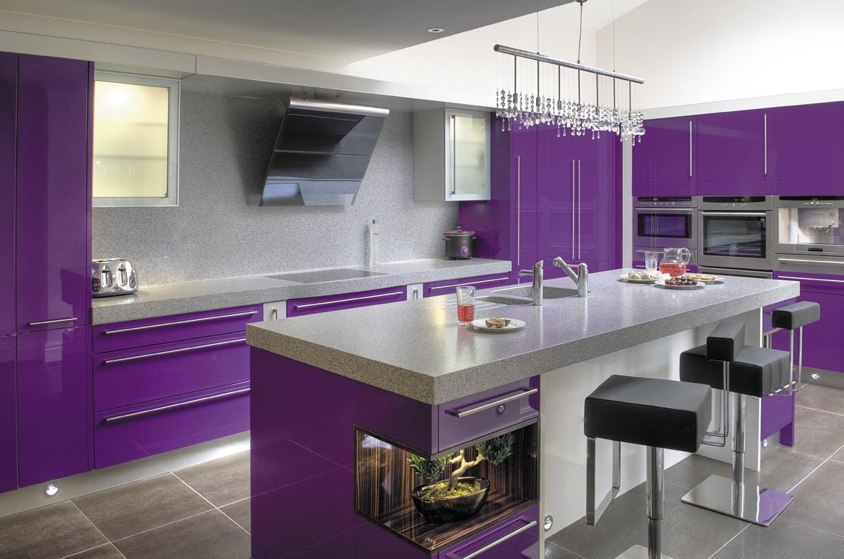
Combinations with gray and black colors will dilute your bright interior!
In such a color scheme you will have a delicate cuisine that embodies calm and tranquility. There will be an atmosphere that is conducive to friendly and sincere conversations, relieves fatigue, and sets you up for a good rest.
Tip!
To dilute the serenity of this combination, add some bright or dark details.
You can implement this combination in glossy and matte versions, add lighter or darker details.But remember that the main emphasis should be on the gray-violet combination.
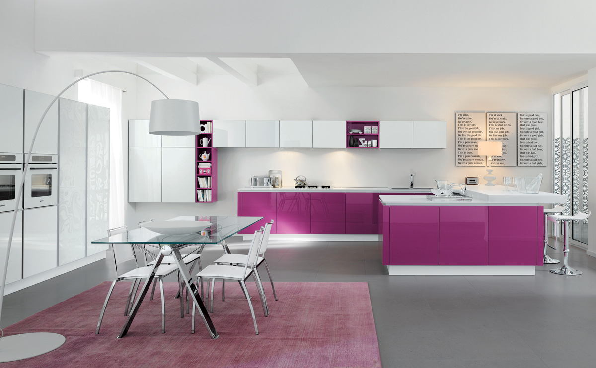
You can order a purple kitchen in a glossy look.
Shade black
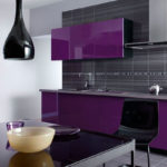
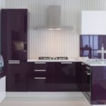
Want to get the standard of elegance and rigor. The combination with black is perfect for this purpose. In this case, it is necessary to maintain the golden mean. If you choose lilac or other light shades, the kitchen will turn out to be pale and boring, if on the contrary - too saturated - you risk making the room too gloomy and heavy.
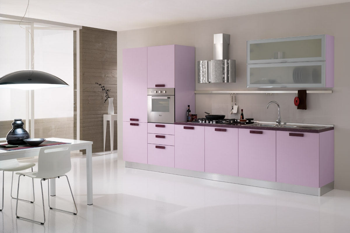
vv cucine 3 The combination of purple, white and steel - the trend of 2018.
For this combination, purple-aubergine, dark purple and others close to these are selected. In order not to have a severe effect, the combination is diluted with gray or light pastel colors, selling them in accessories or textiles.
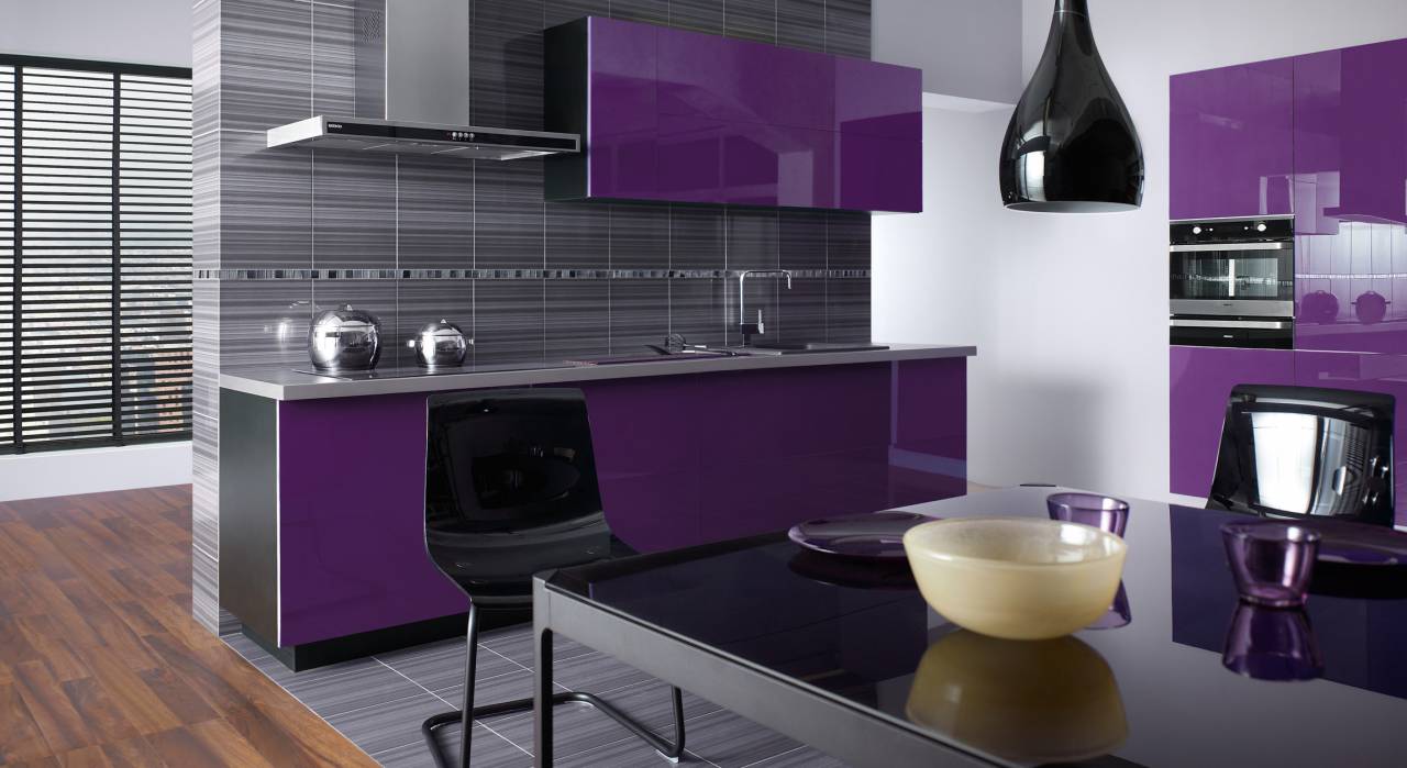
Such a rich purple color can be combined with other colors!
Add a little gold
Purple and gold are very good friends. Such a tandem will bring notes of nobility and austerity to the room. Strict furniture of the correct geometric shape should complement it.
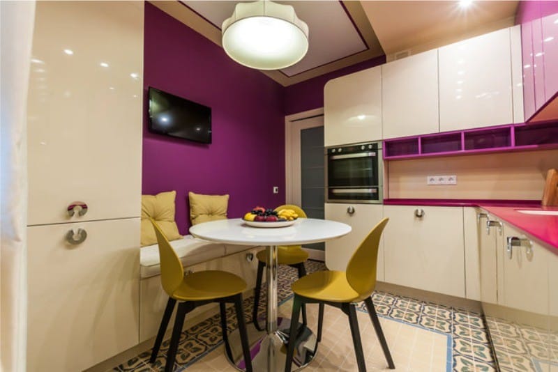
A yellow and gold hue will add purple to the kitchen!
Gold is quite specific, so it is displayed in detail. Suitable for furniture handles, textile elements, photo frames, vases, etc.
Another close to gold is yellow. It is the opposite of violet, meanwhile it makes a perfect pair. Such a bright, rich and contrasting tandem will make the kitchen festive and energetic. But here you need to be careful not to get too sharp, cutting the eye effect.
Advice!
To get a harmonious rather than hard design, use yellow or gold in small details.
To achieve the same bright and contrasting effect, think about a combination with green, orange, red, blue.
Purple in the decoration of the kitchen
So, we admired the best combinations. Now we turn to the arrangement, and consider how to implement our main character in the interior of the kitchen. After all, not all surfaces can take this color. And for some it will look just not profitable. Most often, purple finds its application in furniture, textiles and walls.
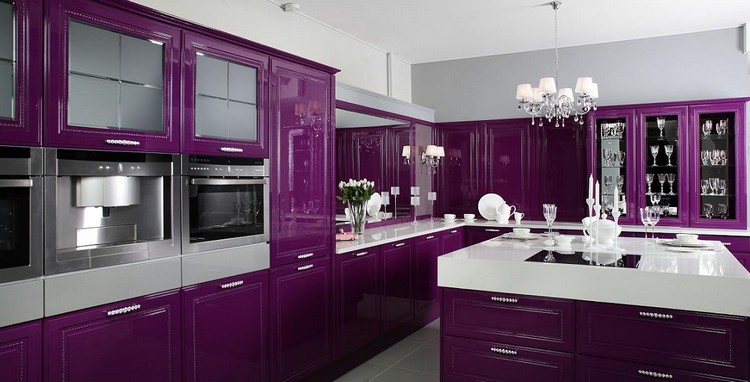
Also purple will look great in large professional kitchens!
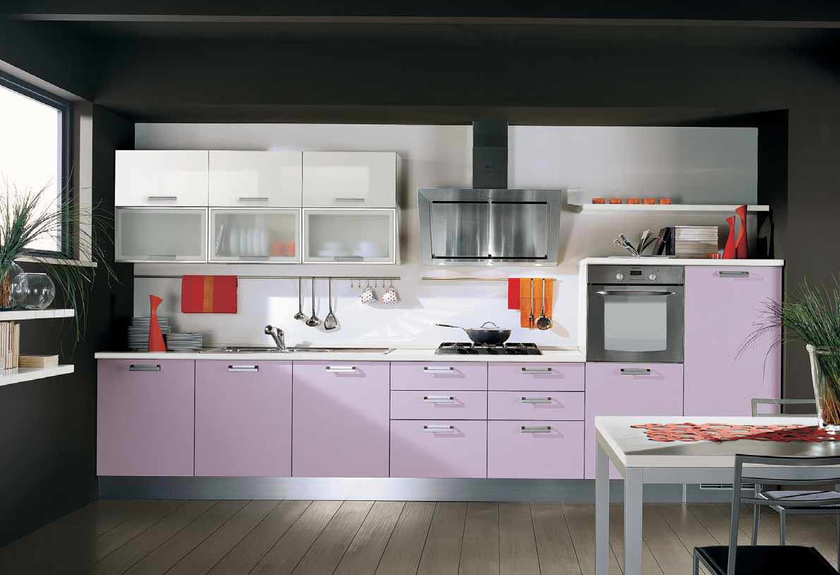
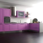
A bright purple kitchen creates the effect of a large room.
Furniture
It opens up a lot of space for creativity. You can independently come up with a furniture project and order its manufacture, but also in the modern market you will find no less interesting proposals.
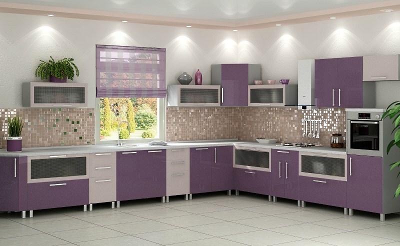
The purple kitchen is a great choice!
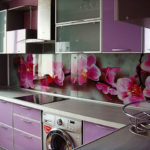
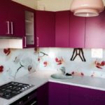
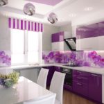
Often this color is selected for the kitchen set, which is made plain, two-tone or with a purple ornament. Widespread floral themes. The large-format image of orchids, lilies, roses or lilacs is an excellent implementation of this color in the interior of the kitchen.
Sometimes you can find purple chairs or a table. But this furniture is best made of wood, and the color, accordingly, left natural. Moreover, brown goes well with our base, adding comfort and warmth to the room.
Textile
This is the easiest and most complicated way to implement it. Often such details as napkins, kitchen towels or curtains are made in an additional color, leaving large parts for the main one.
This method is best if you use the whole spectrum of violet in one idea. Then you can choose the main color and focus on it. And in the additional quality, pick up purple, pinkish shades, or blue, and apply them to textiles.
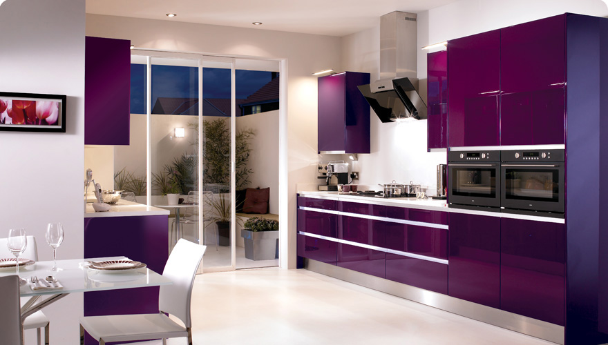
Do not forget about textiles, it can also be added to the interior.
Light curtains of light lilac color will look great in the kitchen. They will add freshness and spaciousness. For napkins and pillows can be appropriate dark colors. You can play with color in different ways.Most importantly, remember that a secondary plan is assigned to textiles.
Walls
Another fairly common embodiment. For this purpose, it is better to choose the bright colors of the spectrum so as not to overload the room with a gloomy mood. The walls are also characterized by the presence of floral print. But the patterns here are not recommended for use, as they make the room heavier.
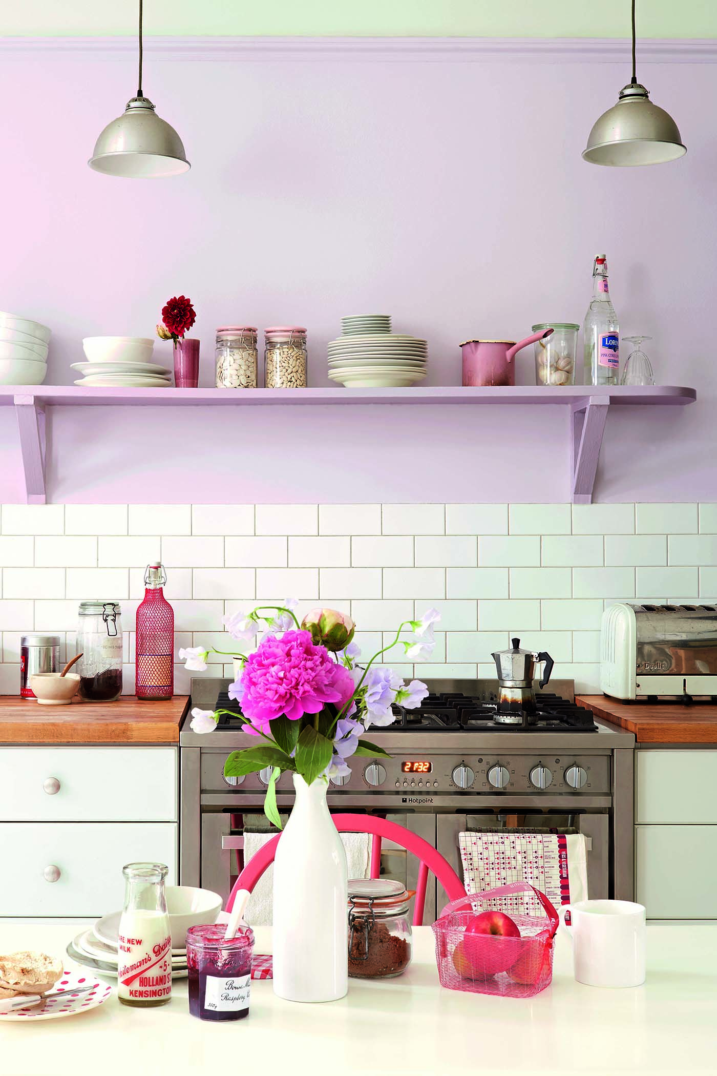
The violet color in the interior will allow you to avoid gloom and excessive pomposity!
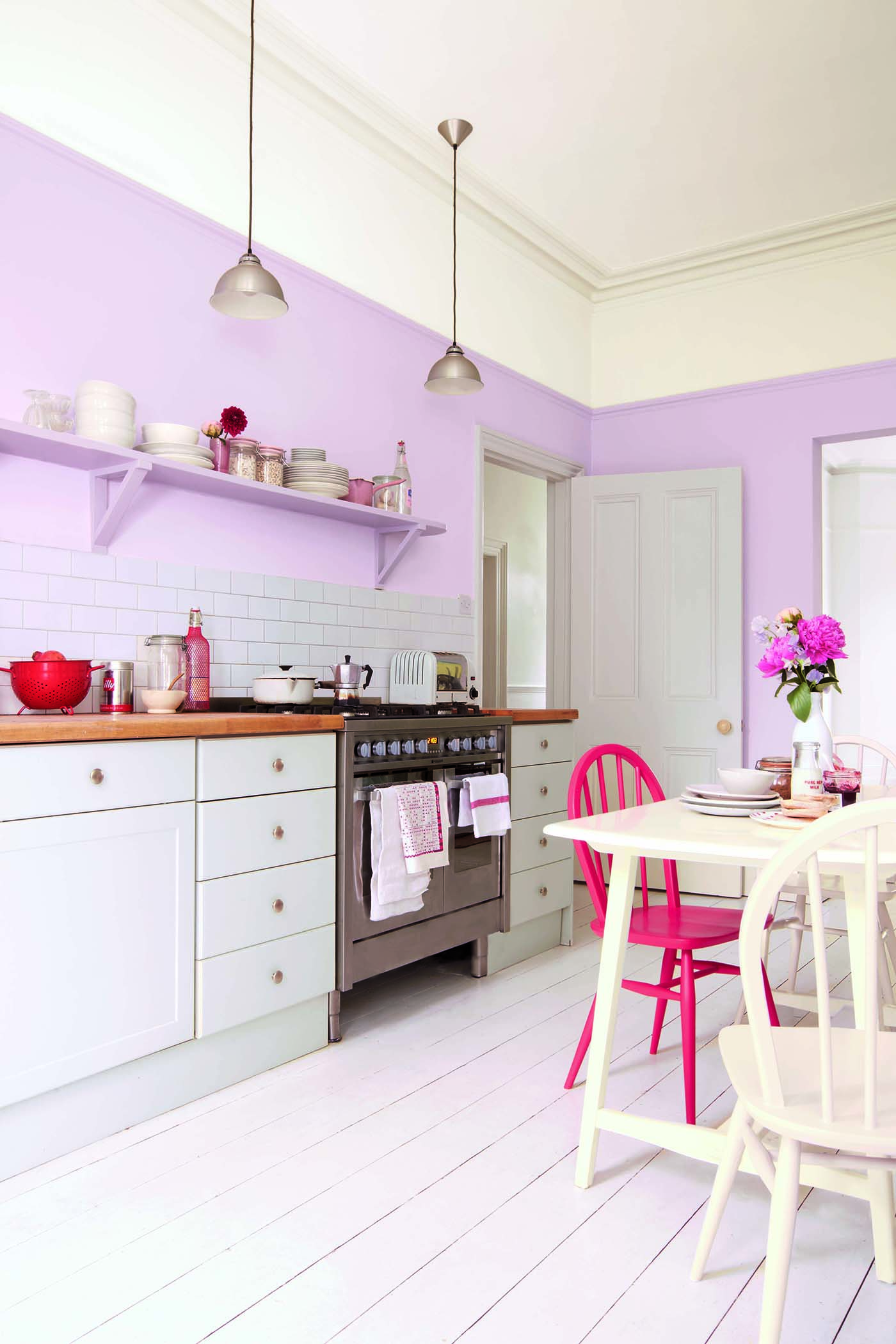
Do not be afraid to dilute the purple kitchen with other colors.
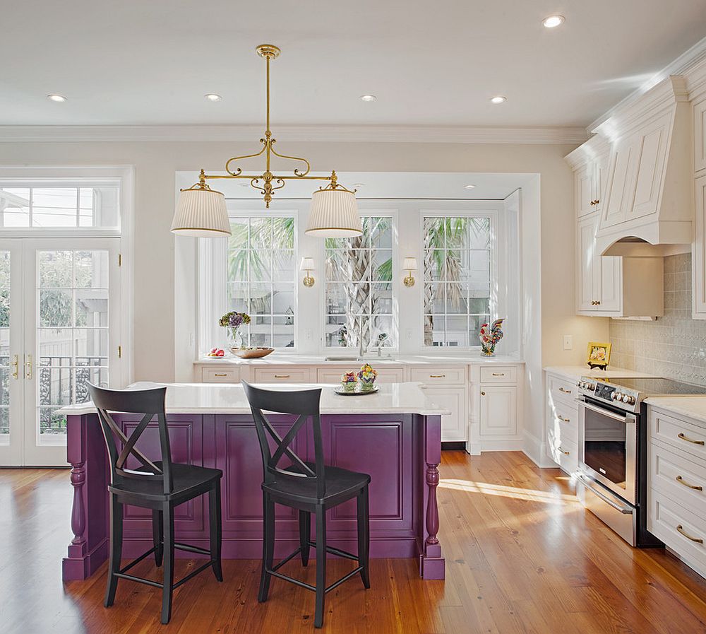
You can even order a purple bar cabinet!
But if you want to add dark details to the walls, you can do it. But in small quantities. For emphasis, use the technique of highlighting. Make one wall plain in a dark purple tone. In this way, a work or dining area can be visually separated.
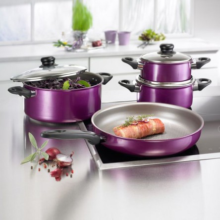
Purple kitchen utensils will be a great addition!
So, we figured out that the purple color in the interior of the kitchen looks great when implementing any ideas. Do not be afraid of it and experiment. The main thing to remember about the rule of the golden mean and harmony.
VIDEO: Kitchen interior in purple hues!
