homeKitchenWhat color of kitchen to choose - popular combinations
What color of kitchen to choose - popular combinations
The requirements for color combinations of kitchens are quite simple and do not differ much from the requirements for the design of other rooms. In one kitchen, designers do not recommend combining more than three colors.
A successful kitchen interior is largely dependent on a thoughtful color scheme
Lockers need special attention. Although lockers are most often made plain, without color transitions, according to the laws of design, a smooth color transition from a dark “bottom” to a light “top” is needed. For example, the cabinet is white at the top and light gray at the base. This rule especially applies to kitchens consisting of two colors.
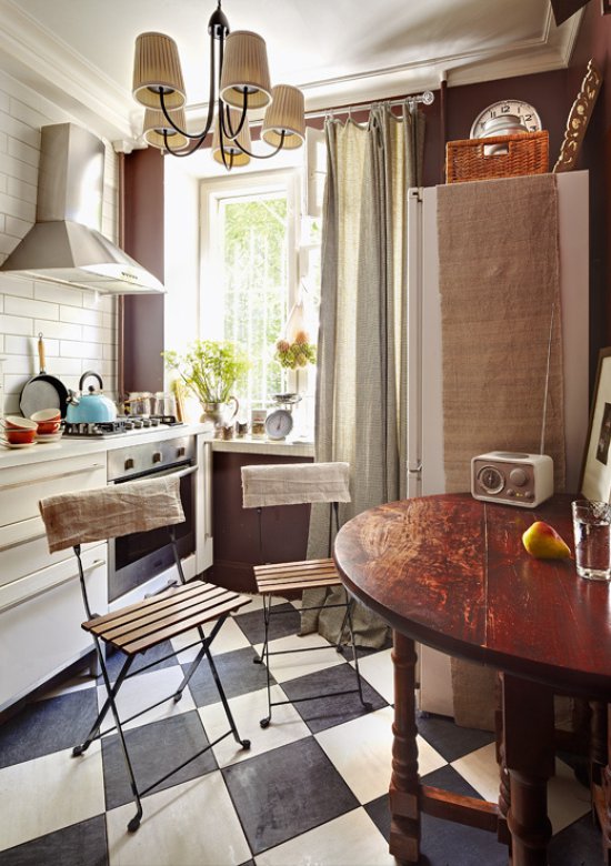
In this case, a dark shade should occupy a smaller part of the kitchen space
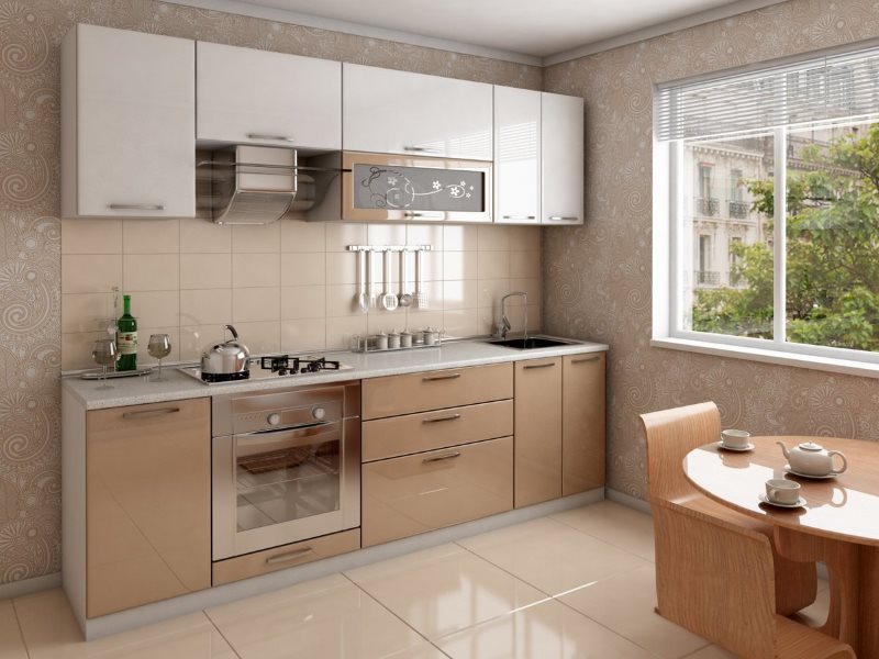
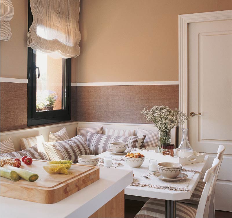
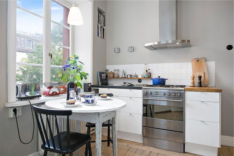
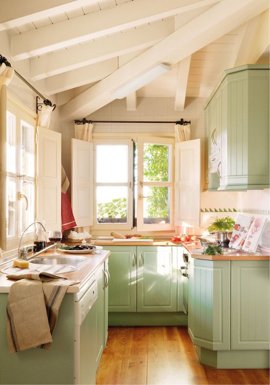
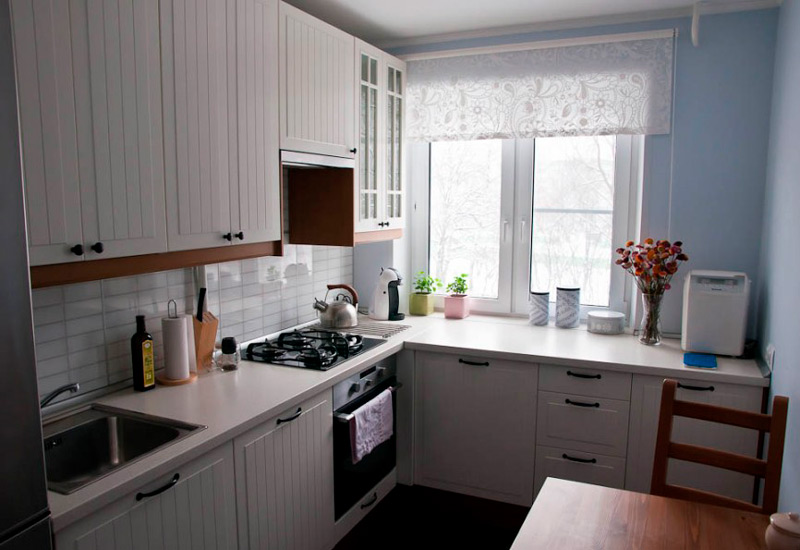
A small room for cooking can be plain, in which case it is better to choose some pastel shade for its design. For example, beige, complemented by individual small bright accessories. You can also choose brown, plum-colored kitchens, photos of which are presented on the site.
It is also worth considering such an interesting fact: in a two-color room, one color should prevail, and the second should simply complement it.
The kitchen background is created on the largest surfaces - floor, walls and furniture. It is their colors that are primary
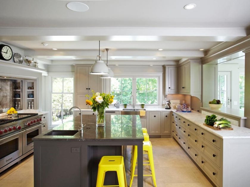
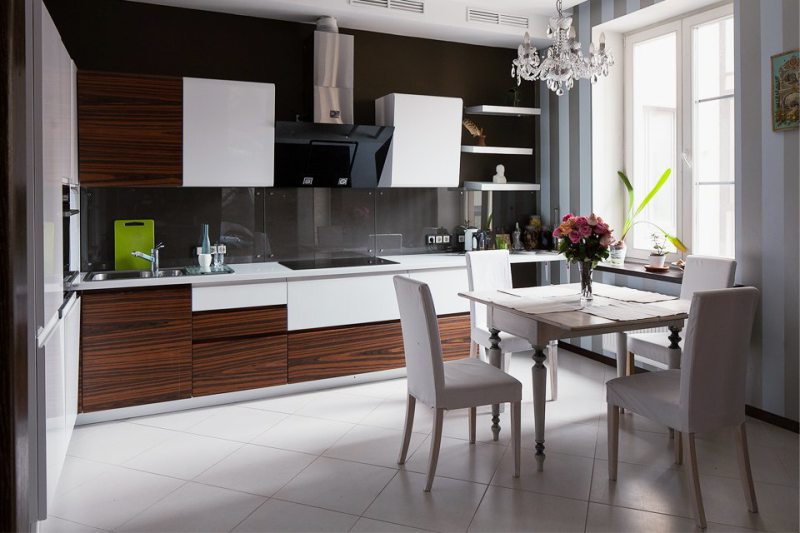
Since most of the dining room space is occupied by furniture, they primarily pay attention to the color of the furniture. But if the cabinets and tables are bright, saturated colors, then the walls are painted in soothing colors. It is worth choosing combinations of furniture and walls, using the usual achromatic circle, which artists use when painting. They know that bright yellow does not complement violet and blue, so a bright yellow table will look inappropriate against the background of a purple wall. And warm-beige or light green will perfectly complement the sunny set, it will ultimately be harmonious and “finished."
Important! Colors should be in harmony with each other.
The harmony of the color palette allows you to create an unusually beautiful and original kitchen interior
How to choose a kitchen set by color to look harmonious
The most important thing is to feel comfortable with the colors that surround you. If a person does not like any design decision, a fashionable color, he should not torment himself, and adapt to the standards.
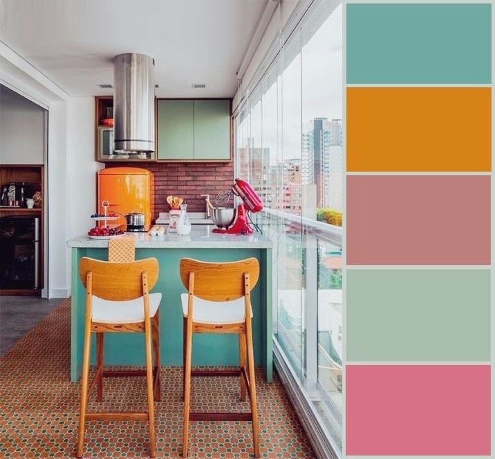
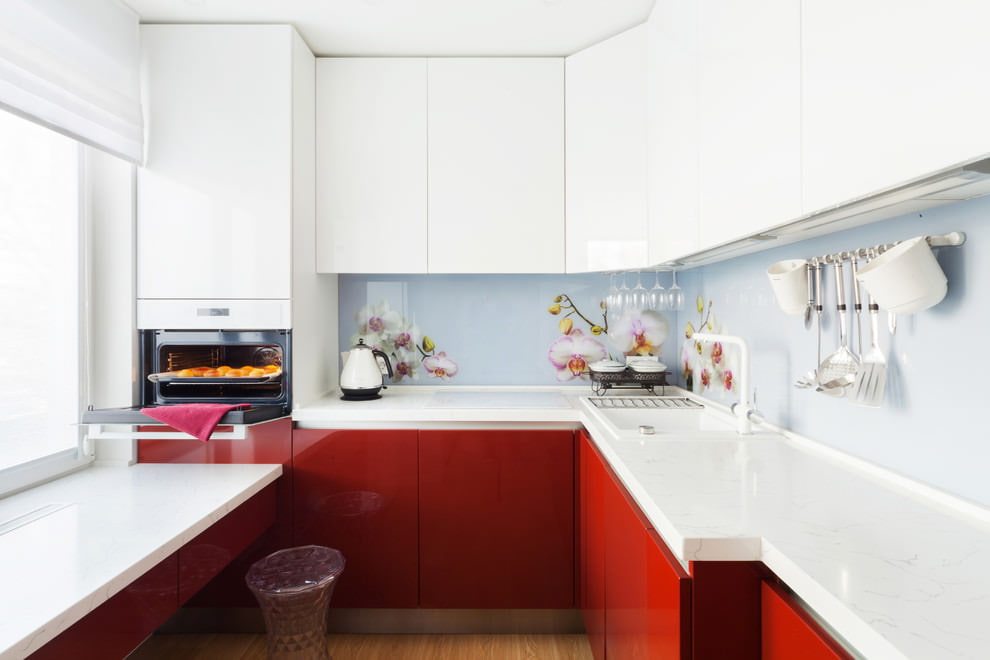
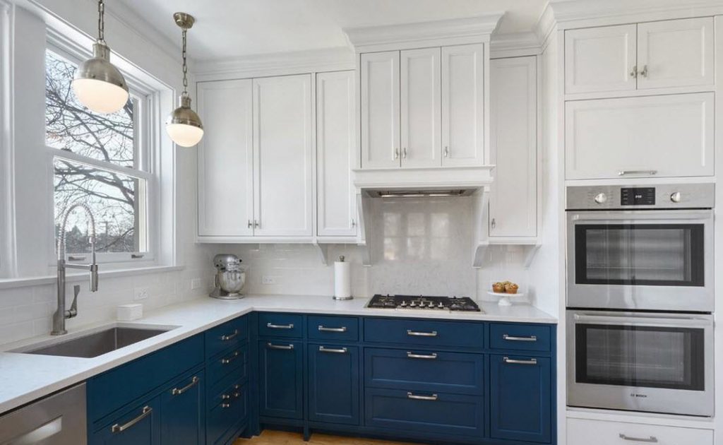
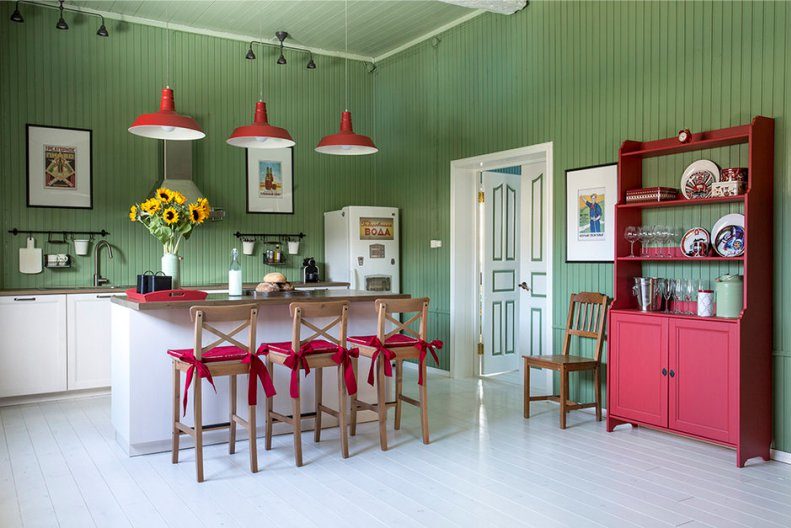
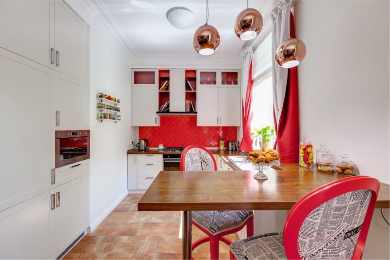
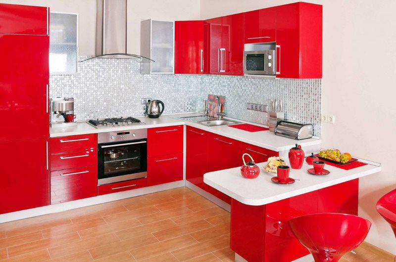
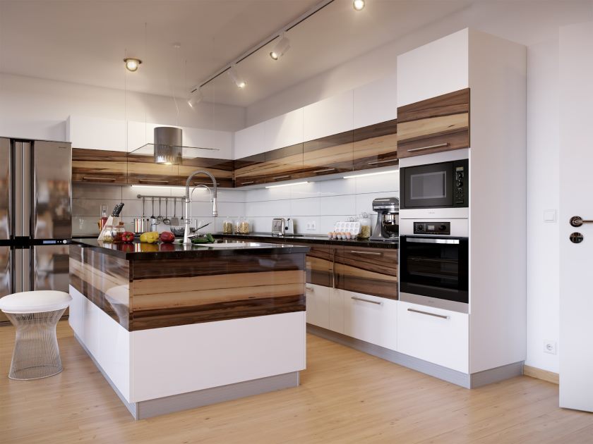
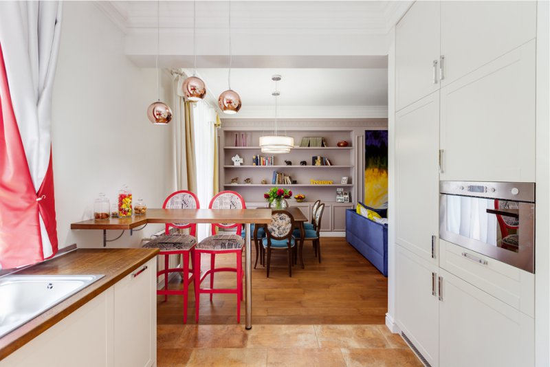
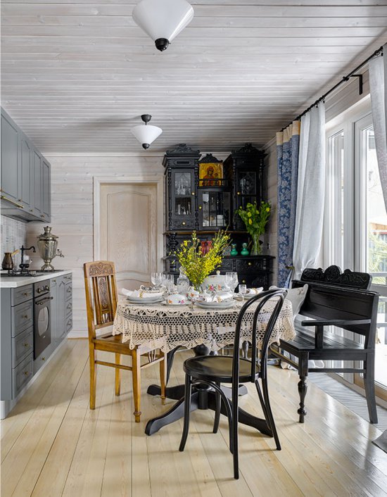
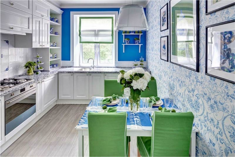
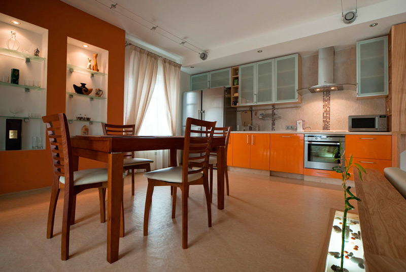
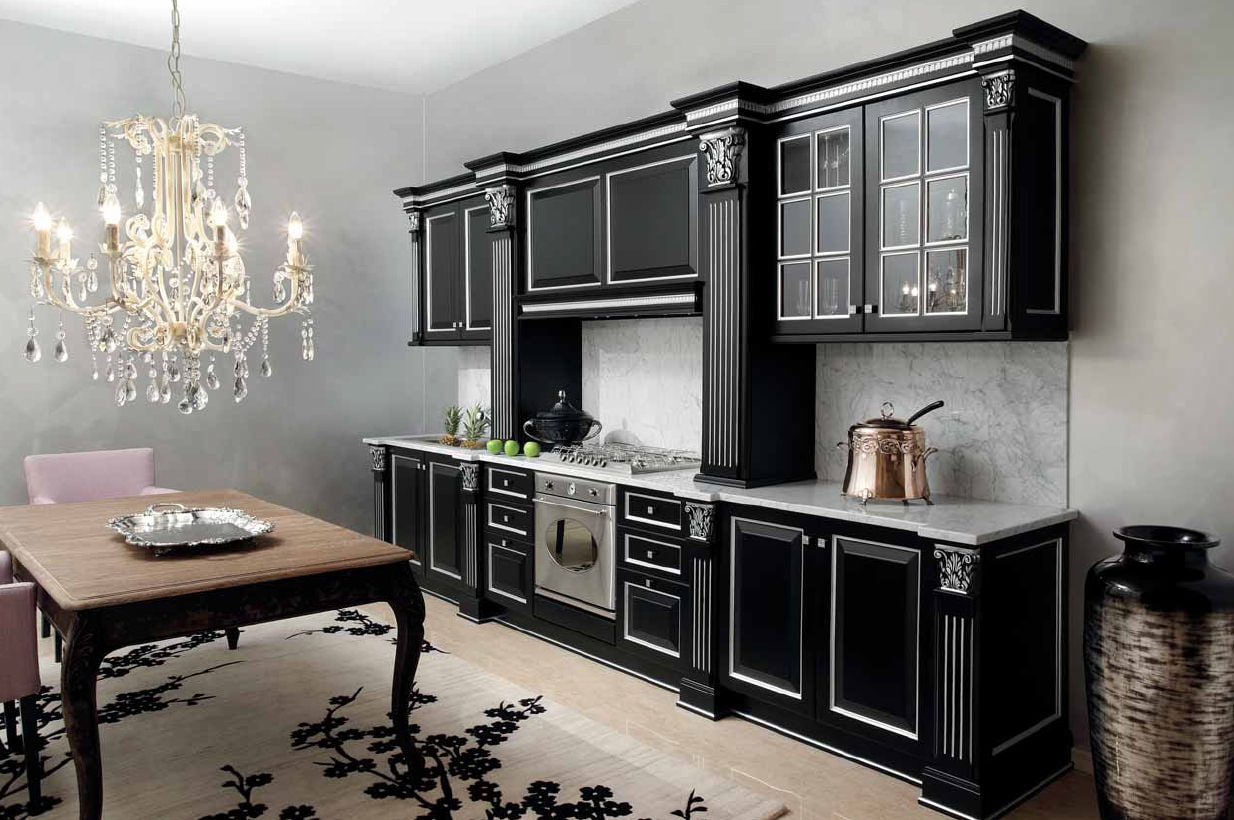
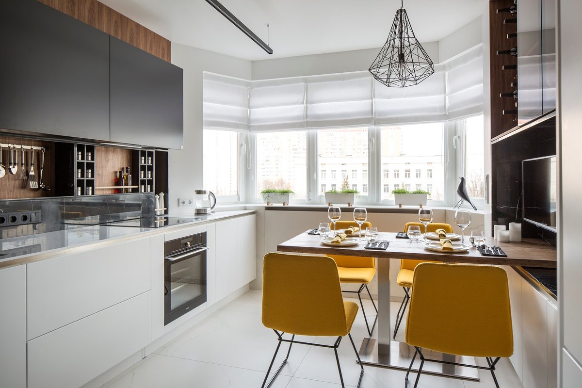
You can consider such combinations and focus on them, coming up with a design: a black cabinet and light cream (or pink) walls, a red suite and gray walls, orange walls and dark kitchen furniture, gray walls and red furniture, a red suite against white walls, a combination of green and yellow. The latter option looks very chic, tunes to positive, suitable for Russian climatic conditions with gray rains. A combination of red and white is also a very beautiful color combination, which makes the interior dynamic and contrasting.
Red color in large doses presses and irritates, in a small amount - it warms and stimulates appetite
It should be noted! Dark-colored headsets are not bought into the “small-sized” kitchen. The walls of the small room for eating should be painted in positive, bright colors. For example, in light green, yellow.
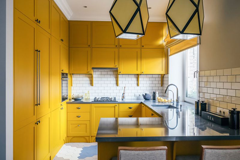
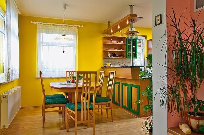
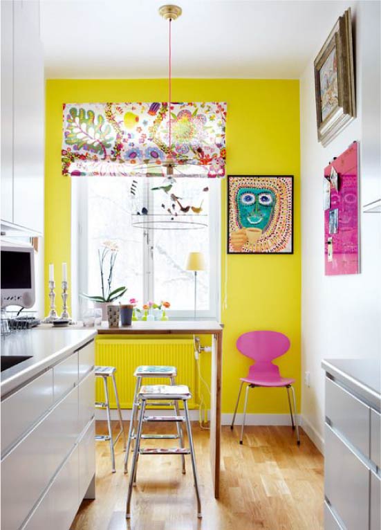
Yellow is especially indicated for northern and dark kitchens, where it can replace sunlight.
In a spacious room, light tones are acceptable, but they must be diluted with bright, saturated colors. For example, dishes, paintings. But dark gray bulky furniture can make even a large room a little gloomy.
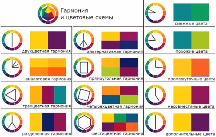
Rules for combining colors in the interior
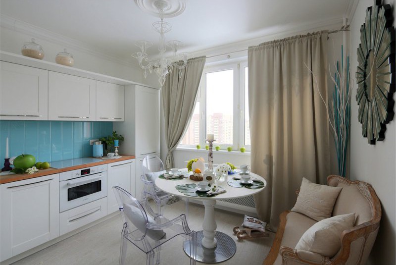
Light, milky tones look good with all other shades, especially spectacular with red, blue.
A blue and white combination is an excellent solution for a modern kitchen with sufficient lighting
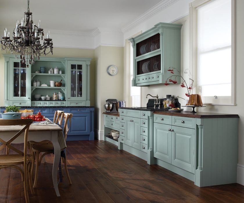
Beige color effectively complements calm, cool shades: gray, azure, blue. Many shades of beige harmonize well with brown, creating a combined coffee and milk highlight.
Milk coffee shade in the interior of the kitchen is often used along with gloss.
Gray color is combined with all shades of neutral or cool range: with pink, cream, lilac, blue. However, do not combine gray with too cold a color so that the room does not seem gloomy.
Light gray color is practical and versatile, ideal for both the walls of the kitchen and for the headset
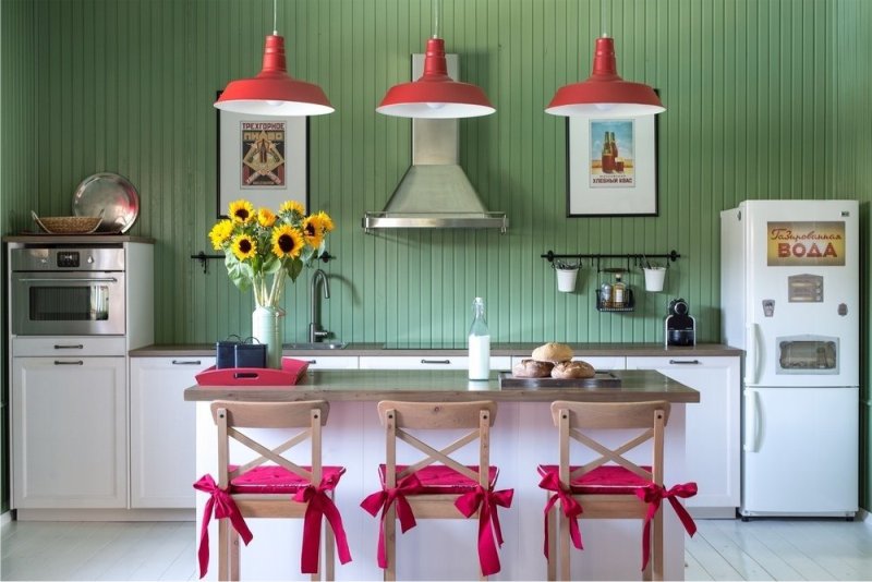
Pink shades complement neutral colors, as well as warm or calm cool. For example, gray, snow-white, brown-beige, olive, lime.
The pink-green combination sets in a positive mood, which is appropriate for breakfast before leaving for work
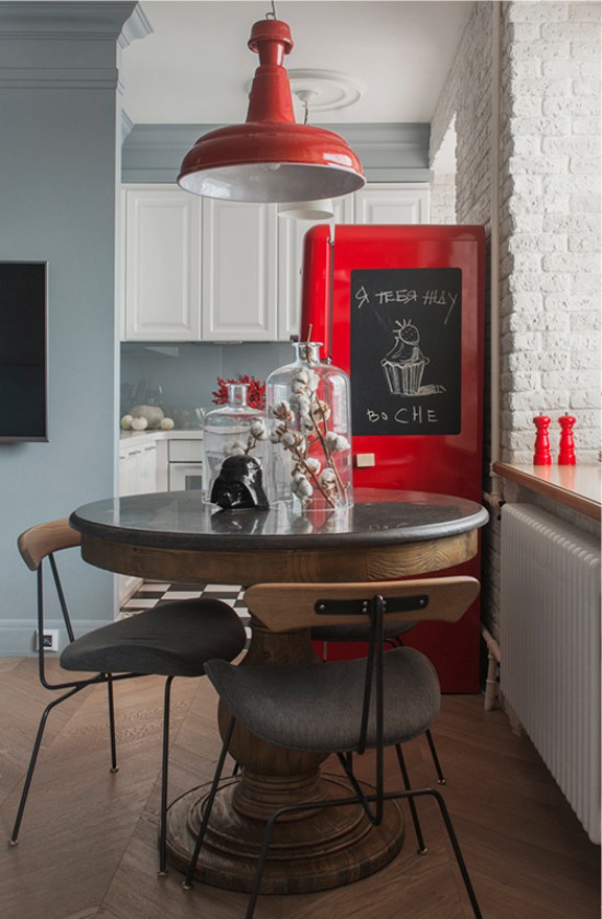
Red can be supplemented with gray, white, black, green (rather bright, picturesque contrast), yellow. Avoid bright yellow so as not to strain the psyche, and give preference to light yellow).
Aggressiveness of red color is easily neutralized by a white background
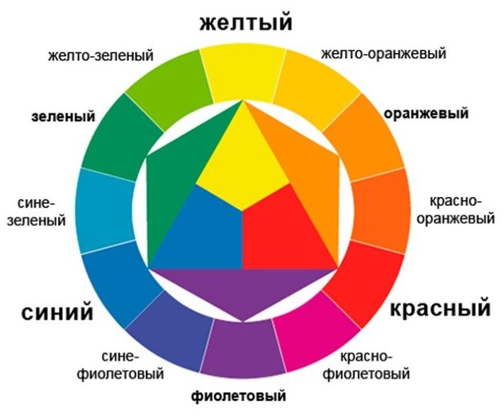
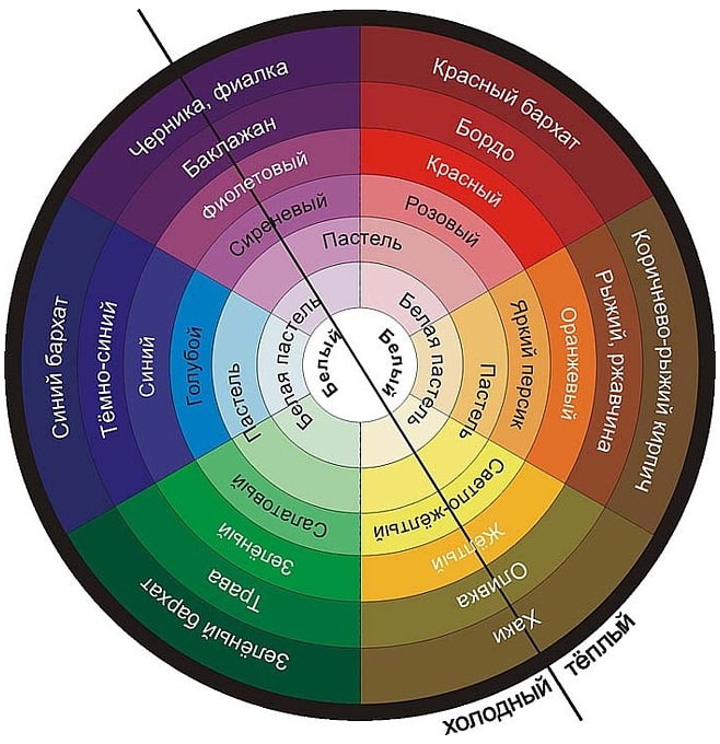
What is the color wheel and why is it needed
The color wheel, a professional tool for designers, can be used by everyone by downloading a picture on the Internet. It consists of 12 colors (sometimes they are complemented by many shades).
A color wheel is a spectrum of all colors, designed as a circle
The color wheel is drawn so that the opposite colors (which are called antagonists) are placed in it opposite each other, and related colors are nearby. Antagonists create a noticeable contrast in the interior, but two opposite colors (for example, red and blue) do not get along well with each other. They are needed to emphasize the brightness of each other. You can combine red with pastel (for a special effect - a glossy kitchen), blue, but a combination of bright red and blue will unnerve many people.
When creating the interior of the kitchen, various color combinations are used
Related colors can be freely combined, since one color, for example, yellow, is a continuation of its related, orange, these two colors will create a smooth, playing tandem in the kitchen. Using a floral, bright circle, you can choose the most optimal combination.
Color scheme for the kitchen: choose the best
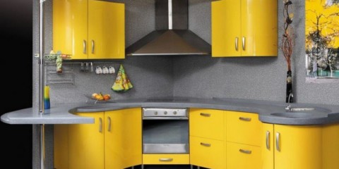
In the kitchen, a person spends enough time, so the color of this room should fill it with strength. Dynamic, cheerful and most demanded can be called light yellow, white, red shades.
Yellow headset or wall. Light, bright cheerful yellow fills with energy, gives a feeling of celebration. I want to look at the light yellow room for a long time.
Yellow color invigorates and warms, any food on such a background seems appetizing
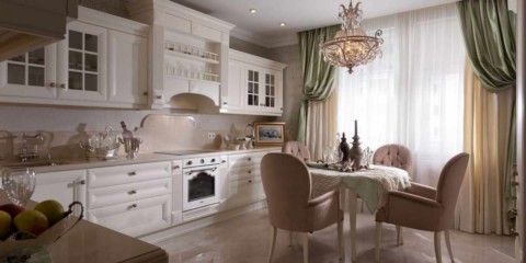
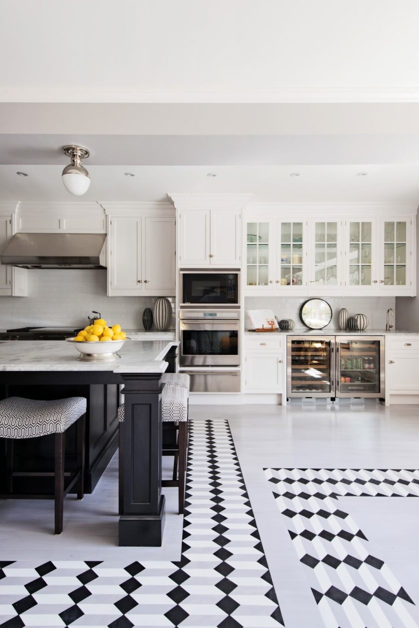
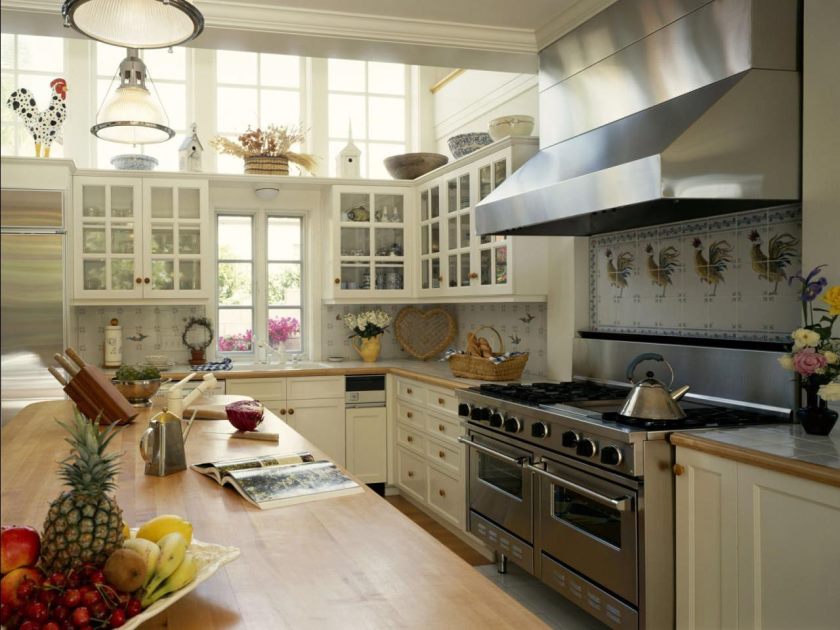
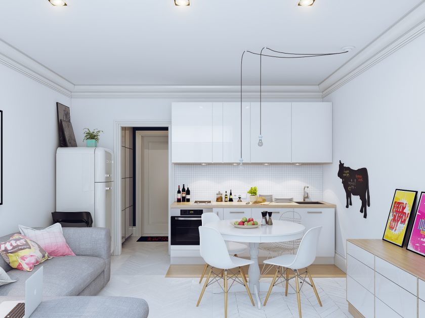
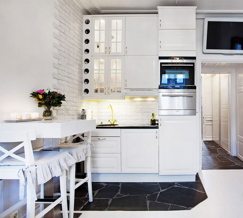
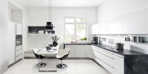
White headset or wall. White is good first of all because you can buy things of any color to it. It is an excellent background for the embodiment of any artistic ideas.
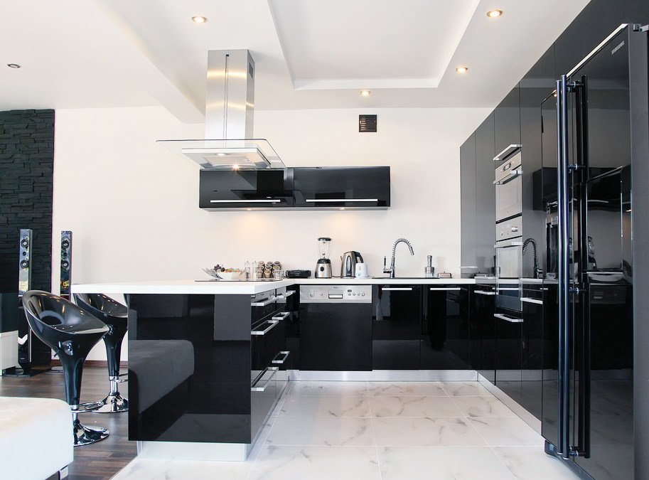
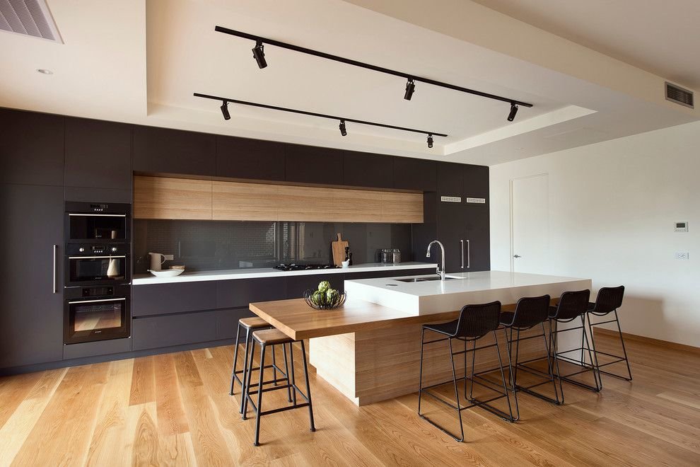
Against the background of white walls, dark furniture looks spectacular, this technique is often used in minimalism and hi-tech
Red headset or wall. You need to get used to such an extreme solution, but it will have a good effect on the vivacity, mood of a person living in the kitchen. In the morning, such a kitchen will help to wake up no worse than a cup of strong coffee.
The red facades are impressive, but not everyone will like an excessively bright interior
Warm and cold colors and their impact on humans
Different shades can cause different emotions in a person. The experiments of the designers of the 60s and 70s, when they used only bright colors in the interior, showed that too much bright color makes the interior aggressive and tiring. You should also not overdo it, creating a clean, warm or, conversely, very cold interior.
The whole color circle is divided into warm and cold shades.
The combination of bright red and bright yellow will create an aggressive mood, and a combination of gray and purple can cause a depressed mood. The same problem can arise in a person if, when arranging a kitchen, he will combine cool pink (turning into lilac) and purple shades. But peach, warm pink, combined with turquoise will create a cheerful atmosphere that is safe for the psyche. Such a color of the kitchen, a combination of colors, a photo of a recreation area pleases a person for a long time.
Warm shades stimulate appetite, while cold shades, on the contrary, reduce the desire to eat
Cold shades must be used in the interior of the kitchen, if its windows are oriental. This will create a calm, relaxed, but not sleepy environment.
Colors of kitchen sets depending on the style of the kitchen
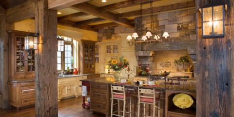
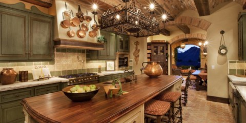
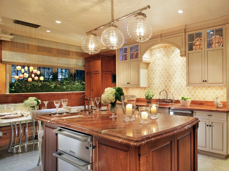
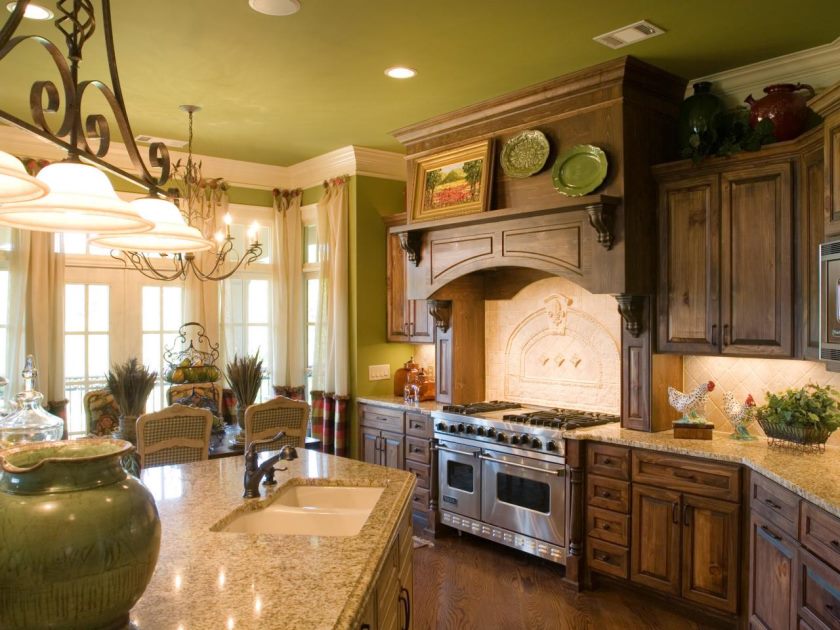
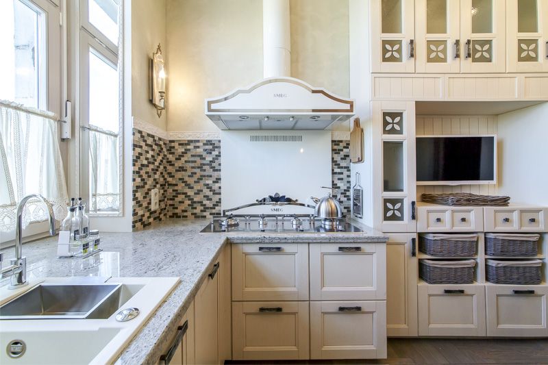
Usually stores offer furniture, the color of which is great for her style. But when arranging your favorite vacation spot (or work), a person wants to take into account every little thing. He will be interested to know that brown, milk, beige, yellow and red color looks better in the kitchen of a classic style, turquoise, gray, blue will suit a dynamic high-tech room, all pastel, green and gray shades will look good in the kitchen, whose interior is in the style of art deco.
Classic kitchen interior with brown furniture
Minimalist modern kitchen in black and white.
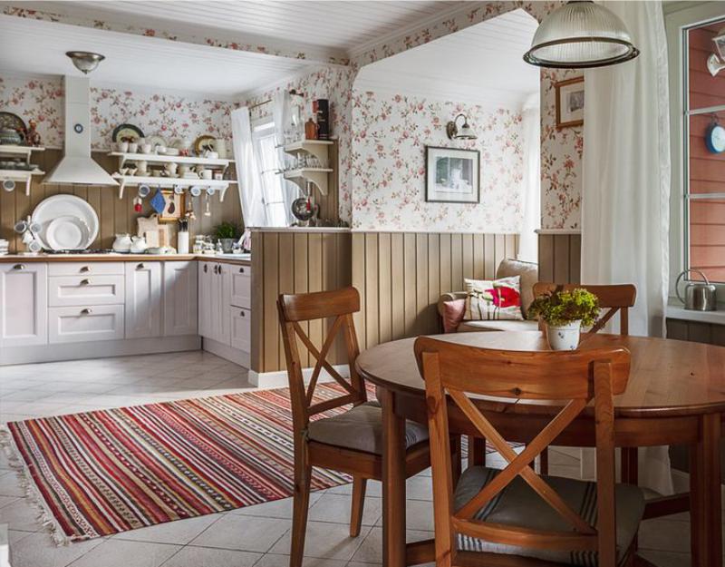
Modern styles of dining rooms are often not full-fledged areas in art, but a combination of several directions. Therefore, do not fanatically select furniture and accessories, make the color scheme of the kitchen monotonous. On the contrary, if the “Provence” is slightly diluted with high-tech accessories, it will not go bad, but will play.
Options from which you can build on when choosing a color for the kitchen
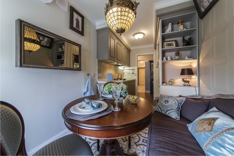
Most often, the landlord first acquires a headset, and then paints the walls, selects accessories, buys curtains. The fact is that furniture costs more than paint or curtains, so a person, first of all, focuses on it, choosing more or less successful sets for the price and beauty. However, if the decoration of the lounge or lunch room is exclusive, then some may focus on it.
The starting point for planning the color palette of the kitchen space can be furniture or wall decoration
Building on wall decoration
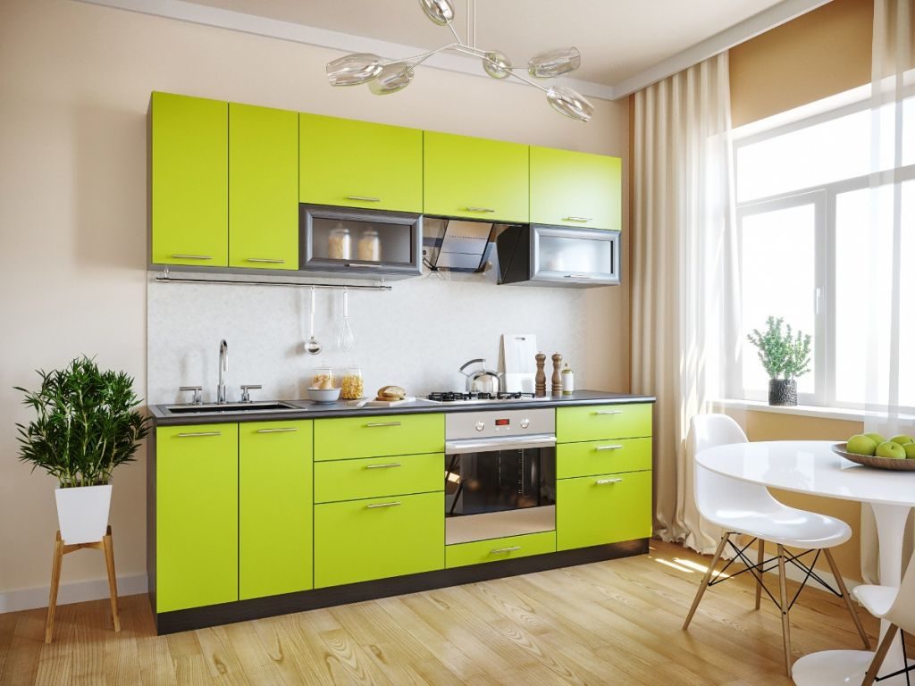
Even the most beautiful walls can ruin kitchen furniture of the wrong color. Despite the fact that in the 60s, artists proposed a defiant design of the dining space, they strictly took into account that two colors, red and turquoise, did not cause a desire to escape from the room. If a person could not find a headset, for example, a warm-red shade, then it is better for him to buy a lime-colored headset rather than a blue or lilac to match the warm-beige wall.
The lime color suite blends perfectly with the beige-finished kitchen.
Building on accessories and textiles
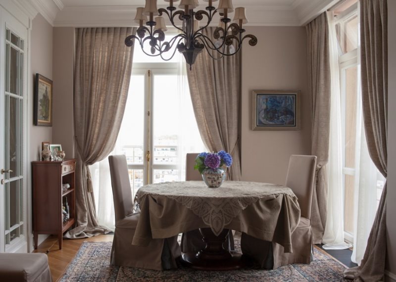
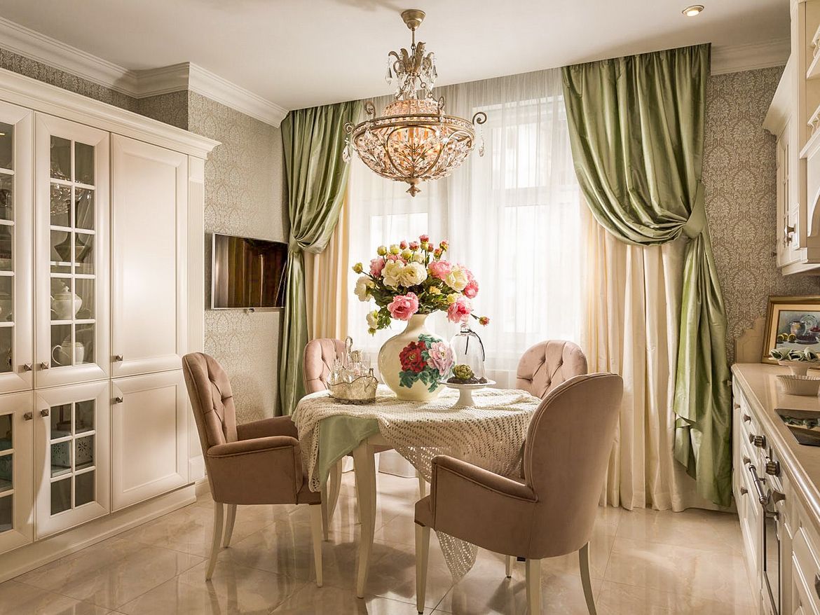
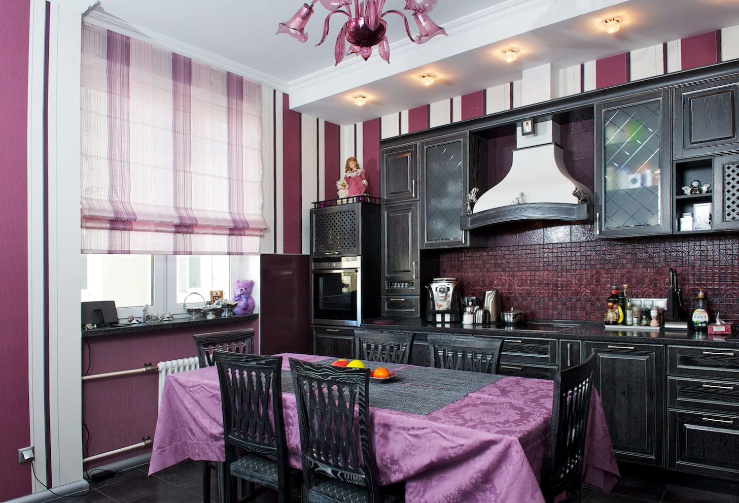
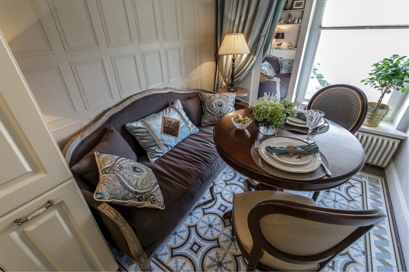
Curtains may be the first thing a person who enters the dining room sees. During a meal (cooking, chatting with guests), an involuntary look falls on them again. Curtains in color should be in harmony, first of all, with a headset, a table, and, last but not least, complement walls. For example, a gray curtain and milky-colored headsets. The combination of furniture and window frames will create a single color ensemble.
An example of a successful combination of textiles on the windows with a tablecloth and chairs, which were specially hidden under the covers to match the curtains
We take into account the lighting
The warmer a person prefers the color of lighting, the warmer should be the color of the kitchen. Do not go to extremes and buy orange furniture just because light bulbs create the illusion of sunlight. However, the cool twilight in a room with cheerful, summer shades looks strange.
Lighting in the kitchen should be comfortable and zoned
From a working apron
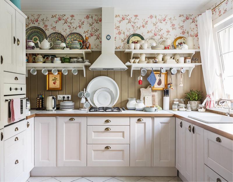
If a person often cooks, the first thing he pays attention to when buying furniture is the color of the apron of the headset, which should not be too light, transparent so that dirt and stains are not visible on it. Multi-colored aprons are in great demand, which are convenient to navigate when searching for a color scheme for the entire kitchen: cabinets, tables, curtains. Since the picture consists of many colors, the furniture can be matched to one of these colors, thus, we get an ensemble.
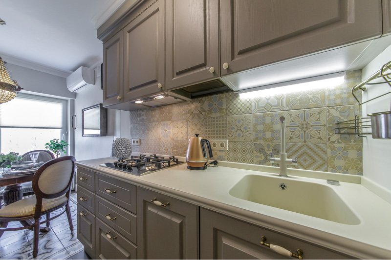
Ceramic tile - the most popular material for a kitchen apron
If the apron is solid, sand, it is perfectly complemented by a white (milk) kitchen table and light curtains. The same goes for gloss kitchens.
The apron of bright, summer shades looks good with furniture of almost any color, but it should be borne in mind that if the headset is very pale, calm, the rich color element above the cutting table “takes away” all the attention to itself, and everything else seems pale. lifeless. Therefore, avoid combinations such as an apron of all shades of the rainbow and a light gray set. It will look like a picture, against the background of cheap cuisine. Even if you want to visually refresh the space, it is better to choose an apron bright, but plain.
Video on how to choose the color of the kitchen
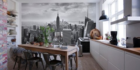
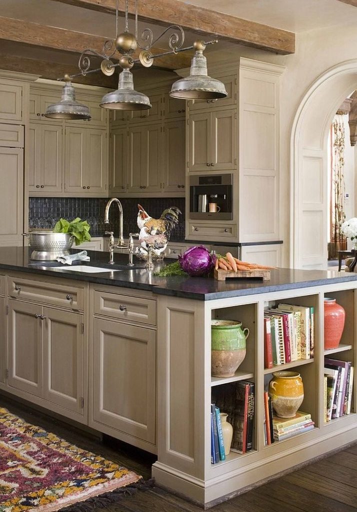
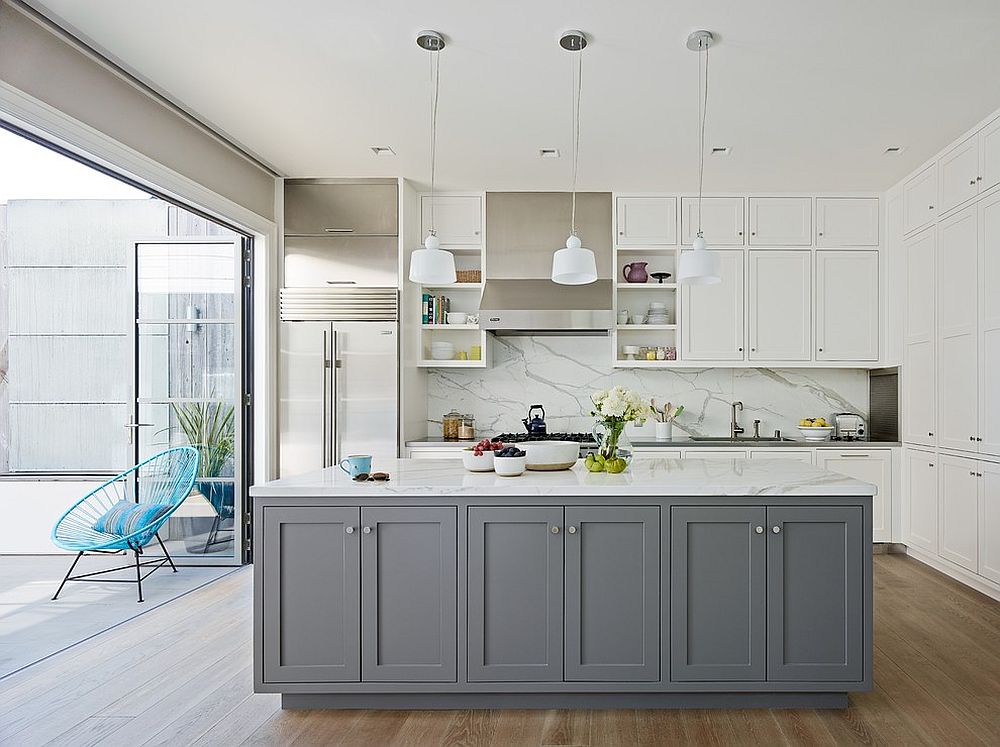
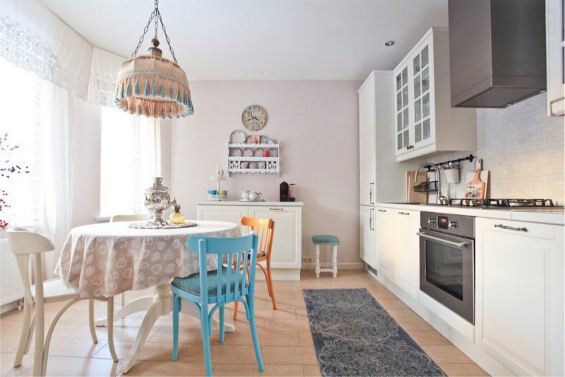
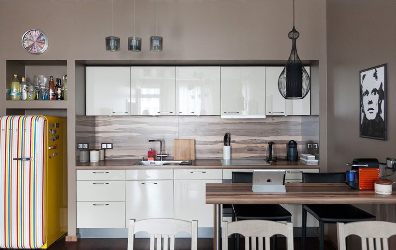
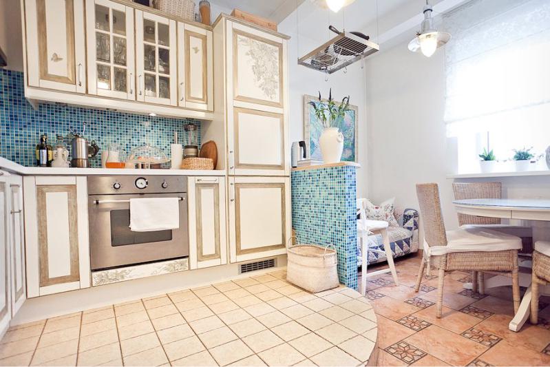
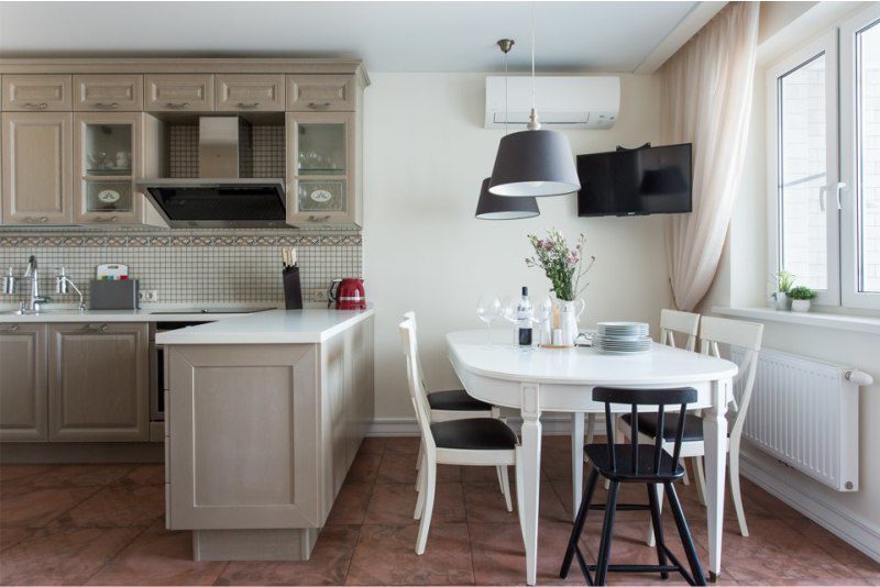
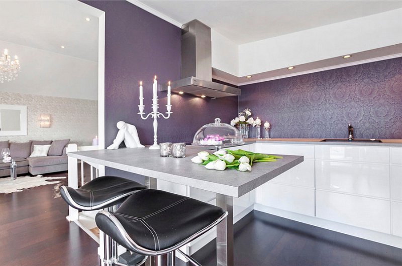
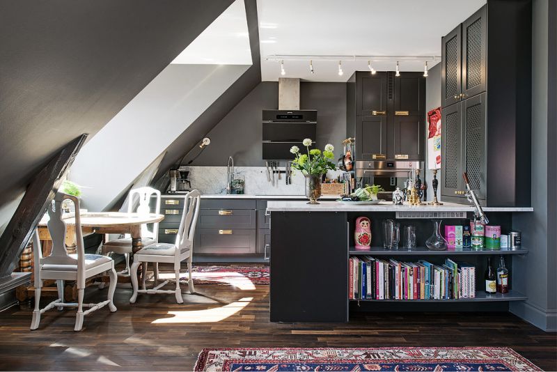
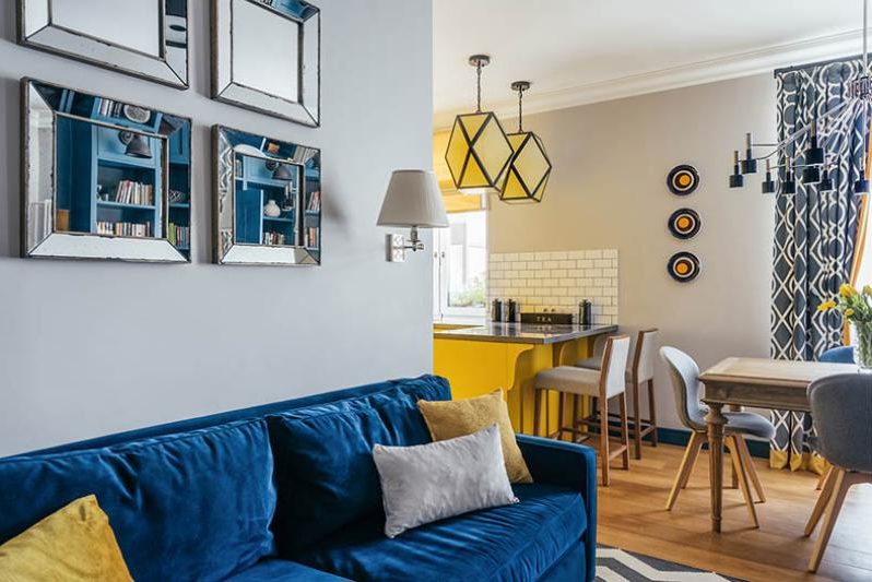
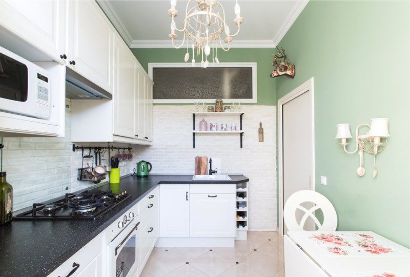
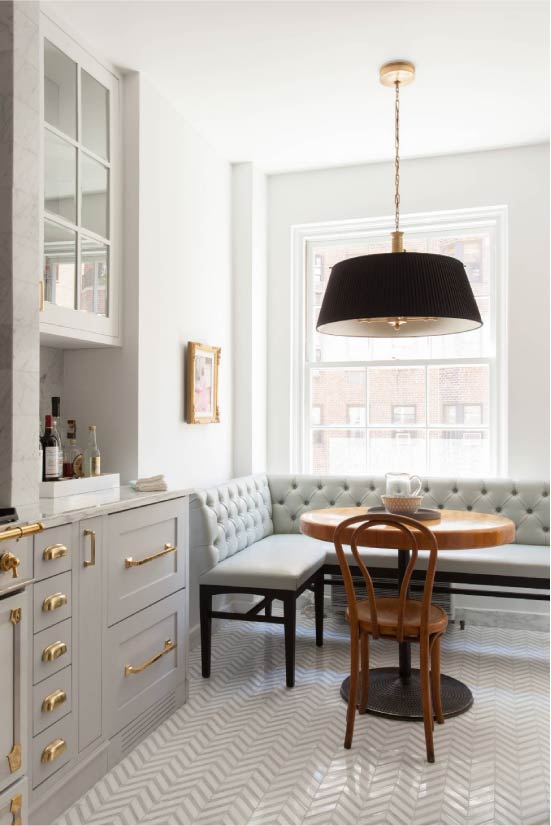
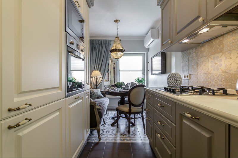
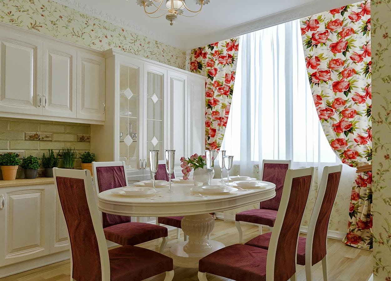
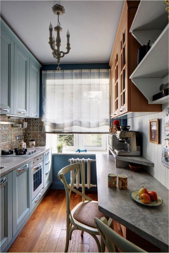
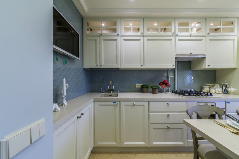
Photos of successful color combinations in the interior of the kitchen
In design developments, more and more often you can find projects designed for rooms of different functionalities and footage, made in white. Especially beautiful ...
Every woman wants to have a cozy, comfortable and convenient to use kitchen. To do this, you need to competently think about its design using modern finishes ...
During the repair in their own home, everyone tries to recreate the interior, which will harmoniously combine beauty, practicality and comfort. When...
The warm sea, good-natured energy, emotionality beating over the edge, excellent refreshments - all this is a cheerful, sunny Italy! Having once visited this blessed ...
Designing a small kitchen is not an easy task even for an experienced designer. The average area of this room of Russian apartments is 11 square meters. m. This ...


 Kitchen
What could be the design of a white kitchen in the interior
Kitchen
What could be the design of a white kitchen in the interior