homeKitchenRed kitchen set - a combination in an interior with other colors
Red kitchen set - a combination in an interior with other colors
Saturated, stylish, bold - not all epithets with which red can be described. It looks beautiful in clothes, accessories, but is also applicable in the interior. Many are afraid to experiment and use this bold shade in the interior, especially in the kitchen. And in vain. The kitchen space made in such a palette looks very stylish and elegant.
Red color can increase efficiency, stimulate blood circulation and improve mood due to a surge of vigor
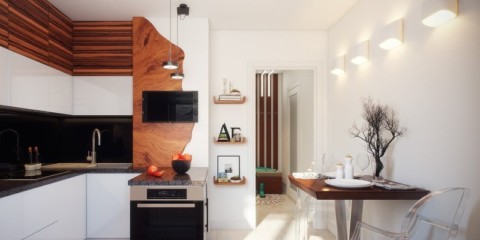
This color fits perfectly into almost any style, so fans of modernism, minimalism, hi-tech, retro, neo-classics and even Provence, country, can use this palette in their own home.
Also, red has other properties: increases pressure, excites the nervous system, improves appetite
Remember, red has a rich spectrum of shades, if you do not want to equip a room that is too catchy, choose a calmer palette. Consider the advantages of decorating the kitchen in red colors.
You can choose any palette - from the brightest, most saturated, juicy to pale, calm. You can choose dark or light, you can combine several colors and create a three-dimensional visual effect.
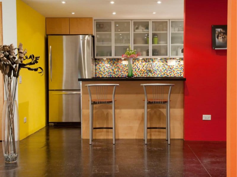
It goes well with other colors, it turns out to achieve different results depending on the background used. Choose a red kitchen set and contrasting walls - the result is magnificent.
It is considered a paint that attracts attention. With its help, attention-grabbing accents are created, the room is more refined, expressive. Even a small footage using this tone looks stylish, solid, elegant.
It is important that the red color does not stick together in an inseparable picture, but is correctly divorced by other tones and maintains a central position
It creates a different atmosphere. Would you like to design a room in hi-tech style, then only cold tones will do, for example, a red-gray kitchen. And if the goal is to create a warm, comfortable atmosphere, then it is advisable to use warm shades. There are both in this palette.
Improves mood. Imagine a cloudy morning or day, you do not want to do anything, there is no mood. A pomegranate is able to give a feeling of joy, improves mood. Well, if on a cloudy morning you can have breakfast and gain strength in such a warm atmosphere.
The red tint of the facades is able to convey a positive mood and cause a storm of positive emotions
But there are a few drawbacks:
Not applicable for small spaces. If a person is limited in square meters, scarlet will only worsen the situation - he reduces the room visually. It is advisable to use it only in rooms of large or medium size.
Intense red color can visually reduce the space, so it should not be taken when decorating small kitchens
People react differently to a given color, and it annoys some. It will harm irritable people, prone to mood swings, with a constantly arising feeling of anxiety.
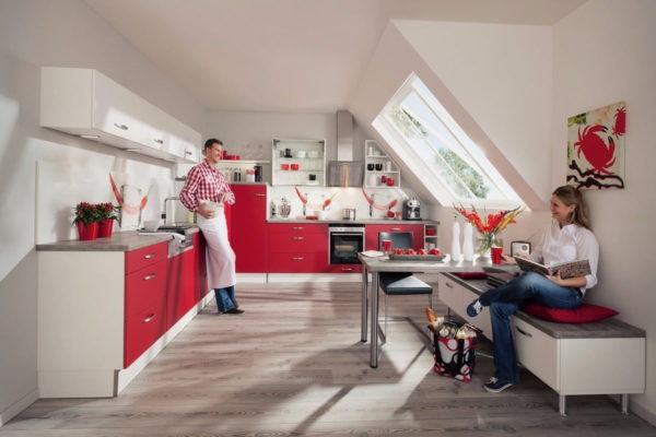
The red kitchen is too bright to call it cozy and family, but it suits modern people with bold views on design
If you still want to apply a scarlet tone, but the room is too small, you can choose red only for some furniture elements. Kitchen facades take up too much space, they will not fit, but a chair with chairs on a light background will look very beautiful.
To make the kitchen in red look harmonious, it must be combined with other shades
Photo and description of the kitchen in scarlet color in different styles
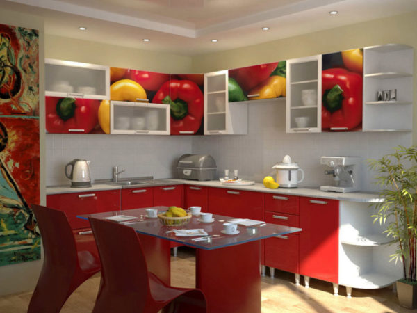
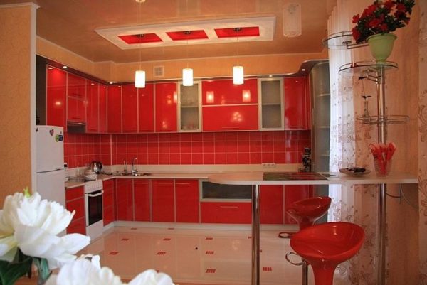
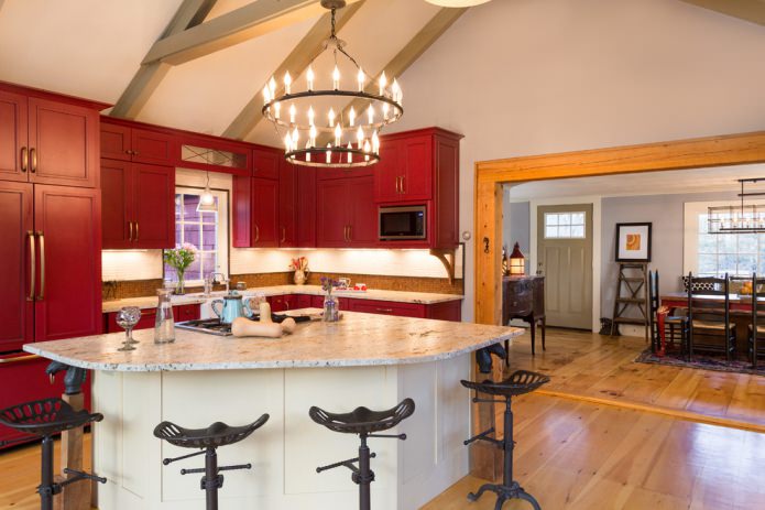
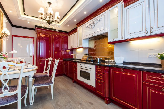
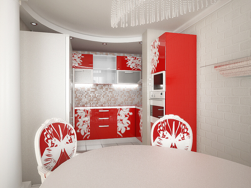
A red kitchen often represents a classic interior design.
Different directions in design have distinctive features and characteristics. Acceptable neoclassical style details are categorically not suitable for retro-style. It is necessary to take into account the specifics of the style, if you want to arrange in only one decorative direction.
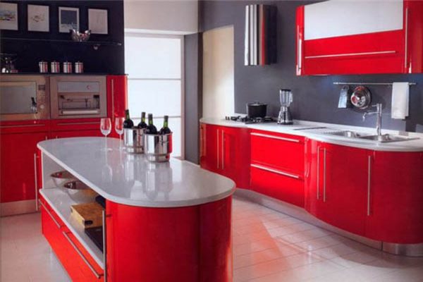
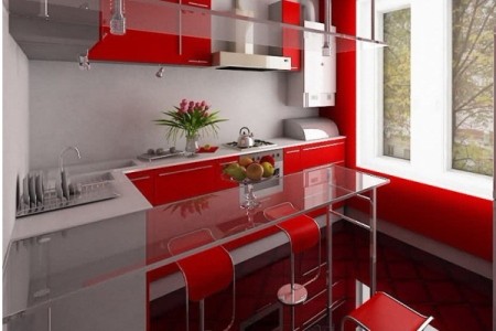
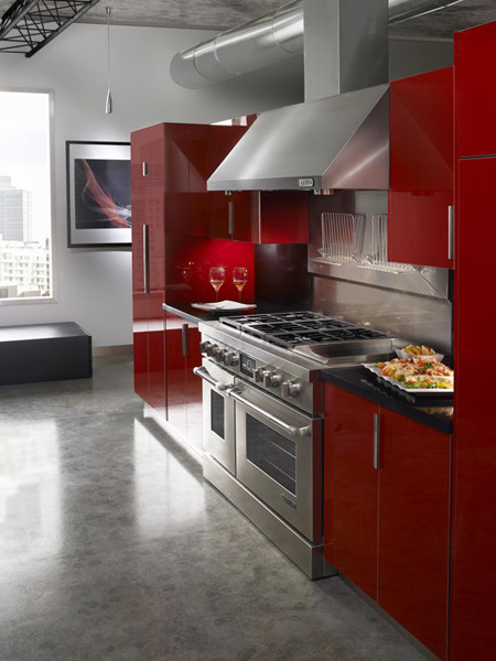
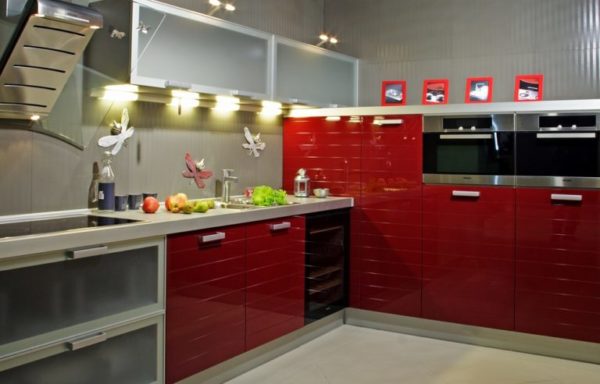
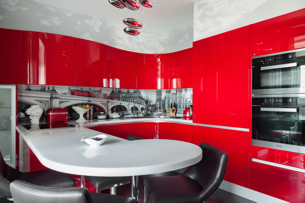
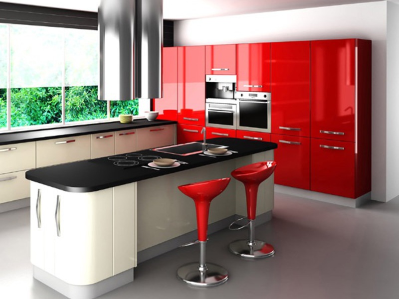
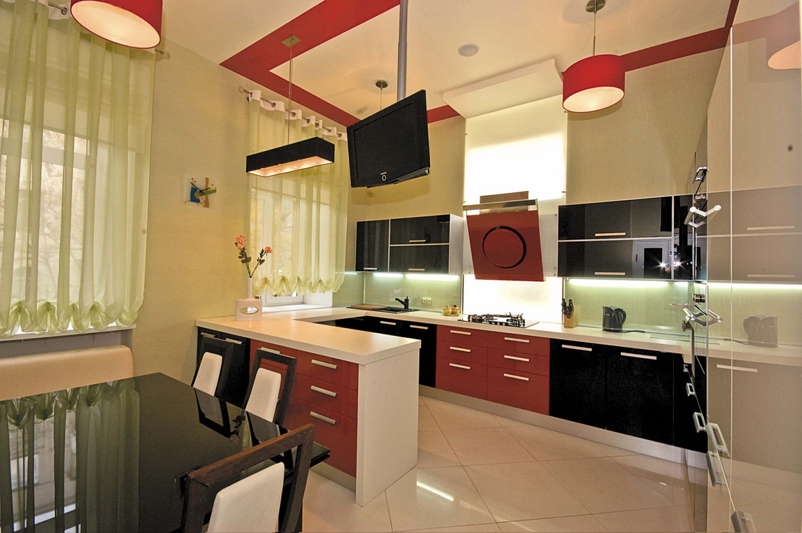
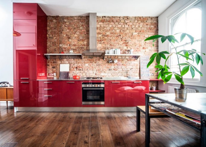
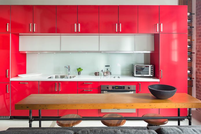
Often this color is applied in the direction of hi-tech. This is a trend in which only modern materials, appliances, furniture, etc. are inherent. Intense scarlet fits perfectly into this trend, especially when combined with gray or white.
Most often, for a high-tech style, a duet of red with a gray or white tint is used
High-tech red and white kitchen photos are easy to find on the Internet and play a similar project in your own home. When decorating, chrome elements and only the latest technology are used. Ideal for fans of modern gadgets and functionality in the workspace.
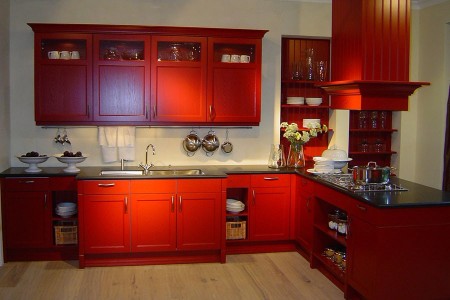
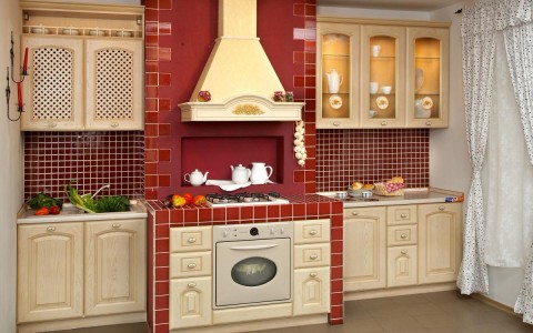
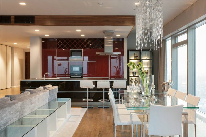
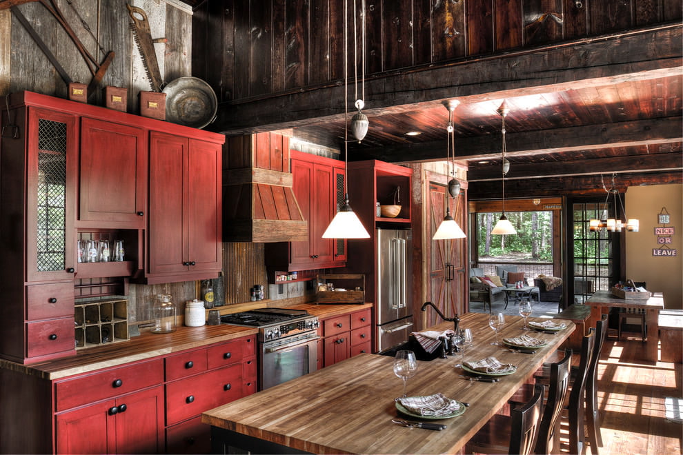
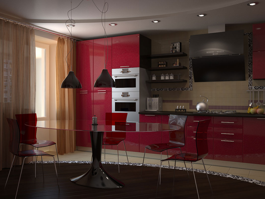
If you correctly design a retro style, you will be able to achieve the interior, as in the film. This orientation is incredibly stylish and unique; only rich gamma is used in the decoration, as well as dark, for example, cherry, burgundy wine, pomegranate. If you choose a contrasting color scheme that will shade the shades of red, you will be able to create a complete and sophisticated design.
Advice! Complete the retro-style room with white and black decorative inserts, paintings, panels and the result will be stunning.
Surprisingly, this gamut fits into Provence and country. Both focus on the countryside, but two different regions. The first is characteristic of a province in France, the second for America. For the direction of Provence, it is undesirable to select a dark gamut.
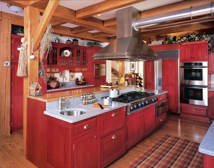
Used red and its shades in country style, preferably natural tones
For country, choose darker and more calm shades - burgundy, pomegranate. The interior should convey restraint, be aesthetically beautiful and concise, seasoned, like wine.
Kitchen in red combined with others
The design of a red kitchen cannot be designed exclusively using different shades of fiery red. It is necessary to dilute the decor with other suitable paints.
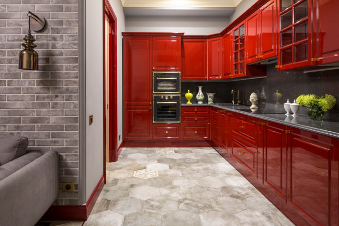
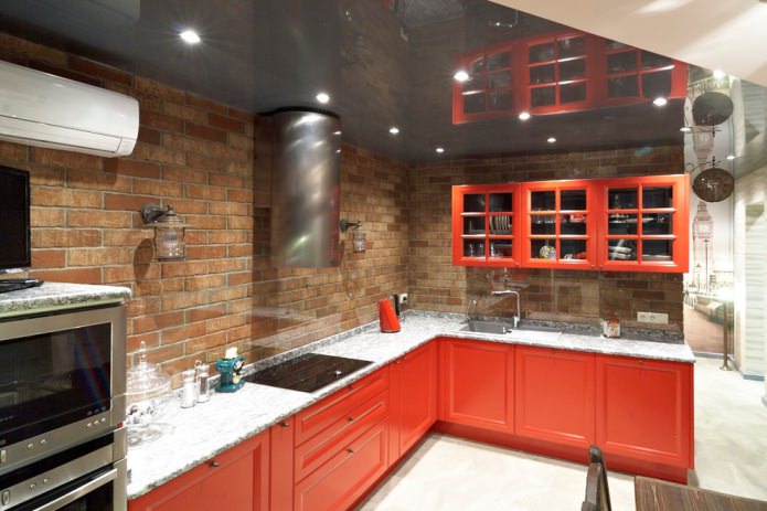
Decorative brickwork over the work area organically fits into the interior of the red kitchen
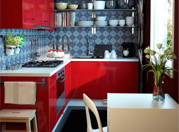
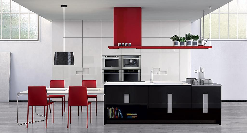
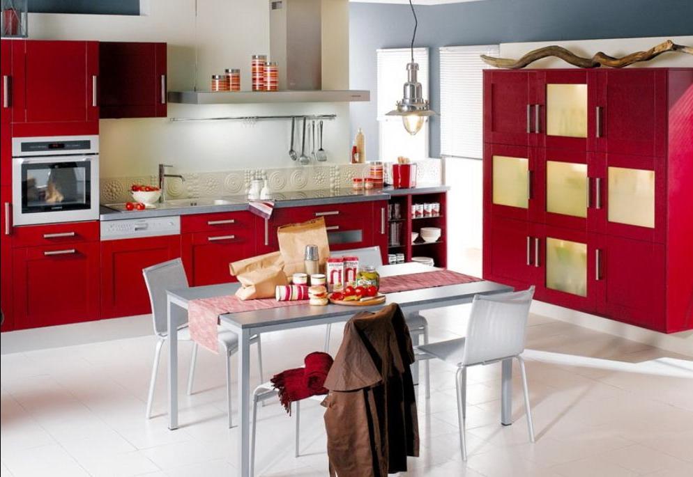
It is considered active, which means that it does not fit well with the same active range. There are several options that perfectly complement the scarlet tone. The list of ideal combinations includes white, black, gray and even blue. For classics, a combination with beige, cream, gilding is suitable. The main thing is not to go too far with gilding, otherwise you will get a tasteless design.
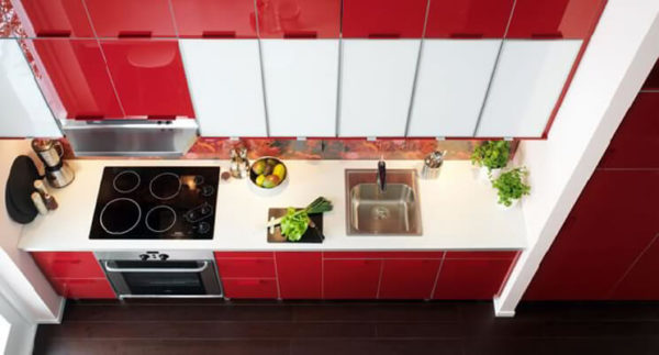
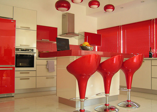
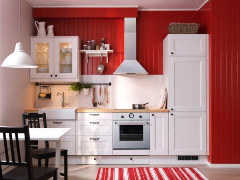
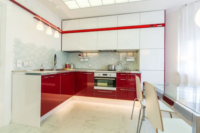
White red
The perfect combination is a calm background and expressive accents. Or, conversely, a scarlet wall, but white furniture. A contrast is created that looks very harmonious and natural, as if two shades were created to create the whole picture.
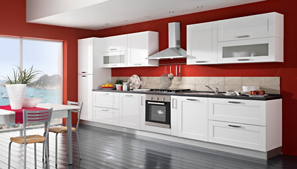
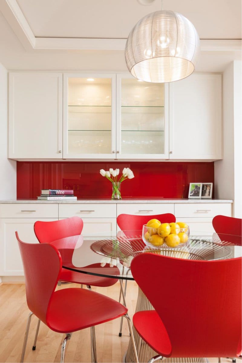
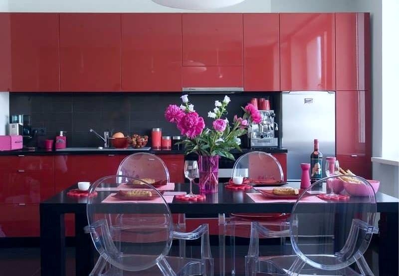
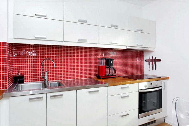
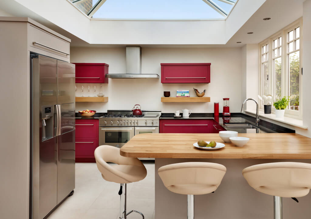
The combination of a white headset and red walls in the kitchen is stylish and bright, giving a feeling of spaciousness and freshness
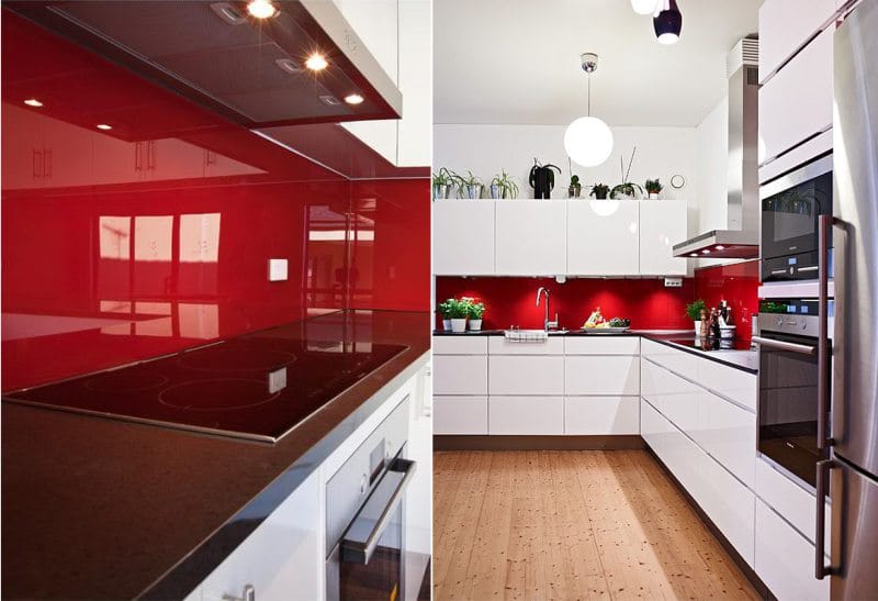
With the help of white, it turns out to dilute the saturation of the bloody, make it less aggressive, soften. Experts recommend creating bright red accents, and leave the background white.
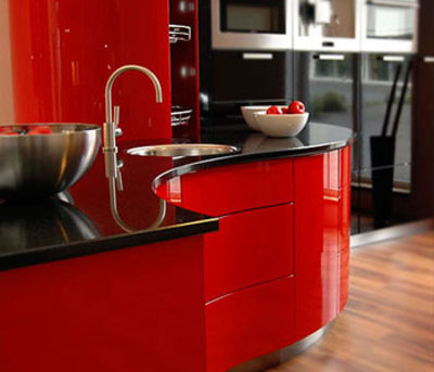
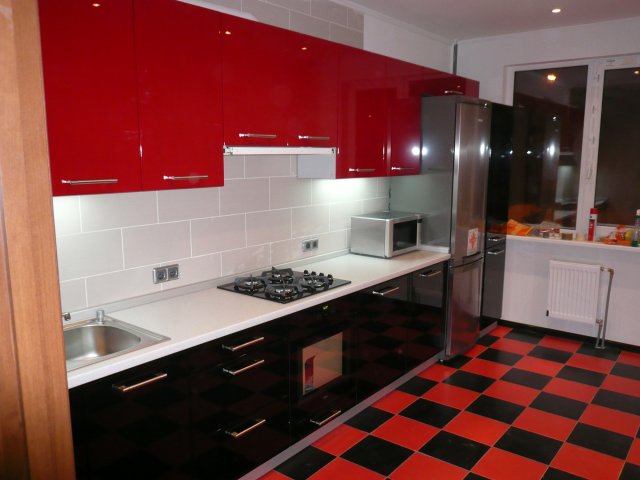
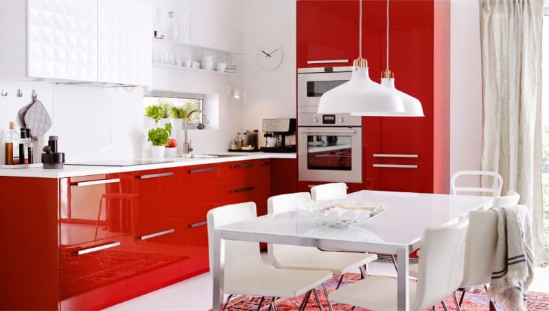
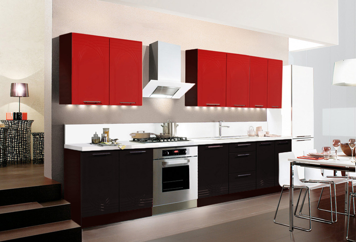
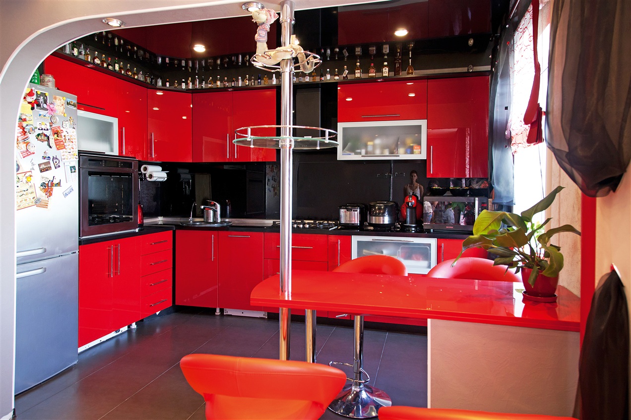
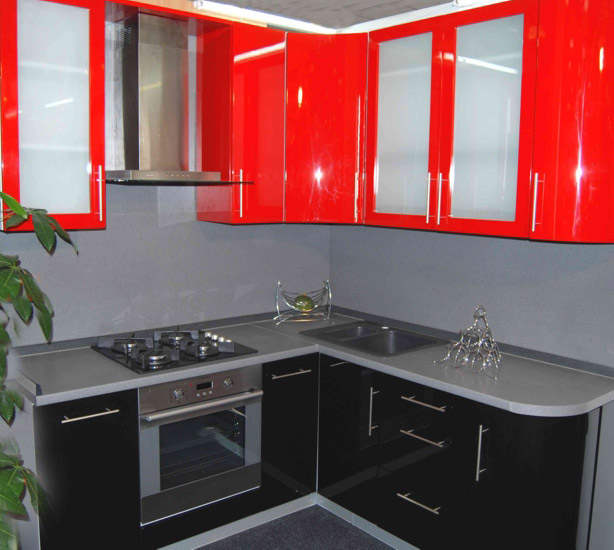
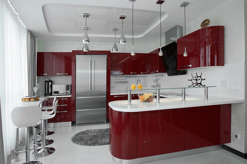
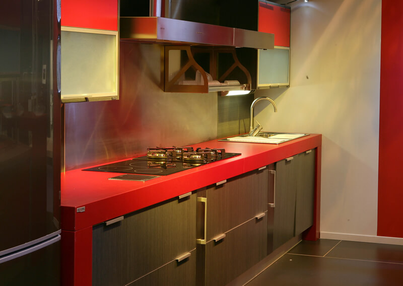
Red glossy facades look great in combination with white
An important feature of the combination is that it is not necessary to select only fiery colors. Experiment, combine calm soft red with boiled color. It all depends on the chosen style and preferences. See photos of kitchen design in red and get inspired.
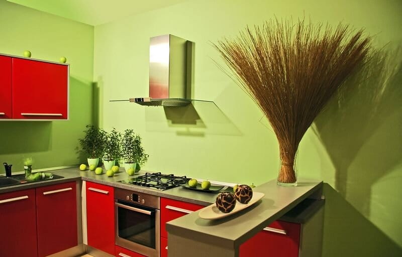
With rich red, beige, sand, earthy, straw
Red gray
A noble, restrained gray will wonderfully fit in to dilute an overly aggressive color. It turns out a rich, but restrained and noble design. Cold gray range perfectly sets off scarlet.
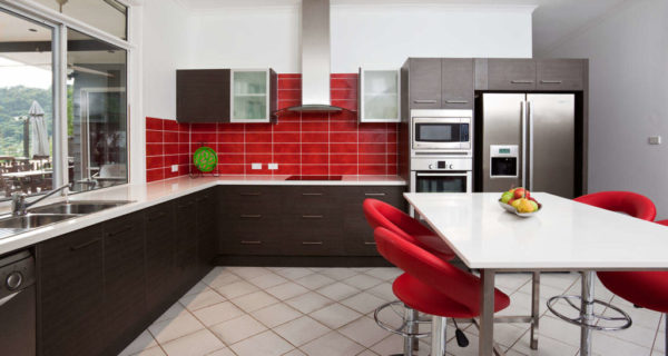
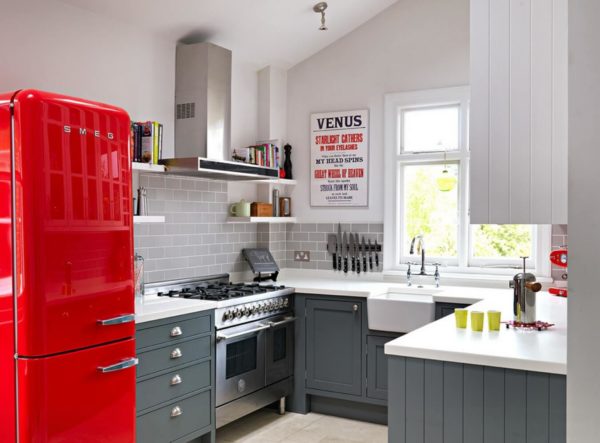
The red-gray kitchen is usually built on dark gray shades of gray, metal surfaces and moderately bright tones of red
This option is optimal for modern areas - loft, underground, high-tech. It is recommended not to engage in such topics in small rooms.
Based on red and gray, you can make very effective and stylish modern solutions.
Garnet blue
Not afraid of experimentation? Then the red-blue combination is suitable to emphasize a unique taste. The photo of the kitchen in garnet-blue colors looks extravagant, but very original.
Blue and red cuisine is very specific, it is better to add a neutral white color
Blue is considered quite muffled, cold, so it miraculously sets off the scarlet brightness. Ideally, if the facades are made in one of these colors, and the apron is in contrast.
Other combinations of garnet blue are possible, the main thing is that the owners like it. The only advice, red-blue is quite expressive, it is undesirable to use the third active color, it will be too much.
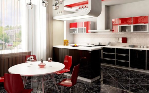
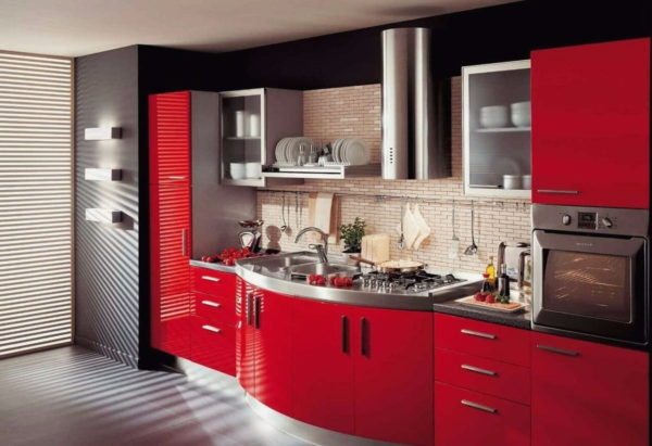
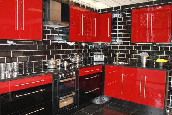
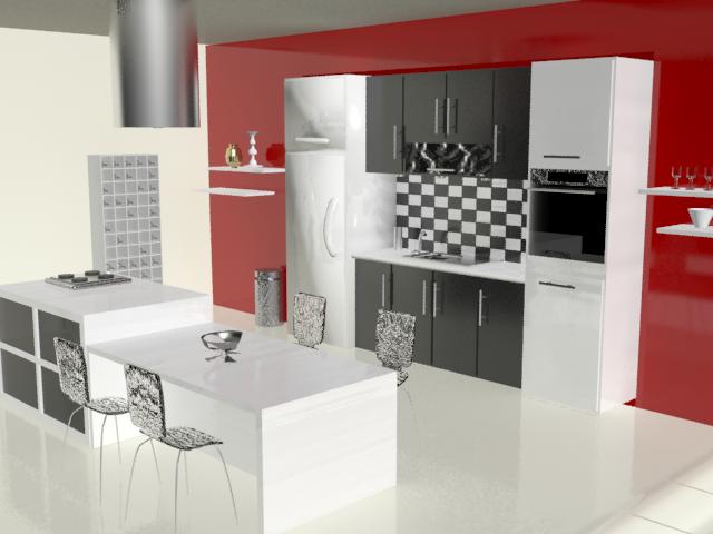
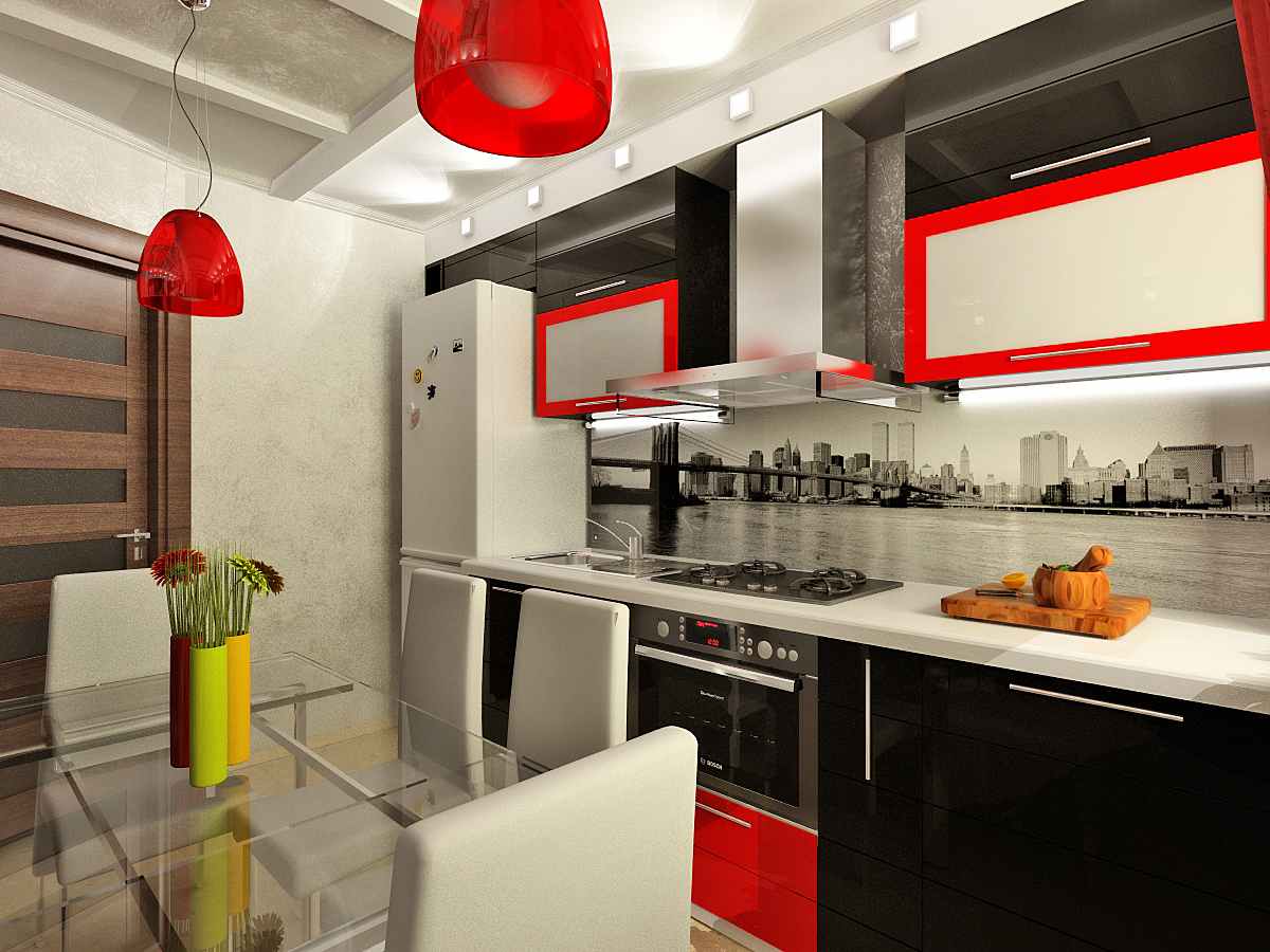
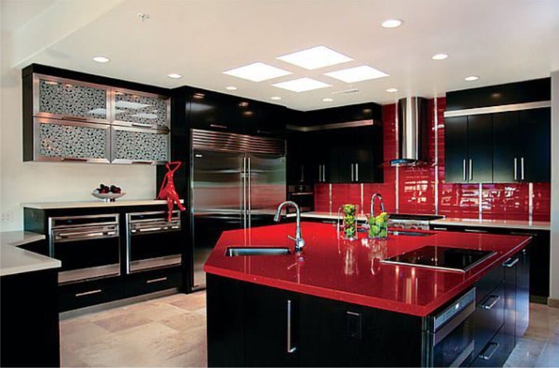
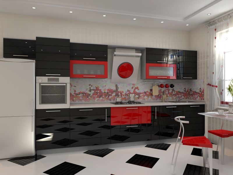
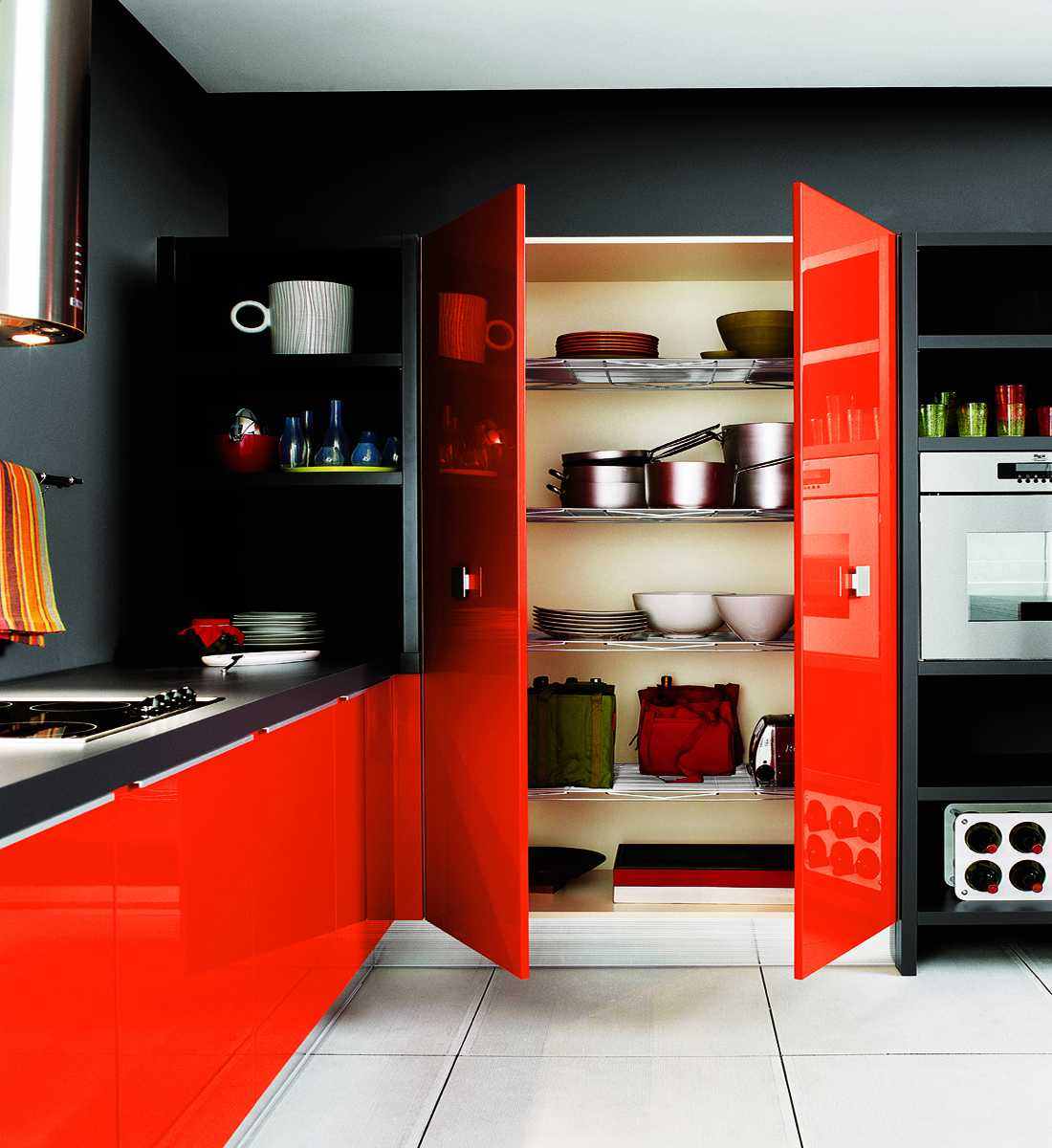
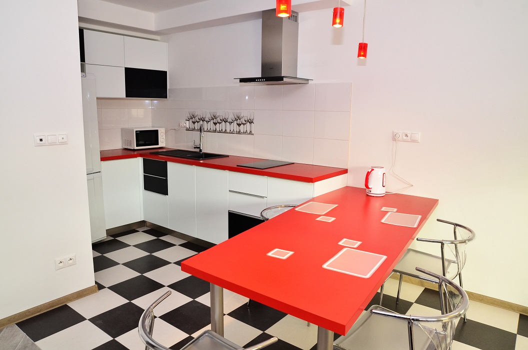
Red with black is the most provocative combination, but it is better to dilute this duo with gray, white or beige
How to choose the color of the walls, ceiling and floor
The main thing to remember is do not overdo it with garnet elements. You can not completely paint the kitchen space in such a rich palette, at least with a constant visit, your head will hurt, and as a maximum the design simply will not succeed.
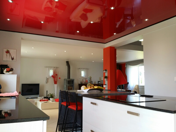
The red ceiling in the kitchen is an interesting design decision, it can occupy the entire upper area or become an element of the ceiling design
If the apron for the red kitchen is made in this color, then the walls and floor should preferably be white, gray or black, and the ceiling should be painted white.
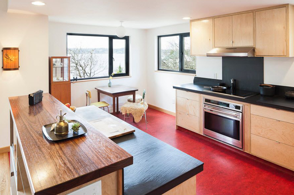
The red floor in the kitchen is a rather rare occurrence, but an interesting method of creating a red “atmosphere”
Another option is to create an accent wall with a rich red hue. Then it is advisable for the remaining walls to apply white, black or other ideas.
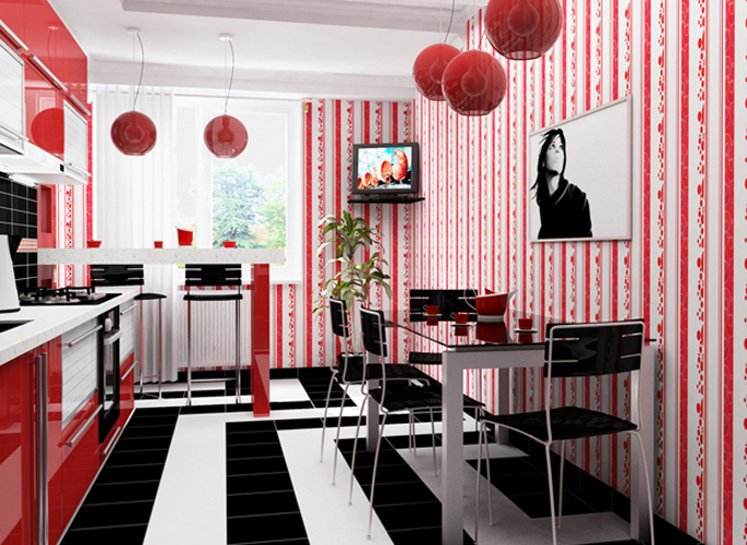
A bright accent wall with an apron made of red tiles looks original and bright against the background of white walls and furniture
Choose a shade of facades
If you prefer catchy accents, then it is optimal to choose the facades of a bloody color. Depending on which style is chosen, you should choose a shade of red. For example, for hi-tech, rich red is suitable, for the Provence style, more restrained, warm undertones.
If the apron is made in scarlet, then you can not pick up the facade of any red shade. Ideally, when a room using rich red creates contrast. That is, a black headset is a red apron, etc.
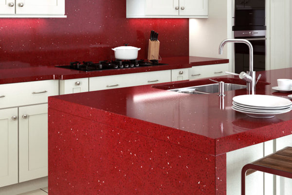
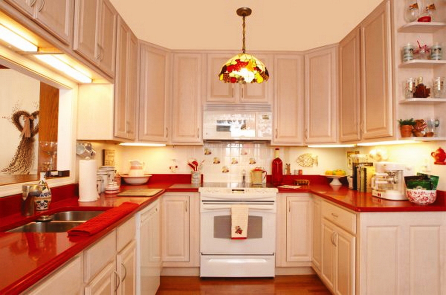
The choice of countertops and aprons
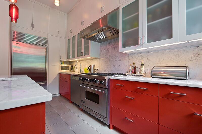
Typically, the countertop is adjacent to the apron, it is undesirable to choose red to decorate these details, otherwise they will merge. It is permissible if both components are light, or decorative elements, for example, bricks, are present in the apron.
For lovers of extraordinary solutions, a counter top and an artificial stone apron in dark red are perfect
You can choose not a plain apron, but, for example, with a pattern or small pictures. Experts recommend applying a contrast effect to the apron and countertops, then the design of the room looks more stylish and elegant.
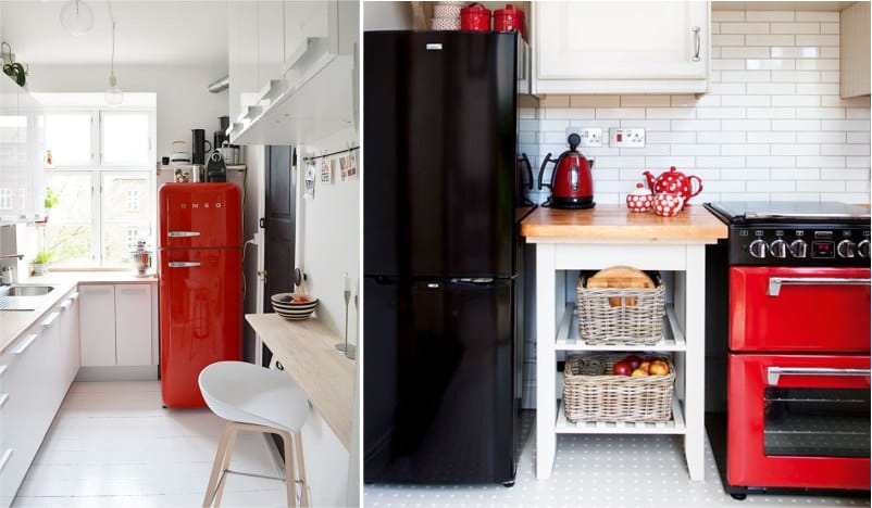
Red furniture
The muffled red furniture blends wonderfully with matte facades or simply with rough surfaces. It turns out quite restrained, elegant design.
It turns out to be very original room, finished only in white, combined with a juicy red dining table and chairs. The same effect is achieved with the use of gray, black creates an excessively dark atmosphere.
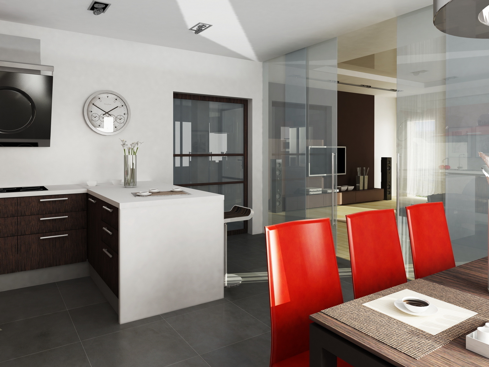
Red Room Chairs
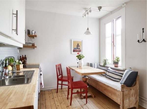
The choice of chairs depends on the situation. They chose a light or dark background, pick up dark red or light red chairs, respectively. Try to stay discreet in decorating.
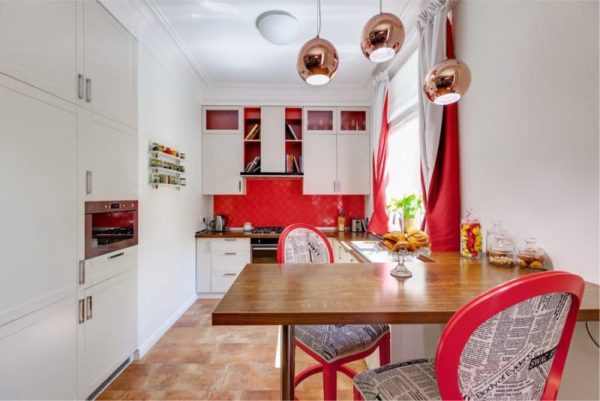
Furnishing the dining area with bright red chairs is an effective and safe way to bring color energy to the interior
Wallpaper under the red room
In the kitchen, the walls are finished with ceramic tiles, because here a person cooks. Smooth or embossed tiles are easier to clean than wallpaper or plaster. One careless movement when knocking down products with a mixer can completely destroy the wall covering, finished with wallpaper or plaster.
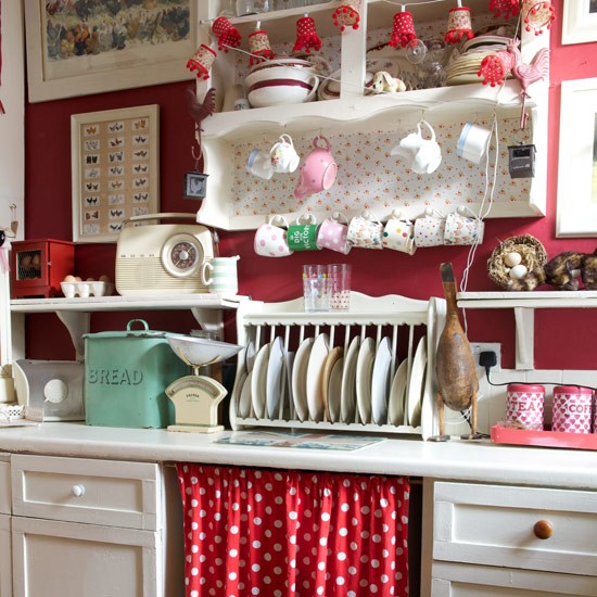
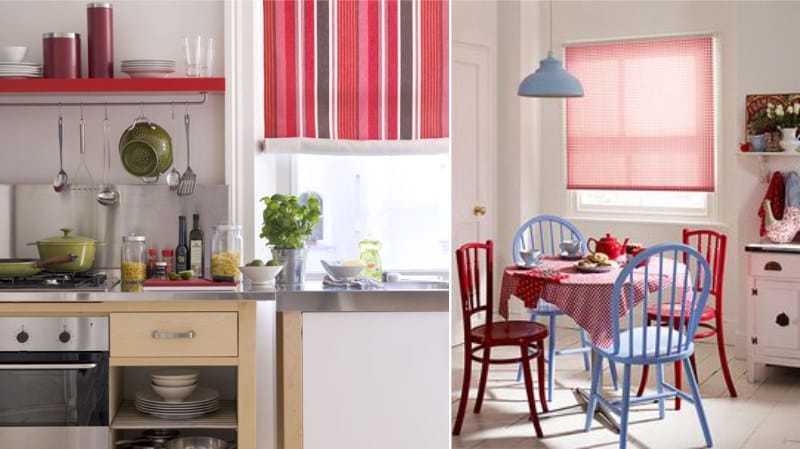
But the opposite wall is quite possible to wallpaper. For example, the lunch area, opposite the kitchen set, where no one is guaranteed to cook, but only eats, decorate with contrasting wallpaper. Ideal to choose light or dark red color schemes.
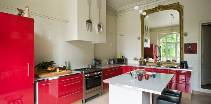
Red kitchen
This is a profitable design idea, because if you use scarlet only for painting a headset, you get an expressive accent. In this case, the walls, ceiling or floor cannot be done in a similar palette. The maximum is the decoration of the opposite wall in a bloody palette. A photo of a red kitchen set confirms that there is already quite a lot of scarlet in the room.
The kitchen set looks glossy with red glossy facades with neutral colors on the walls.
Decorating your own kitchen area, do not overdo it. Bright or saturated details should be in moderation.
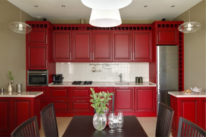
The room acquires a festive atmosphere, with a combination of red and white, milk and beige colors
It is optimal to focus on one thing - an apron, headset or dining set. Select one element and visualize in the head. If it turns out not too intrusive, then turn your dream into reality.
Video: Red Kitchen - Red Kitchen Design
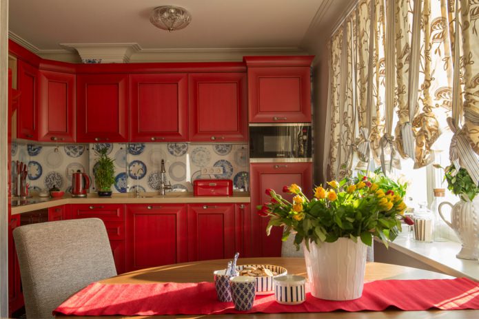
50 interesting and extraordinary kitchen interiors using red:
The kitchen is the soul of every home, a center of attraction for all family members. This place is for cozy meals and informal friendly meetings. Often the kitchen is personal ...
When visiting various houses, whether it be visits to friends, dinner parties with relatives or business meetings with colleagues and work partners, the first impression ...
In our country there are many old prefabricated houses called P 44. These are ten-story high-rise apartment buildings that were built 30-40 years ago ....

 Kitchen
What should be a modern kitchen in 2020
Kitchen
What should be a modern kitchen in 2020