 Kitchen
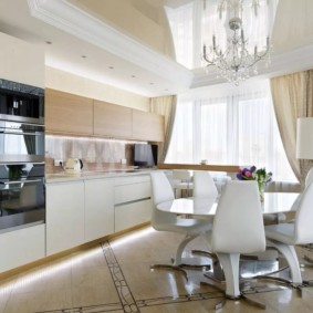
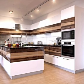
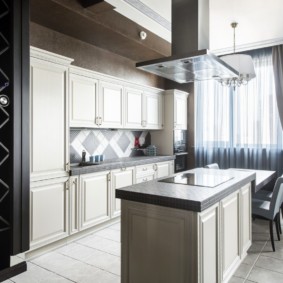
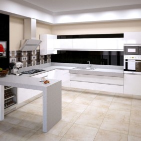
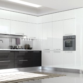
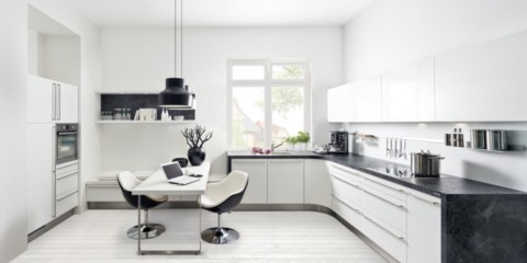
What could be the design of a white kitchen in the interior
When planning repairs or buying new furniture for the kitchen, a problem arises related to the interior design and the selection of a color background for one of the most important rooms of the house.
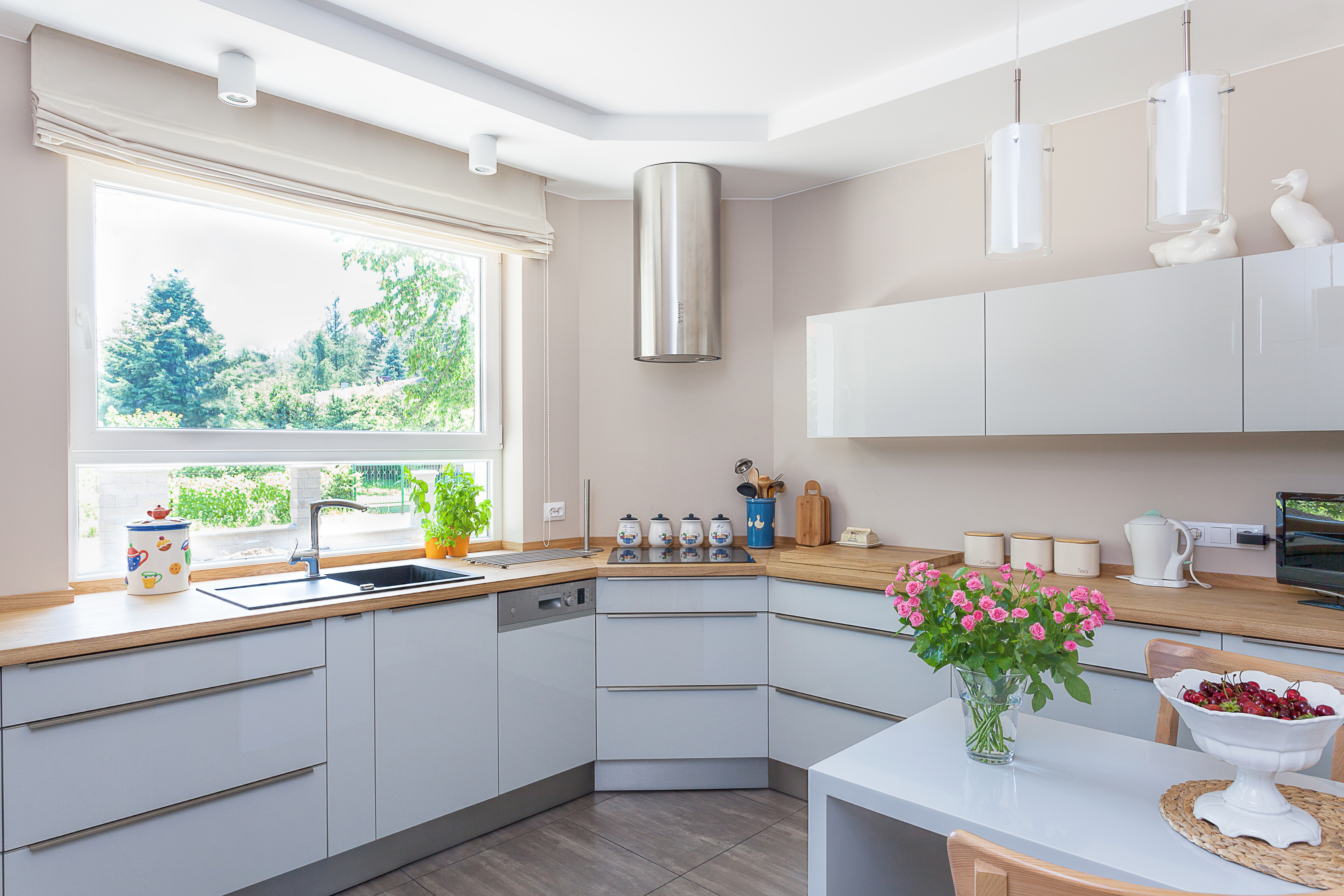
Modern style is most often chosen by people who keep up with the times, love order and practicality.
The combination of colors in the interior of the kitchen - what color should the kitchen be
Content
- The combination of colors in the interior of the kitchen - what color should the kitchen be
- Combination options based on the main color of the kitchen
- What color is combined with orange in the interior of the kitchen
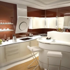
- The combination of brown with other colors in the interior of the kitchen
- What color is combined with lilac color in the interior of the kitchen
- What colors are combined with gray in the interior of the kitchen
- What color is blue combined in the interior of the kitchen
- What color is green combined in the interior of the kitchen
- What color is combined with beige color in the interior of the kitchen
- Rules for a harmonious combination of floor and wall colors
- Rules for choosing the color of tiles in the interior of the kitchen
- The best color solutions for the kitchen
- Two-tone kitchens - photo combination of colors in the interior
- VIDEO: The right combination of colors for the kitchen.
- 50 stylish color combinations in the kitchen:
The selection of colors for the kitchen
In everyday life, they directly affect mood, which means physical condition and even appetite. Therefore, the combination of colors in the interior of the kitchen is an important component of the overall harmony of the interior of the housing.
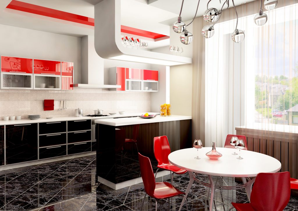
The main thing is to choose the right furniture, think over where it is better to install household appliances, and take into account many other details.
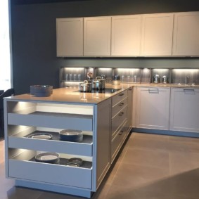
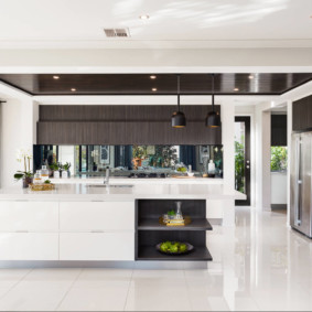
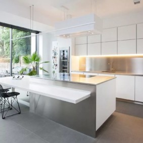
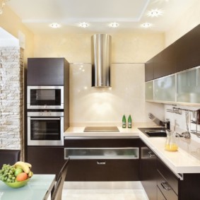
The use of light and calm tones is an ideal solution. They will reflect light and visually expand spatial volumes, which is especially true for small kitchens. The maximum number of colors used is limited to three. In percentage terms, the alignment is as follows: 60-30-10. Light, neutral (beige, white, gray) dominates. It emphasizes the design of walls or kitchen facades - these two elements contrast. The bright facade fits perfectly under neutral walls (and vice versa).
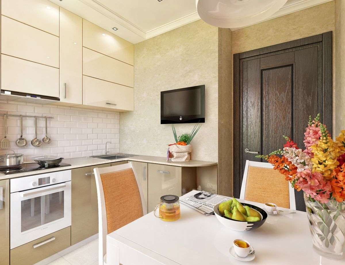
The main features of modern kitchen, regardless of the chosen style: the presence of wide working surfaces, clear lines.
What is the color wheel and why is it needed
To find the right combination of colors in the interior of the kitchen, a circle-shaped table has been developed that allows you to see the color compatibility, determine the contrast and adjacency, creating harmony. The basis of blue, red and yellow is explained by the inability to get them by mixing other shades, but they are the basis of all the others.
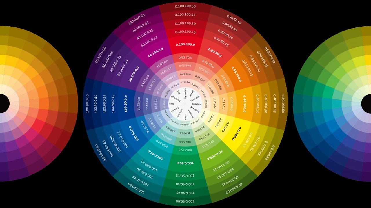
The color wheel will help with the right choice of combinations.
The colors opposite are contrasting and adjacent are adjacent, they are used as complementary. First you need to determine the primary color with a further selection of harmonious combinations.
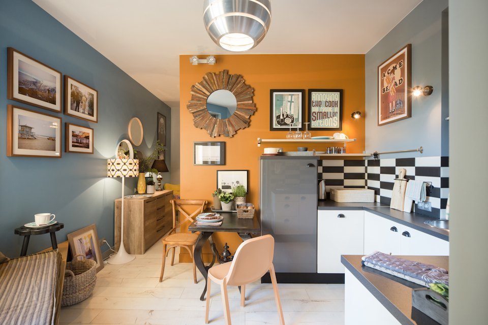
A popular accent and refreshing room is to highlight one of the walls with a separate bright color.
The effect of color on the perception of room height
Home decoration is based on a number of factors, one of which is color. This requires understanding the impact on the psyche of different shades, and with it the way we perceive space.
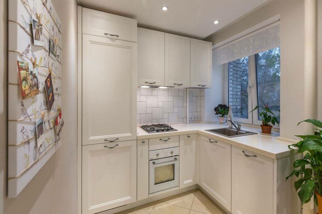
The play of colors can create the illusion of large in relatively small rooms, as well as "reduce" too large open spaces.
The process is divided into groups of colors:
The main thing with the entry of blue, yellow and red into it is the primary ones (as they are also called).
Secondary are formed by a compound of the main. Together with the main ones they form the main group of flowers. The cold group includes the blue gamut (sky, ice, water). Neutral - green. To warm - a yellow-red palette.
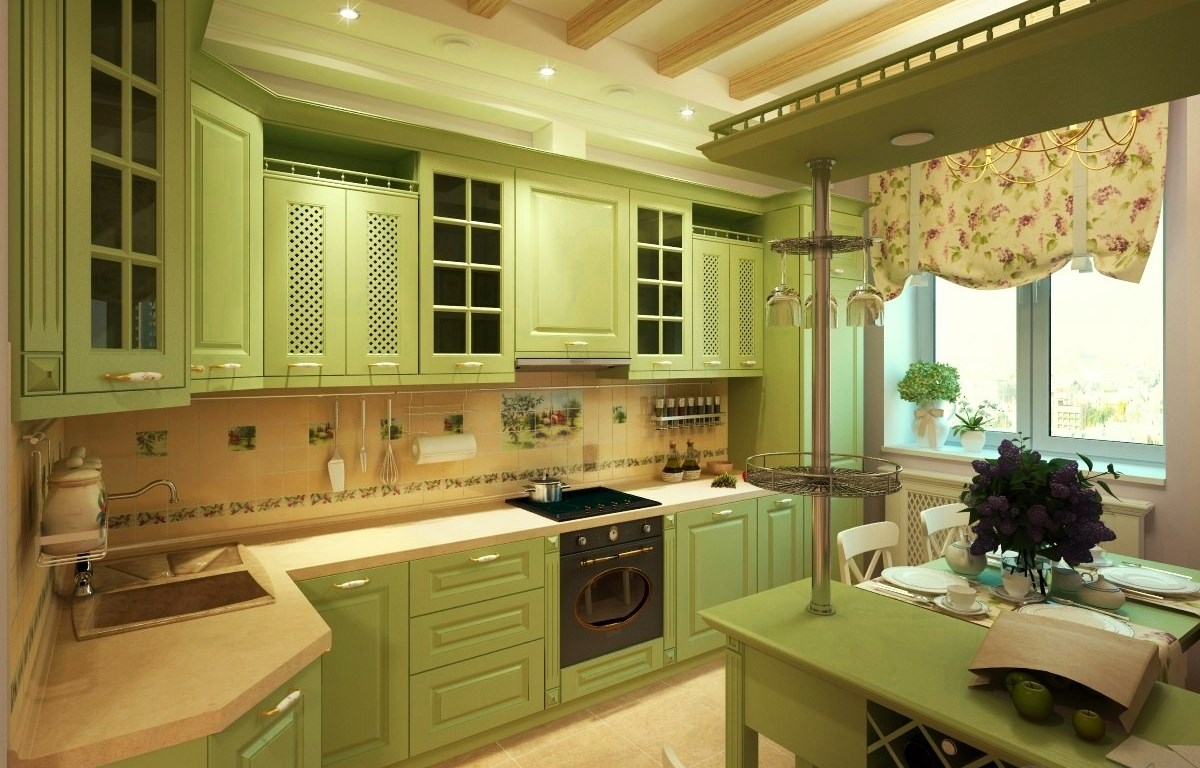
Low saturation of light tones is determined to light colors. Thick brown and olive to heavy.
Warm color combinations for the kitchen reduce it and give some intimacy. They are also used, focusing on individual elements of the interior. Psychological coolness, blowing from the cold flowers, removes objects from the observer. If you paint a low ceiling in light cold tones, then it will seem a little higher than its actual size. Quite dark colors, on the contrary, will make it visually lower, as if crushing on those present. The light colors of the ceiling and walls will make the room much more spacious for the observer.
Combination options based on the main color of the kitchen
What color is combined with orange in the interior of the kitchen
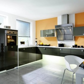
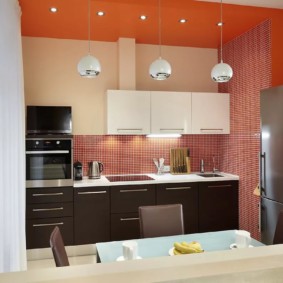
One of the warm colors that is able to give an energy charge, coping with depression and, including, raising appetite. But in large quantities can cause irritability. It is combined with different colors.
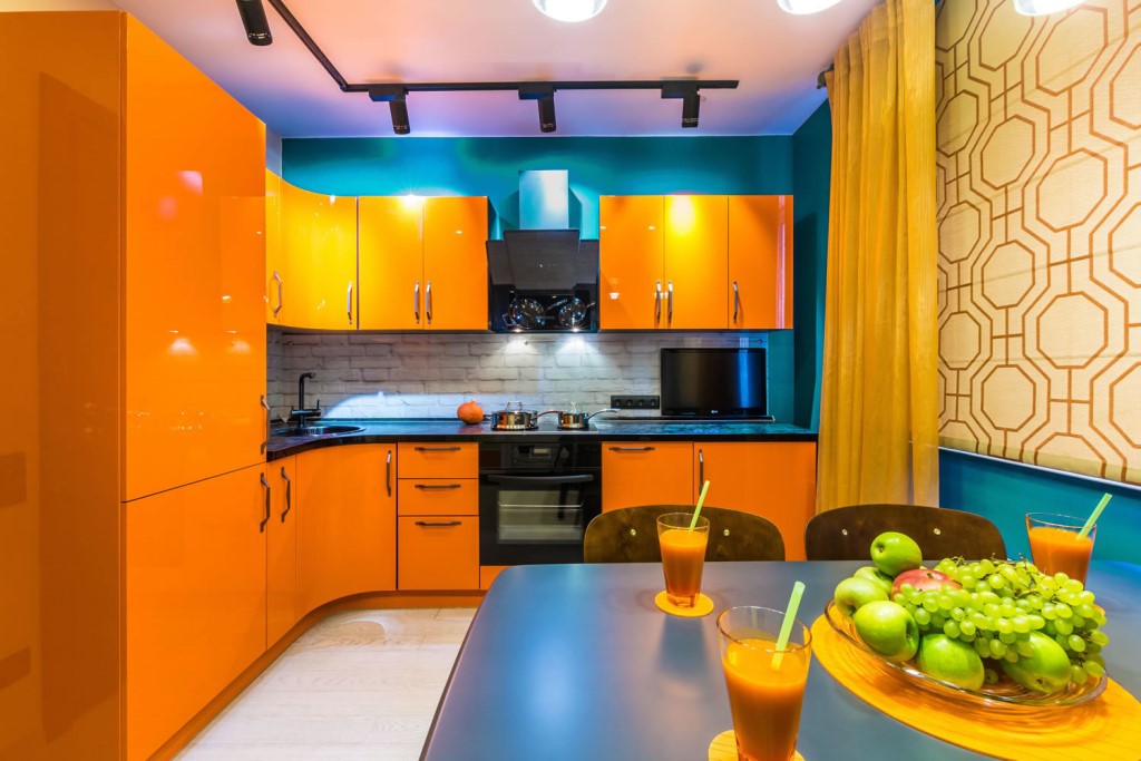
The main thing is to choose harmonious combinations.
Cold tones (blue, violet, blue) will refresh the atmosphere. Although they are color opposites, they are able to balance color temperature.
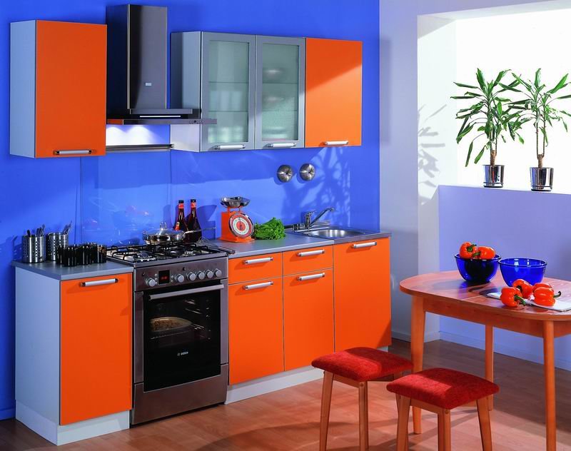
Provence style actively uses such a game of tones.
Since orange is a representative of a warm gamut of colors, it is harmonious with other colors of this color segment - brown (natural wood), sunny and cheerful yellow, red.
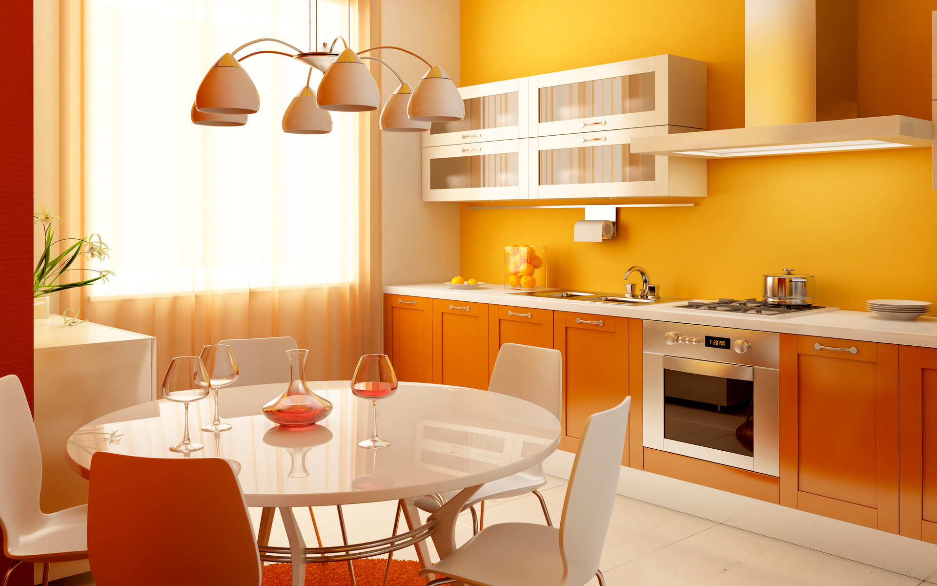
Choose shades with extreme care so as not to make the kitchen aggressive.
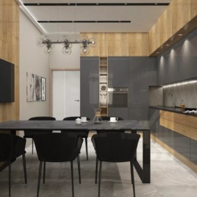
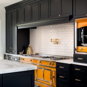
The use of black, gray and white (neutral gamma) enhances or soothes orange colors. Usually they are used as background. Black adds aggressiveness and should be used to decorate large rooms in the neo-Gothic, Art Deco, and high-tech styles.
The combination of brown with other colors in the interior of the kitchen
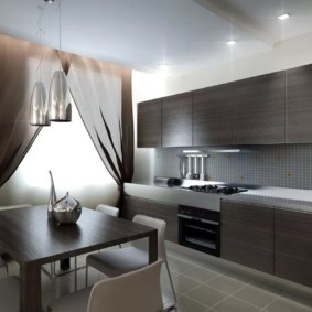
In combination with black, beige, white, gray and muted tones will create a solid and comfortable atmosphere. Use orange, green, purple, and other vibrant colors to create an eccentric vibrant design.
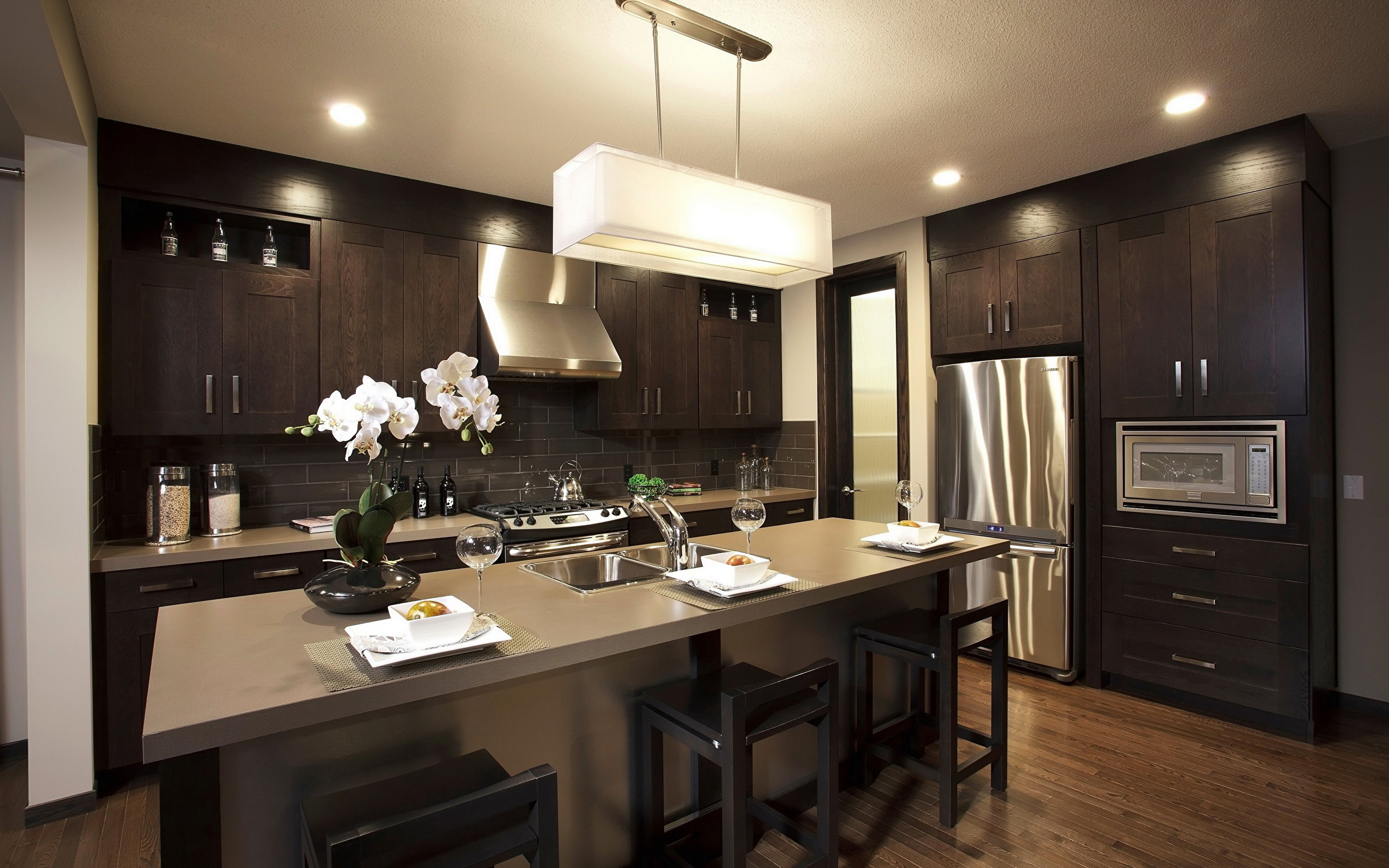
The brown kitchen in the interior looks solid.
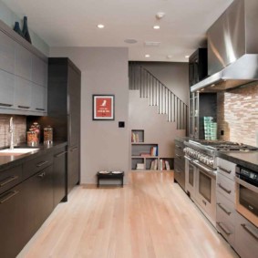
The combination with white is a calm stylish classic. Black needs to be diluted to avoid a too gloomy environment. Beige will create coziness, comfort and style. Yellow should not be abused. Cools will add blue shades. Green tones calmly cool the interior.
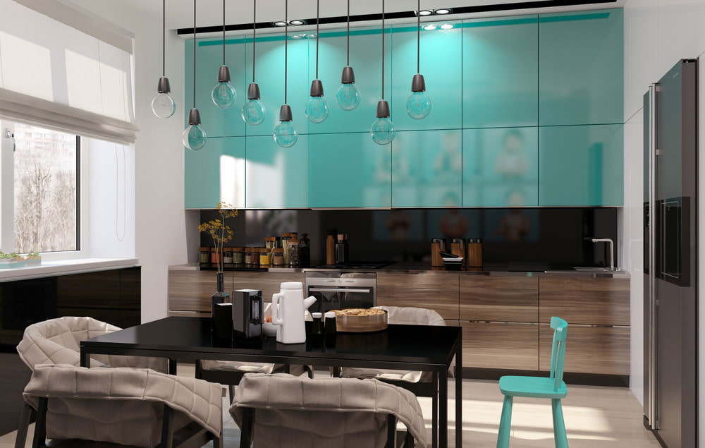
Brown color is ideal for decorating the kitchen, because it is practical, creates comfort, combines with all colors and is universal for interiors of any style.
What color is combined with lilac color in the interior of the kitchen
For a small kitchen, light tones should be selected. And the larger the room, the richer they are. Combination with violet will add sophistication and style, while maintaining the balance of tonality.
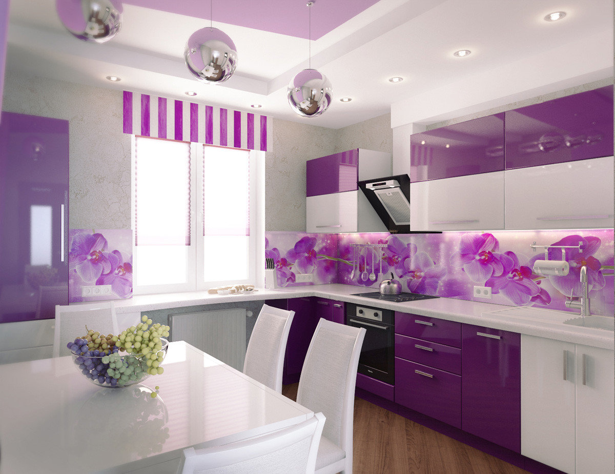
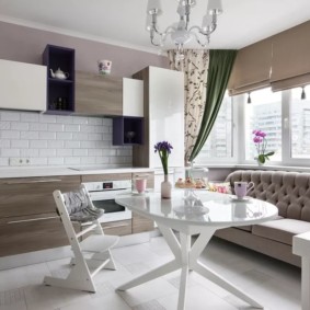
The rather sophisticated interior of the kitchen creates a combination of lilac and white, as shown in the photo.
Black and white added to the dominant tone will add rigor and sophistication. Gray shades will look stylish, sophisticated and noble. A variety of green tones will add spaciousness and freshness to the interior. The combination of yellow and lilac perfectly balance the saturation.
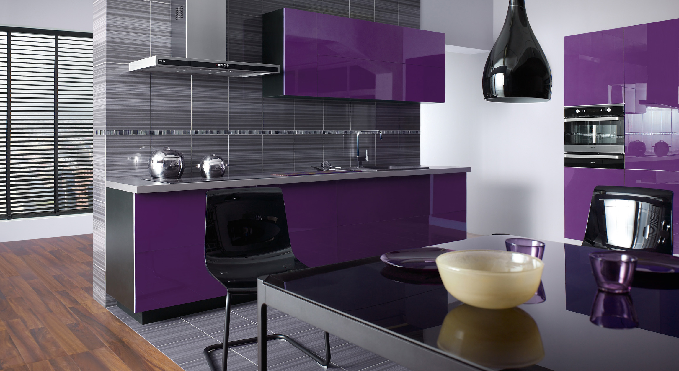
The purple color, which is a symbol of mystery and sophistication, looks unusual in the interior of the kitchen.
What colors are combined with gray in the interior of the kitchen
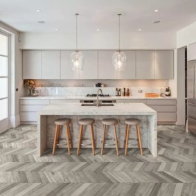
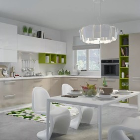
Gray shades need to be complemented. Harmoniously mixed with green. The charm of gray-white kitchen in simplicity and restraint.Warm wood tones refresh and give spatial freedom (used both for Provence, country, and for technological styles). Bright red, light green, blue, orange is suitable for Art Nouveau, adding color and exoticism.
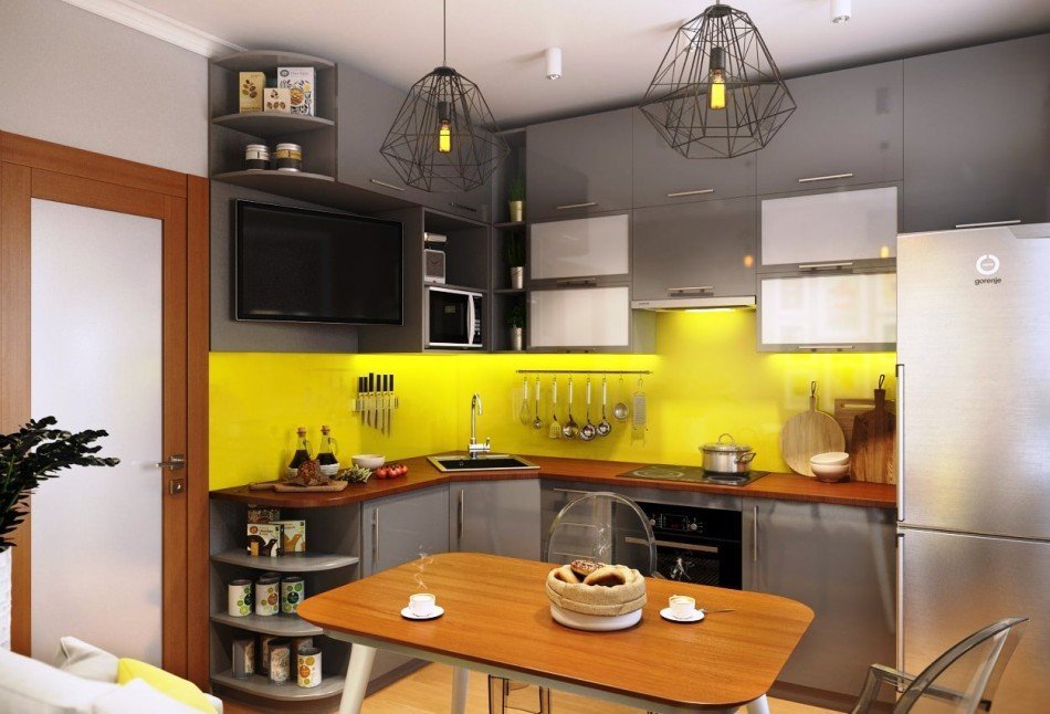
Gray and yellow can dissolve each other, so you need to carefully approach this ambiguous decision.
What color is blue combined in the interior of the kitchen
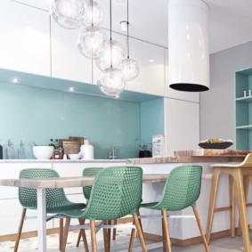
The combination with white will create a classic beautiful interior. Not only walls are made in such a combination, but also ceilings and floors. Gray will add nobility and style to minimalism, hi-tech, etc. The combination with black should be restrained (flooring and household appliances can be decorated in dark colors).
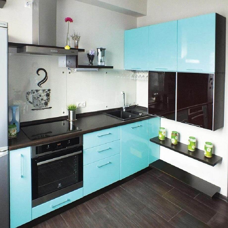
In the interior of the kitchen, blue shades are used on different materials and surfaces.
Yellow with different shades will give cheerfulness. The romance of raspberry or pink will look spectacular. Contrast with red can be expressive, so there should be few such blotches. Blue and cyan must be diluted with neutral shades. Pop art and country style allow the brightness of green with neutral tones.
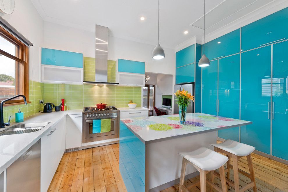
Gentle and light pistachio is universal and will be harmonious in any style.
What color is green combined in the interior of the kitchen
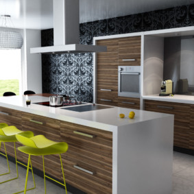
Brightness with simultaneous calmness and cheerfulness of green can be played in contrast with black, adding seriousness to the interior. In combination with woody shades it gives peace and proximity to nature. Finishing with exotic wood has become fashionable (we are talking about drawings on plastic or veneer).
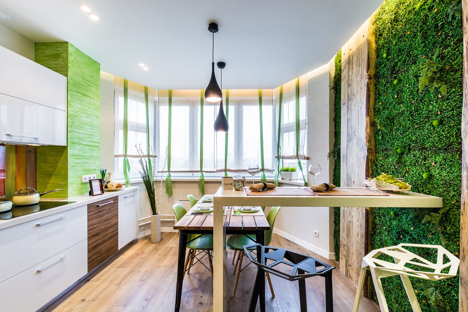
Light green color - the personification of spring, freshness and awakening of nature.
The intemperance and infantility of green is suppressed by gray - these can be large vertical objects. Blue will give the atmosphere of grandeur and leisurely. Yellow will bring cheerfulness and playfulness. If the party is not sunny, then this is a great design decision. The burgundy will be contrasting, it can not be much so as not to cause irritation. These are tiles, lamps, pillows for chairs.
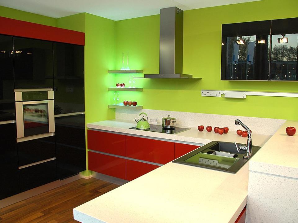
Being in the interior of the green kitchen, a person rests and feels peacefully.
What color is combined with beige color in the interior of the kitchen
Against the background of a neutral hue, green and blue will give saturation and freshness. Violet will be associated with appeasement. The black apron is elegant and unusual. Burgundy is acceptable in large rooms.
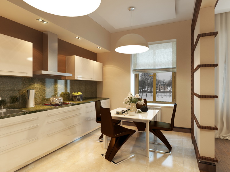
Brown will complement nobleness and elegance.
Rules for a harmonious combination of floor and wall colors
When planning, you need to take into account the rule that warm tones are for large rooms, and cold tones for small ones. A harmonious palette implies a combination of the primary color with several additional (non-contrast).
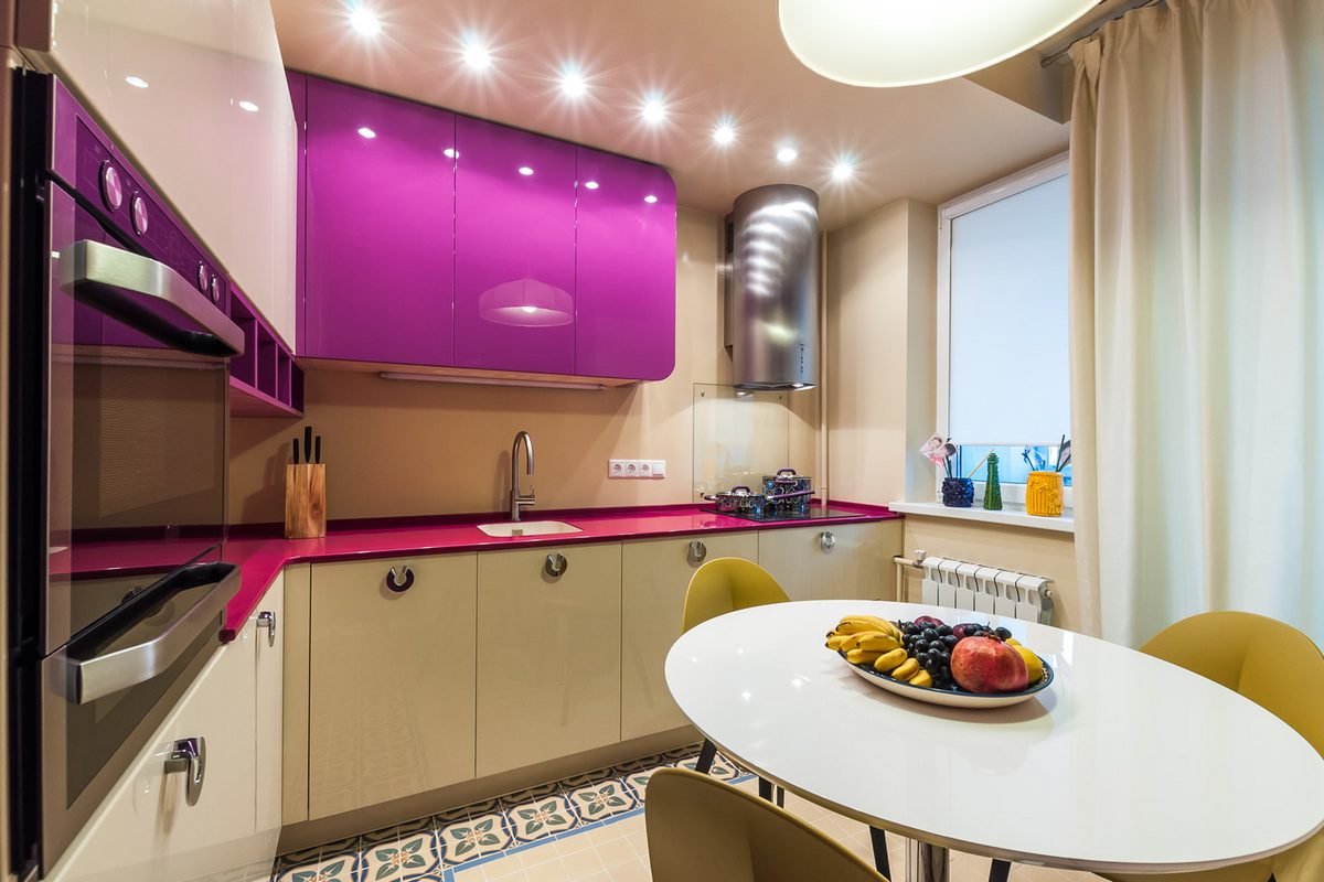
Preference is given to synthetic materials harmoniously adjacent to the natural finish.
If the ceiling is low, then the color of the floor in the kitchen will be identical to it, as well as the wall opposite the door. This will visually shorten the length of the room and make it taller. With a high ceiling, the floor and the far wall are painted in a light tone, with which we give it a rich color. The same rules and in a monophonic combination, only visualization support different tones. A contrasting combination is characterized by staining the walls with light tones and the floors with dark colors.
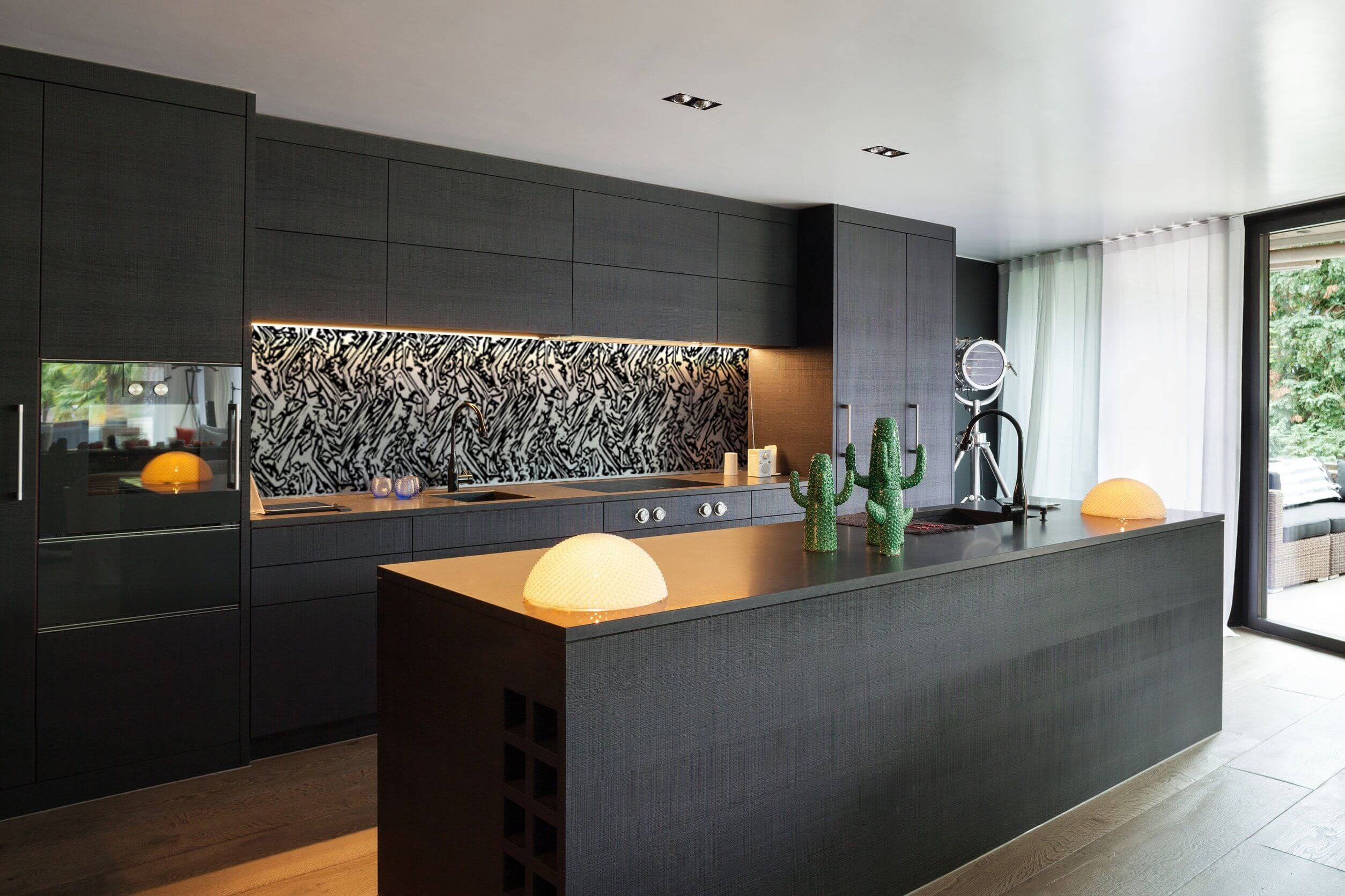
This technique in the decoration visually "raises" the ceiling.
Rules for choosing the color of tiles in the interior of the kitchen
We choose the finishing material not only on the basis of quality, but also in accordance with the general design concept and the color of the kitchen furniture. An apron can play a major role in the composition. Ideally - together with a specialist to create a computer collage of the finished premises with the presence of all elements.
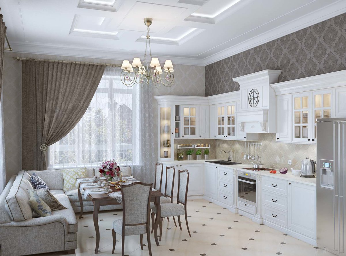
Based on the composition, choose color shades that perfectly harmonize with the overall concept.
The best color solutions for the kitchen
The market offers almost the entire existing palette of materials for arranging the kitchen. Use not only the advice of sellers and specialists in the field of design. Listen to yourself.
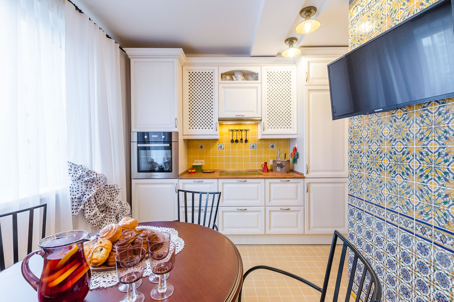
The psychotype, perception and your vision of the special atmosphere in your kitchen should be decisive in your choice.
Two-tone kitchens - photo combination of colors in the interior
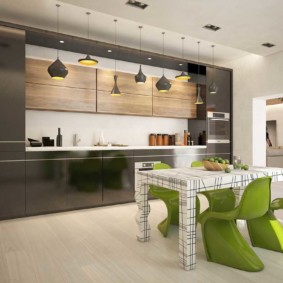
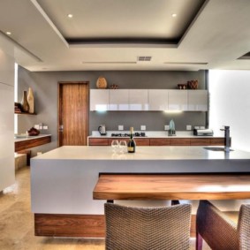
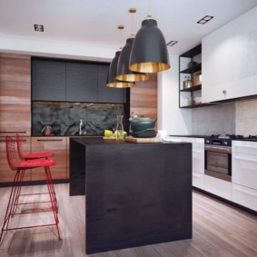
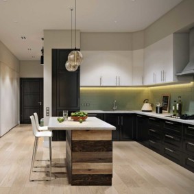
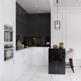
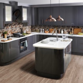
Two-color kitchen is a harmonious game of contrast, stylish, not overloading with shades, and can be used to create different directions. Correctly selected shades will make up for the lack of lighting and volume, giving the room bright touches. But the choice of tone should be approached carefully, in consultation with all household members.
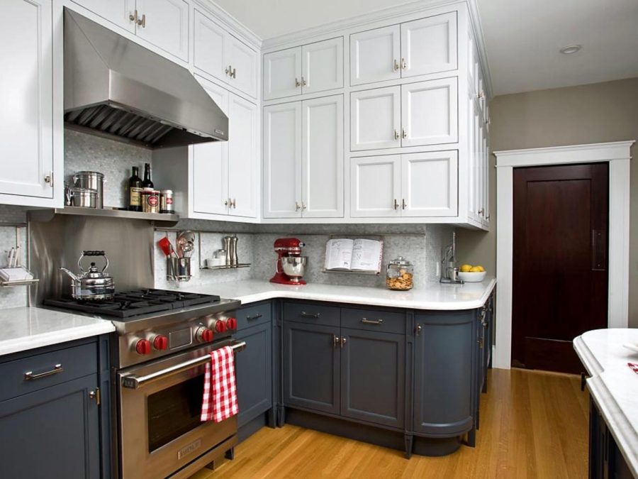
The best design studios offer work options on their sites, as an example of possible solutions in each case.
VIDEO: The right combination of colors for the kitchen.
