 Kitchen
Choosing the right tile design for your kitchen
The kitchen is an integral part of a person’s home. It is her design and the combination of colors in the interior that determine the level of elegance of the entire room. Waking up, admiring the bright and colorful atmosphere, a person receives a dose of good mood for the whole day. Coming home, calming down after a hard day, prepares a delicious dinner for the whole family. The correct combination of tones in interior design has an impact on a person's ability to work. The use of various colors and decorating techniques has long been used in home decoration. Different tones will help to create a unique and pleasant image, delighting the people living there, causing an appetite with expressive coloring. Consider the combination of colors in the interior of the kitchen, choosing the appropriate shades of mood for your own beloved home.
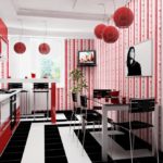
Black and white (achromatic) kitchen
Content
- Black and white (achromatic) kitchen
- Blue kitchen: a piece of gentle cool
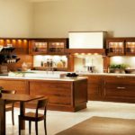
- Brown kitchen: "station wagon"
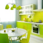
- Green Cuisine: Add Freshness
- Orange cuisine: hello to bright weekdays
- Gray kitchen: peace and comfort
- Red cuisine: love and passion
- Black cuisine: unrivaled classics
- Yellow kitchen: the sun at your place
- Process design method
- Video with interesting new color schemes:
- 50 photos of examples of color combinations in the interior of the kitchen:
The phrase "achromatic colors" means 3 colors - black, white and gray - their combination. The created achromatic composition gives the kitchen formality and grace, calming the nervous over-excitement received by everyday stresses.
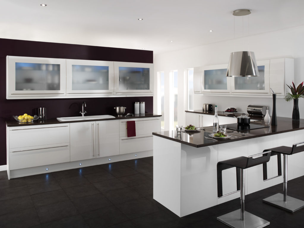
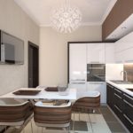
Black and white balance each other
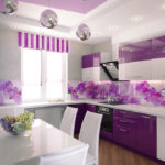
It will be difficult for a holiday person to live in such an official setting. People who love brightness prefer a combination of achromaticity and chromaticity. For example, white with orange or purple flowers, etc.
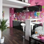
Reduces the official mood of such a kitchen with floral or abstract images on the walls. An excellent solution would be to use various types of photo wallpaper in the interior of the kitchen. They will make a very noticeable highlight, contrasting with the achromatic tones of the kitchen. Vivid images on the walls will not go unnoticed. Such a highlight always looks organic and at the same time very unusual.
In an achromatic composition, each color plays its key role, giving the room a special charm, and occupies an important part in the interior of the kitchen.
- Black color is especially absorbed by light, taking away excess brightness in the home.
- White, on the contrary, gives brightness, visually increasing the room. Against a white background, chromatic colors acquire even greater color saturation.
- Gray color includes a part of black and white, creating a neutrality suitable for the background.
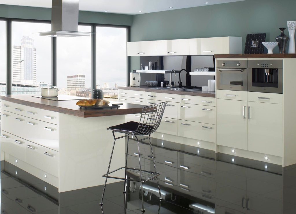
The combination of white and gray shades creates a sense of respectability, and enhances other colors.
The use of each color in different proportions gives a different perception of the room. White will give spaciousness. Black is the opposite.
Blue kitchen: a piece of gentle cool
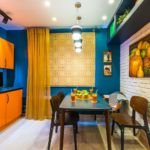
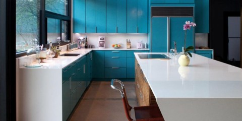
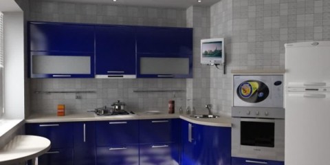
Blue color is associated with the sea, sky and cool evening breezes, causing a pleasant chill on the skin. This color in the interior may remind someone of their favorite time of the year - winter, saving from heat in summer, especially near the stove. The color is cool, loved by many designers for the opportunity to blend harmoniously with the surrounding interior design. He encourages, giving inspiration to many people for creativity, explaining the reason for the preference for this color in most creative people.
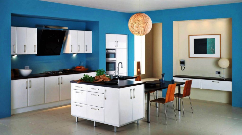
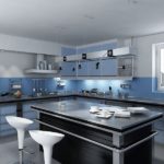
Blue in moderate colors cools bright colors
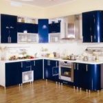
Lightness blue brings only in bright rooms saturated with sunlight.A good option would be to combine blue with white. White color will give its lightness to the kitchen, but only in conjunction with sunlight. After all, the blue color has the peculiarity of burdening the space. The best choice would be light shades of blue. A dark shade will give even greater gravity. Blue should not dominate too much - everything should be in moderation.
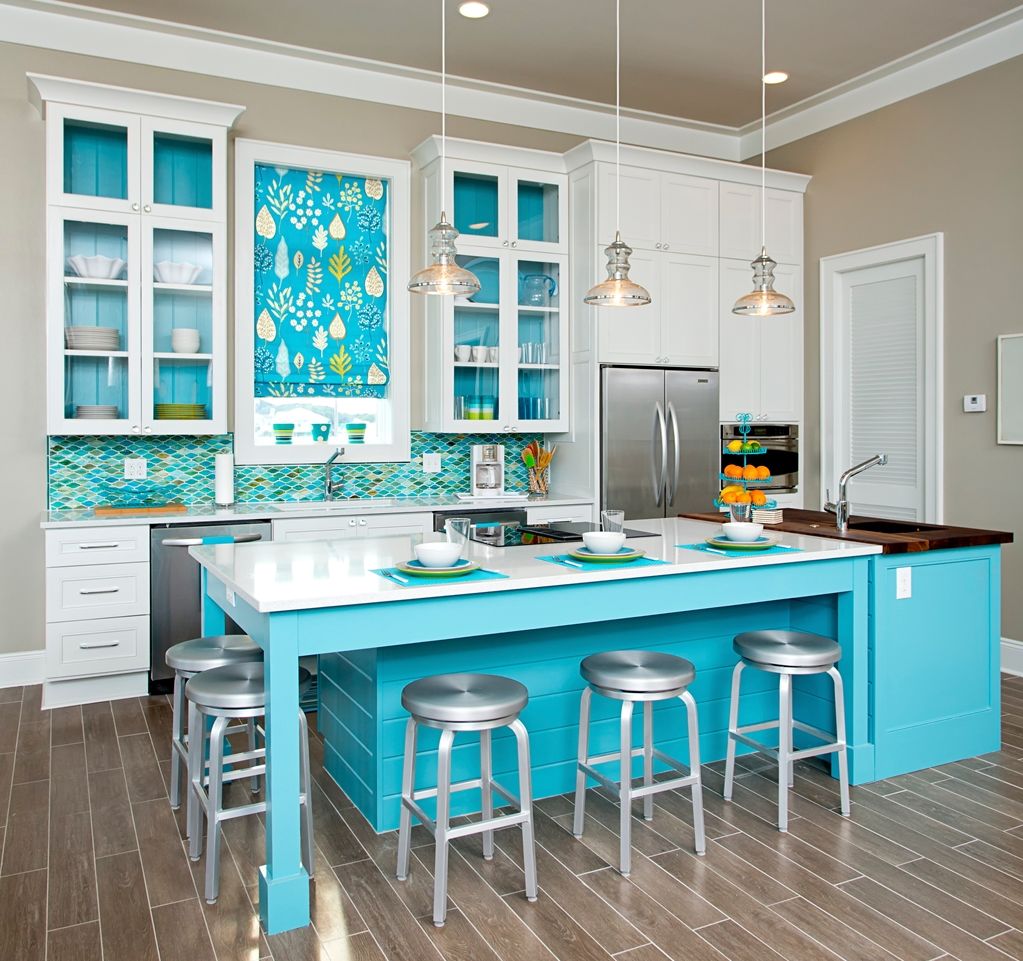
The more light in the room, the easier the blue color looks.
The best options for combining blue with other colors
- White is tenderness. Pictures come to mind of the blue sky with fluffy white clouds or winter, giving its cool.
- Beige is a harmonious combination resembling a beach with soft sand and an exciting sea.
- Gray - relaxes and soothes. This color in itself is soothing, and with blue the effect doubles.
Brown kitchen: "station wagon"
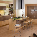
One name speaks of an all-encompassing brown. Brown is a respectful color that has been on the pages of any fashion design magazine. He does not cause any special outbursts of emotions, imagining himself restrained, modest, limited from excessive enthusiasm. In all its simplicity, a hidden nobility lurks, which does not appear at first sight.
Most of all in the design of brown there is a tree. All kinds of hanging cabinets, tables, chairs, flooring - are made of wood of various types and colors. No two different types of wood have the same color, giving the opportunity to give the kitchen different tones, but you can limit yourself to one, adding an image of solidity. Varying the saturation, you can change the mood of the kitchen. Light shades add lightness and sophistication. Deep tones are suitable for people who are serious and assertive.
Creating a single image, you need to consider the smallest details. This color also has its pros and cons in choosing interior items.
- The dark brown shade positively emphasizes the large size. A large kitchen in light colors may seem dull. Little is better to give light.
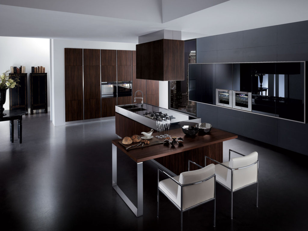
Dark brown gamut will add solidity
- Any color reflects the character of the owner of the house. Saturated brown is suitable for powerful people with a strong character. Gentle natures prefer a bright atmosphere.
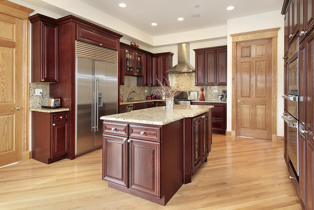
Discreet light brown color fills the kitchen with warm colors
- Light brown fabrics look harmonious. Dark brown is best left for the headset.
Green Cuisine: Add Freshness
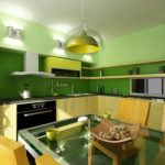
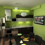
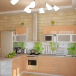
Green evokes summertime: mowed grass, hot sun, sea of all kinds of greenery. Loved by many people for their influence on the human psyche. Seeing him, a person calms down, the psyche normalizes. Everyone loves the nature with which he is associated. After a hard working day amid noise and electronics, green tones up perfectly, resembling a surge of strength after a freshly squeezed fresh juice or fruit juice. In the kitchen in this color comfort and coziness prevails, complementing family dinners and gatherings over a cup of tea. Green has many shades: from light green to dark emerald. Any person will be able to choose for themselves a suitable color to their liking.
A nice bonus in this is the high compatibility of green with other colors.
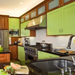
- Brown. This combination will give saturation. The clarity of brown and the smoothness of green complement each other.
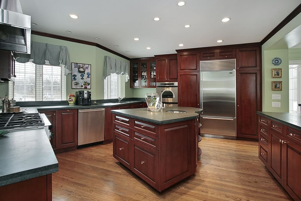
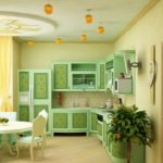
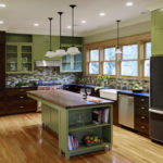
Light green walls harmonize well with brown furniture.
- The black. This combination is often used. Inspires by giving vitality.
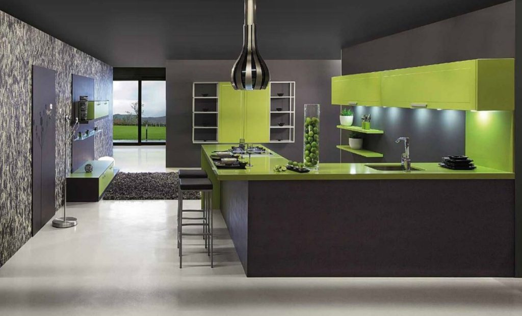
With appropriate lighting, green versus black wins
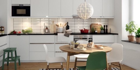
- White. The classic combination. White gives green more softness.
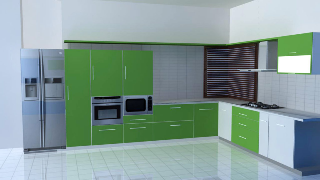
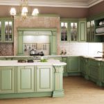
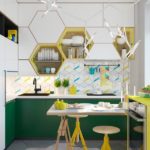
The green color of the kitchen facade looks natural surrounded by white
Orange cuisine: hello to bright weekdays
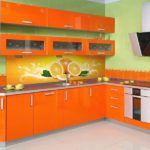
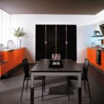
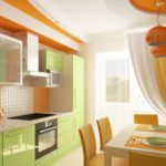
Seeing orange, no man will be more gloomy. Looking at him, everyone immediately rises the mood, and a person is ready to run towards a new day.After all, the orange color is associated with oranges, grapefruits, tangerines - citrus fruits that give such a useful vitamin C, which increases immunity in the fight against various diseases and loss of strength. He throws himself into the eye with his bright message, motivating anyone on an active day with a positive attitude. A person who dreams even in his free time to soak up his energy and vigor will definitely choose this design.
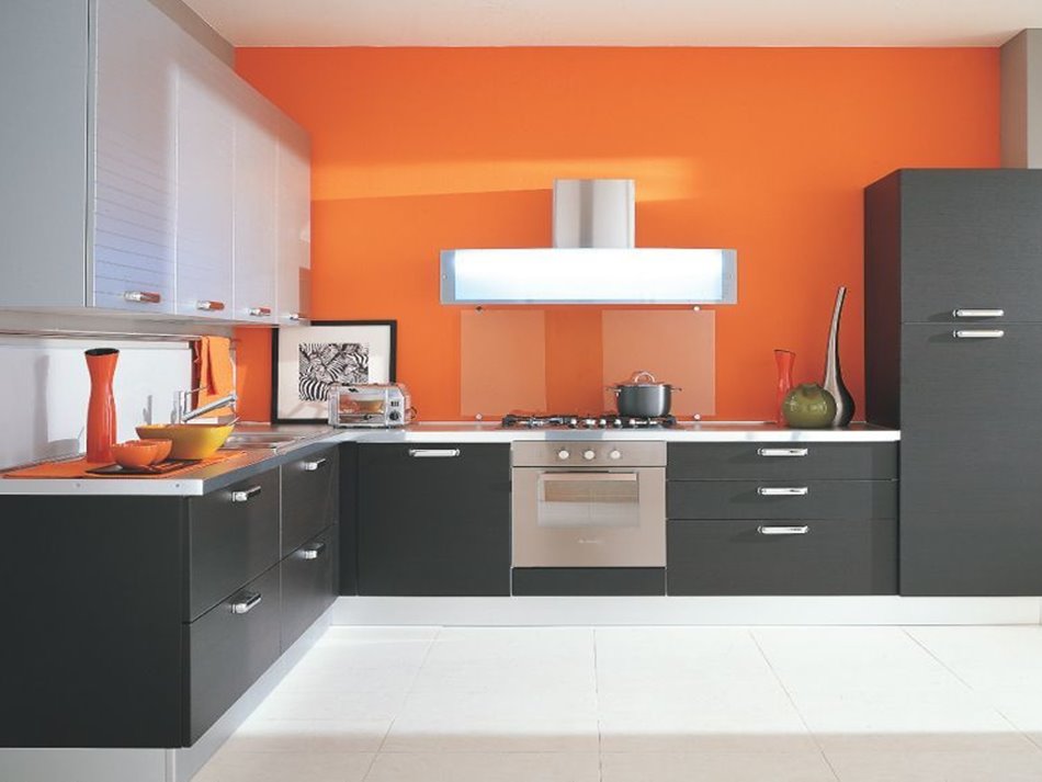
Orange is associated with a sip of fresh orange juice
Too bright orange color can cause a negative reaction in a calm and balanced person. For such people, it would be better to choose something calmer. Fidgets will never pass by this explosion of positive emotions. An extraordinary and exciting interior will definitely be provided for them.
The bold orange color also has its pros and cons in use.
- Cheer up all day! It activates the brain, but at the same time it calms, absorbing all negative thoughts - a paradise for optimists.
- Annoying the psyche. Calm people very rarely choose orange, preferring neutrality.
- Light colors visually expand the space.
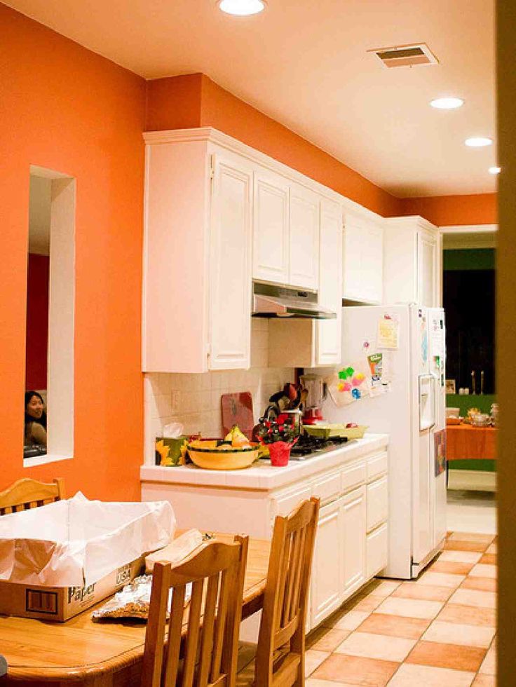
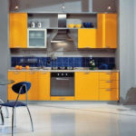
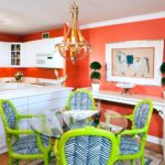
A narrow kitchen will seem wider if you make the walls orange
Gray kitchen: peace and comfort
A true introvert is inclined to this choice. Introverts love silence and peace, relaxing every nerve cell. This color is very reminiscent of these people. Not! In no case gray mice, but relaxed and calm personalities.
Along with calm, gray radiates nobility, which is impossible not to notice. Perfectly suits persons working in the business field, personifying their status.
People who are constantly in the center of attention at parties almost never give preference to gray, opposite to their explosive nature, preferring saturation (for example, to orange). After all, gray was created to appease, allowing you to collect your thoughts.
Positive qualities of this color.
- Together with acidity, the kitchen acquires a special highlight. The combination of coldness with the saturation of acid colors brings a piquancy of former severity.
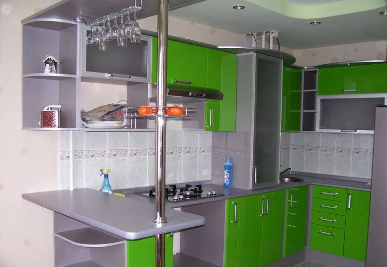
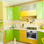
Bright green enlivens the chill of gray
- Its mysterious charm adds versatility to the headset and accessories.
- We use it quite a lot in current design styles: loft, hi-tech, modern, etc. Modern designers constantly use it in their projects. It looks very elegant.
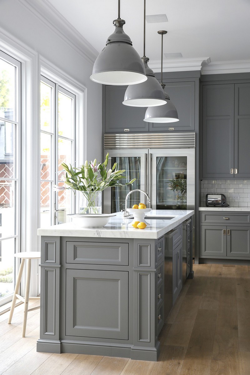
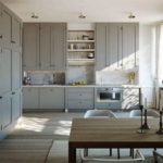
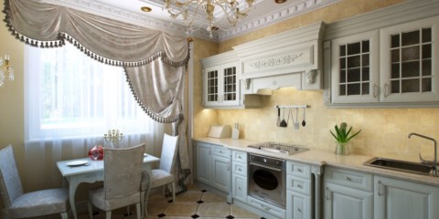
Classic kitchen in gray tones
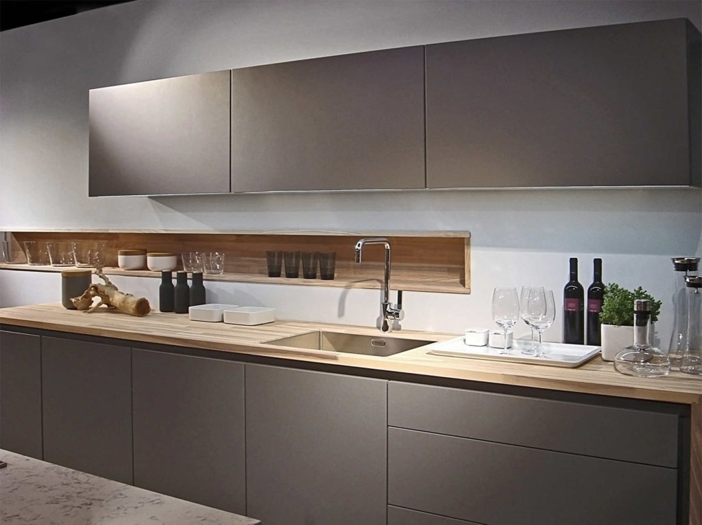
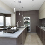
Gray metallic tint of modern hi-tech
Red cuisine: love and passion
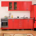
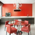
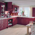
Red color represents passion and attraction. No wonder the tango dancers (the most emotional dance in the world) put on red dresses. In such an atmosphere, I want to dream of great love and uncontrollable emotional impulse.
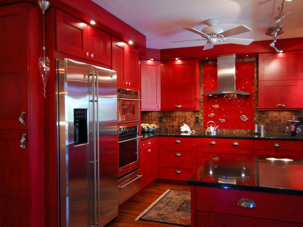
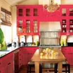
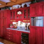
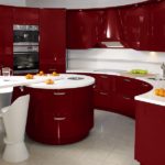
Red color will add energy to you while cooking in the kitchen
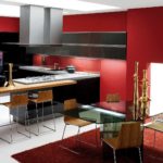
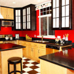
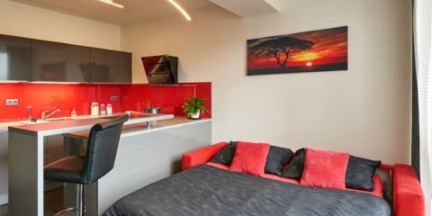
Red is a risky decision. Strong “poisonous” saturation can spoil not only the appearance. Nervousness, incomprehensible excitement, tension are the consequence of a sharp red effect. It is better to give preference to a red headset or decoration. Recommended for people looking for energy recharge. Red color will not let anyone get bored, the main thing is not to overdo it.
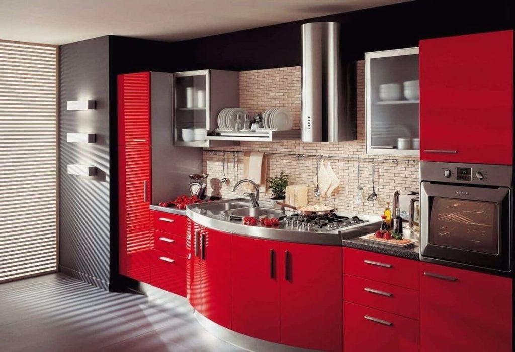
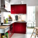
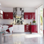
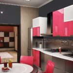
Glossy red color looks good surrounded by dark matte tones
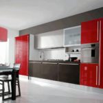
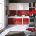
Red is combined with many colors. A mixture with delicate beige, refreshing white - softens red. Fullness with dark colors enhances its effect.
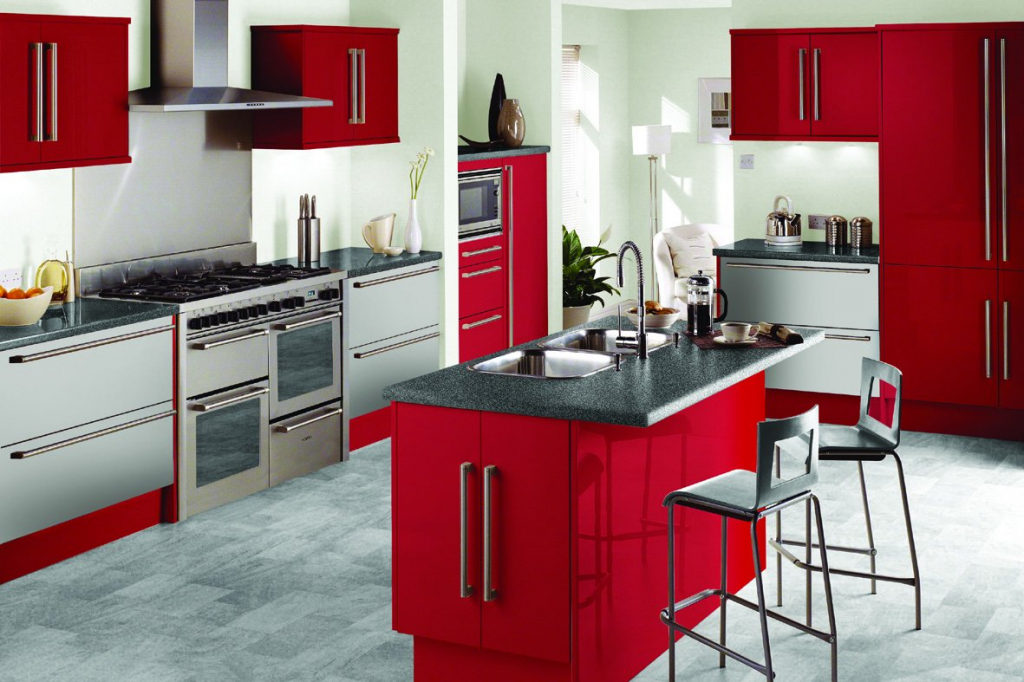
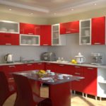
Red perfectly complements the gray-white range.
Black cuisine: unrivaled classics
Do not underestimate the classics, tested by time and experience. Black has long been associated with elegance. He steadily holds on to the consumer market, gaining popularity, which arose a very long time ago. Many styles take it as a basis: from pretentious baroque to the latest high-tech.He managed to earn a lot of negative opinions towards himself. Many argue about the depressive mood of black, oppressive people abiding under his influence. Some part of a primitive society completely underestimated the possibility of creating elegant and flying images of decoration by blacks.
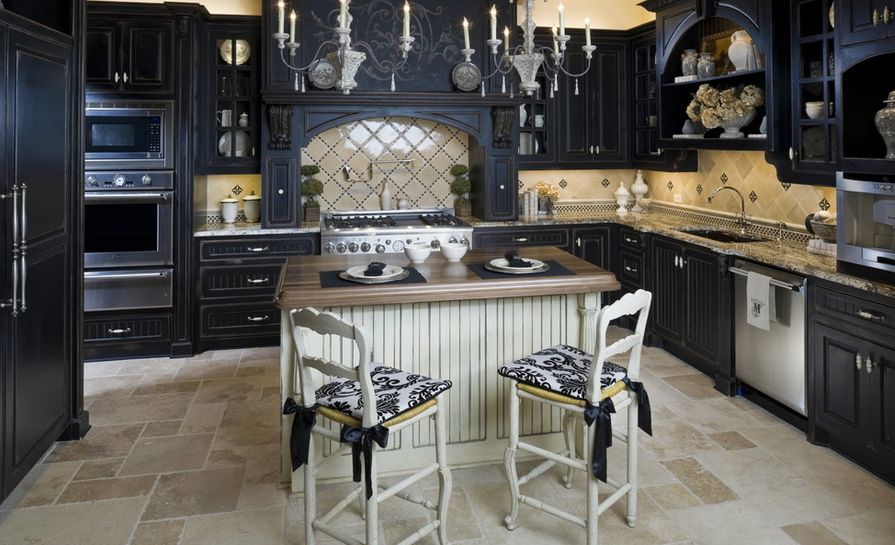
The classic black headset still looks fresh and original
Transforming a floor covering or one side of a wall into black is a profitable option that visibly gives expression. The black set will attract attention, calling for the preparation of a new culinary masterpiece. Small jewelry soothe, giving home comfort.
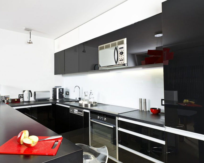
A classic combination of a black kitchen unit and white walls
His partners can choose any color - from inspiring white to extravagant purple, due to its neutrality.
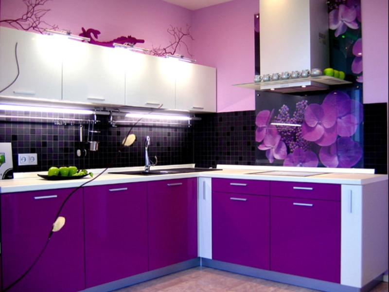
Black and violet colors create rich dense color
Yellow kitchen: the sun at your place
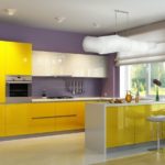
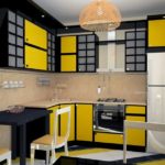
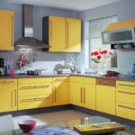
Unlike his explosive red brother, yellow is more tender, having the same acid color. Everyone knows the summer sun, pleasing all living things with its warmth. This property has a yellow color. It triggers brain activity, removing the negative impact. Having been in such a sprightly atmosphere a little, I want to live on, not focusing on problems and easily solve any difficulties. The reverse effect causes too much and single use of yellow in the design. So that it does not irritate, it is better to give a preference to a soothing pale yellow.
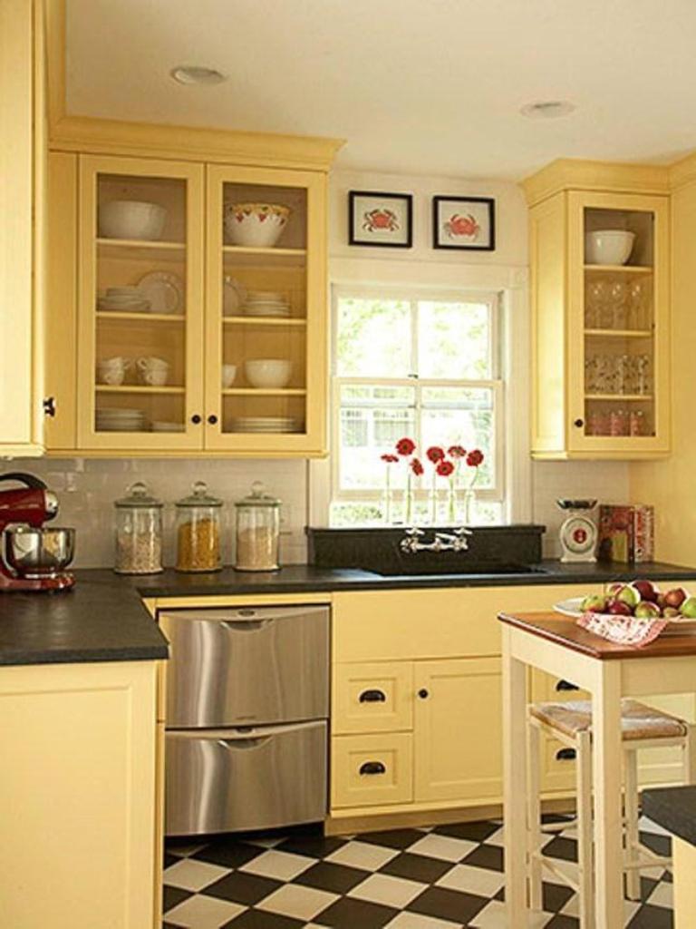
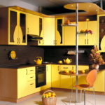
Pale yellow color will help to gather strength and relax
White with yellow is a safe combination. Refreshes, tones, cheers up. This copulation is a frequent choice for cheerful people who do not want to be sad, falling into depression.
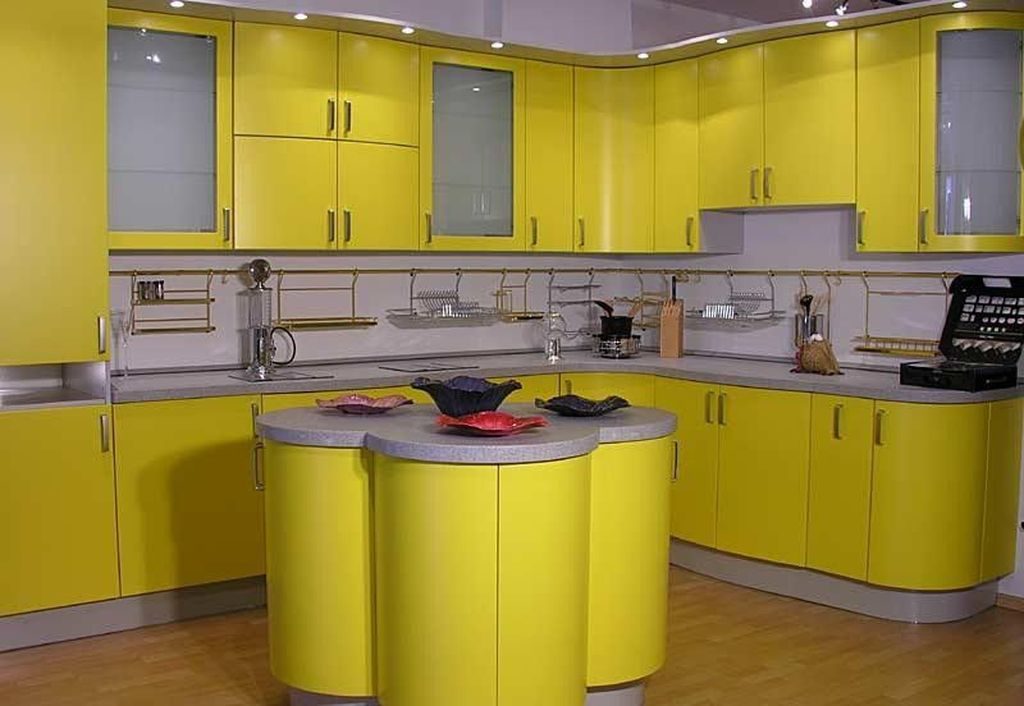
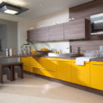
Yellow color invigorates but does not irritate
Process design method
This scheme involves the use of three shades of a particular color wheel, located next to or opposite. Complementing each other, they create a special mood and contrast. Often with two bright colors, you can use neutral, softening the previous ones.
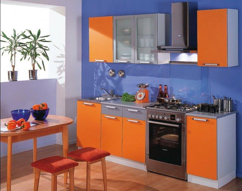
One of the colors of the triad can dominate and the other two can complement each other
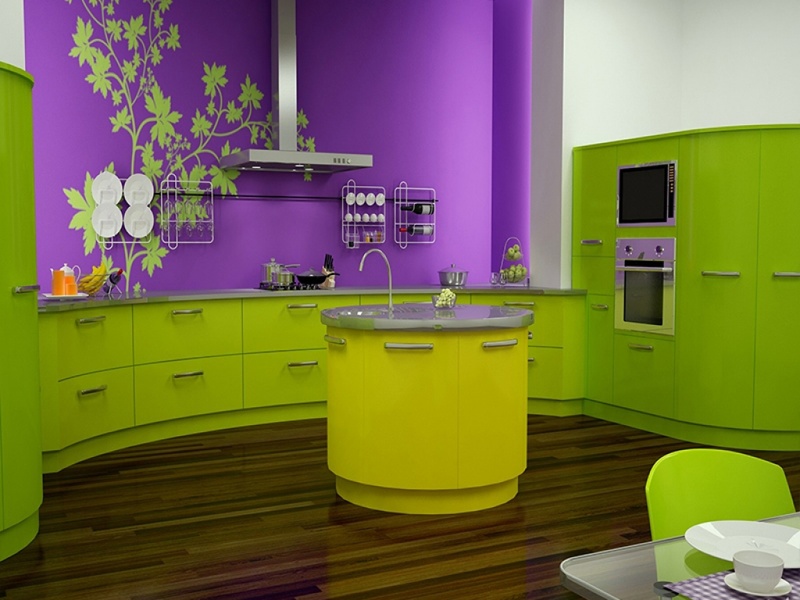
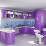
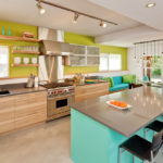
Purple and lime green successfully compete against a white background.
Such a circle consists of numerous tones of primary colors. This scheme helps to choose the most consistent colors among themselves, beating them among themselves. Often, more delicate colors are used as the basis, creating a soft atmosphere. Bright (additional) color brings its originality - explosive freshness to the entire flying image. In more modern and bold solutions, three eye-catching colors are used at once, taking full advantage of this technology. This solution is incredibly popular among young people.
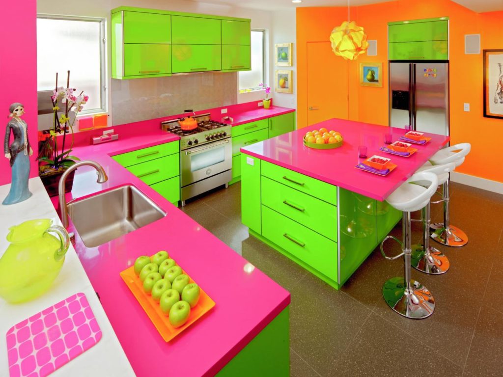
Three basic acid colors make your kitchen fun
Find your perfect color scheme in your kitchen using the tips given to you in this article!
Video with interesting new color schemes:
